


Read a patient’s memory on a retro terminal…
Returning to the last day of summer, you will experience a story about sunflowers and fireworks, betrayal and salvation, and MEMORY.
Play the game here
The version playable via this link is P4.
In the download section of this link, you can access the P2 version (BM1103-Old version.zip). Please unzip the file and open dist/index.html to play.
Important: When entering the P4 game for the first time, it is recommended to click [RESET] to clear any existing P2 data from localstorage to prevent interference.
Iteration Statement
The iteration of P4 focuses on enhancements in visual effects, interactive experience, and textual details. The story structure and choice map remain unchanged compared to P2. Therefore, I have attached the link to the P2 writeup for reference regarding the game synopsis, creative inspirations, and the choice map.
Overview
Initially, when I told my classmates that “I would use P2 as my P4 project,” they were surprised: “Your P2 project is already very complete; what else is there to change?”
This was a question that troubled me as well. At first, I intended only to perform some visual polishing to make it feel more like a “finished game.” However, as development and testing progressed, more and more issues began to emerge, with some minor adjustments triggering a chain of butterfly effects.
The polishing process of P4 became a true test of patience: achieving that final 20% of refinement often required 80% of the time. Moreover, unlike P2, this period was not accompanied by the strong positive feedback of implementing new features. I even began to doubt myself: “I’ve spent so much time; is it possible that I’ve actually degraded the experience?”
Ultimately, adopting the perspective of a “researcher,” I conducted observations, interviews, and surveys. Through 3 major iterations and 13 playtests, I utilized data to drive my iteration process, providing scientific evidence for the claim that “P4 has indeed improved the game quality.”
V1: Visual Polish and New Interactive Experience (11/25 – 12/2)
In class, Butch explained the importance of packaging: packaging determines the player’s first impression of the game. For me, the biggest regret regarding P2 was that the visual effects were not sufficiently polished. As shown in the image below, the border of the main game interface consisted of simple lines, and the division between regions felt rigid, resembling a webpage rather than a “retro terminal.” The scrollbar, in particular, disrupted the immersion.
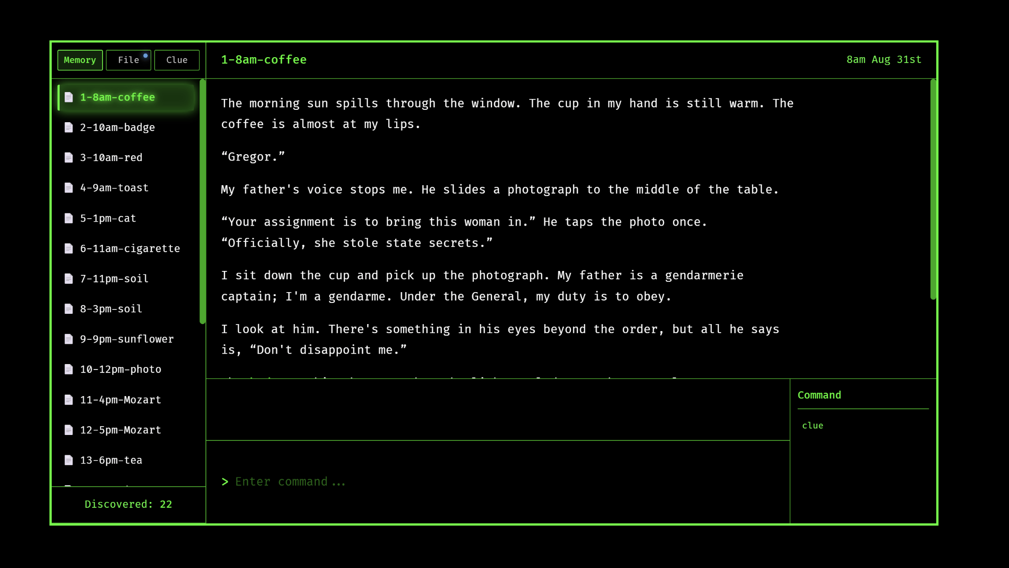 Image: Game Interface of P2
Therefore, I began searching for ways to further realize the “retro terminal” visual effect. I thought of Her Story. As shown below, the game separates the player from the content with a reflective screen layer. This “blurry, dirty” texture enhances the immersion of “sitting in front of a computer investigating,” and it even holds narrative significance. Regarding the specific look of a retro terminal, I referenced numerous images and eventually found that Cool-Retro-Term best aligned with my aesthetic expectations.

Image: Game Interface of Her Story

Image: Interface of Cool-Retro-Term
I asked Gemini to deconstruct the key visual elements of these two references, such as the phosphor green color, CRT glow, and pixel fonts. Beyond the AI’s contribution, I observed that the screens in both Her Story and Cool-Retro-Term feature an outer monitor bezel. Combining this with my undergraduate studies in imagery, I believe this frame is crucial: when facing a monitor, we often default to assuming “the content inside the monitor is fictional.” However, when a “monitor” is nested within our physical monitor, creating a second layer of separation between the game content and our actual computer, it paradoxically enhances the realism of the game content (a technique also employed by many meta-games, such as Inscryption).
Ultimately, I had Gemini generate a static HTML interface to serve as an aesthetic reference for the visual iteration.

Image: Art Style Reference HTML Generated by Gemini
After confirming the art style, I gradually ported the new style into the P2 project. The image below shows a transitional version. You may notice that, in addition to CSS adjustments, I also appropriately modified the page layout: I compressed the interface to fit within a “bulky monitor” and made it more compact (e.g., the original distance between the date and the title was too great). I also removed the command prompt bar, which testing proved was rarely used in P2, laying the groundwork for the next step of interactive iteration.

Image: Transitional Version with Implemented Art Style
Regarding the interactive experience, P2 had a significant issue: many players lacking experience with terminals did not understand the “slash command” input method, particularly for commands like /delete 18. Although I provided hints via the file and command bars in P2, the operational friction here remained high. This involves a balance between “realism” and “game experience.” I find terminal operations cool—especially operating a system using only a keyboard without a mouse—making me feel like a hacker wearing sunglasses. However, the core experience of this game is not “terminal simulation,” but an emotional story. Game mechanics should serve the goal of “helping the player experience the story better,” rather than adding extraneous resistance.
Therefore, I changed the input system from slash commands to a mode switching system, where buttons like [sort] and [delete] unlock gradually as the game progresses. After clicking to enter a mode, the system provides explicit prompts on what needs to be input, making the format much simpler. Furthermore, I added color-changing effects for different modes to provide players with “positive feedback,” helping them feel that “I have indeed progressed something or discovered something.” As shown below:
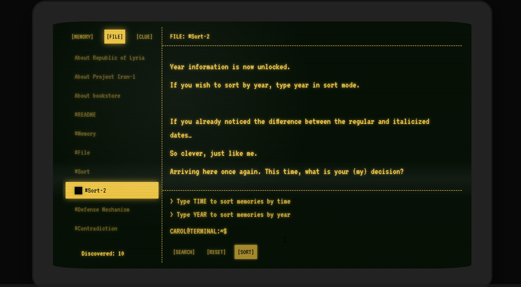
Image: Sort Mode

Image: Delete Mode
In summary, during the first phase, I conducted substantial visual upgrades and changes to the interaction method (from slash commands to mode switching). The visual comparison is shown below, highlighting more retro effects, the removal of emojis, a purified color scheme, and layout changes.


Image: P2 vs. P4, Game Interface of the Same Content (Top: P2, Bottom: P4)
Round 1 Testing: In-Class Observation (12.3)
I entered this testing phase with several specific questions: First, would the new visual style compromise the reading experience? For instance, was the brightness too low, or were the pixel fonts difficult to distinguish? Second, was the new interaction system truly better than the previous one? Would the new interaction system add new friction to the player’s experience of the story?
Brydie participated in the test. I recorded her gameplay session and compiled observation notes. Key points include:
- 01:47 The player was unfamiliar with the terminal requiring “Enter” and attempted to click the [search] button instead.
- 03:31 Did not use the clue list; instead, attempted to re-read previous texts to find clues.
- 05:54 Encountered a bug: “red” was unlocked prematurely, though she did not notice it was a bug.
- 10:10 Was very concerned with the unlock progress of collecting 18 memories for “sunflower.”
- 24:39 The instruction for sort was not updated in the file.
- 26:22 Had not switched files previously; why did she know to switch to the file tab after reading “death”?
- 36:59 Took some time to find her own name.
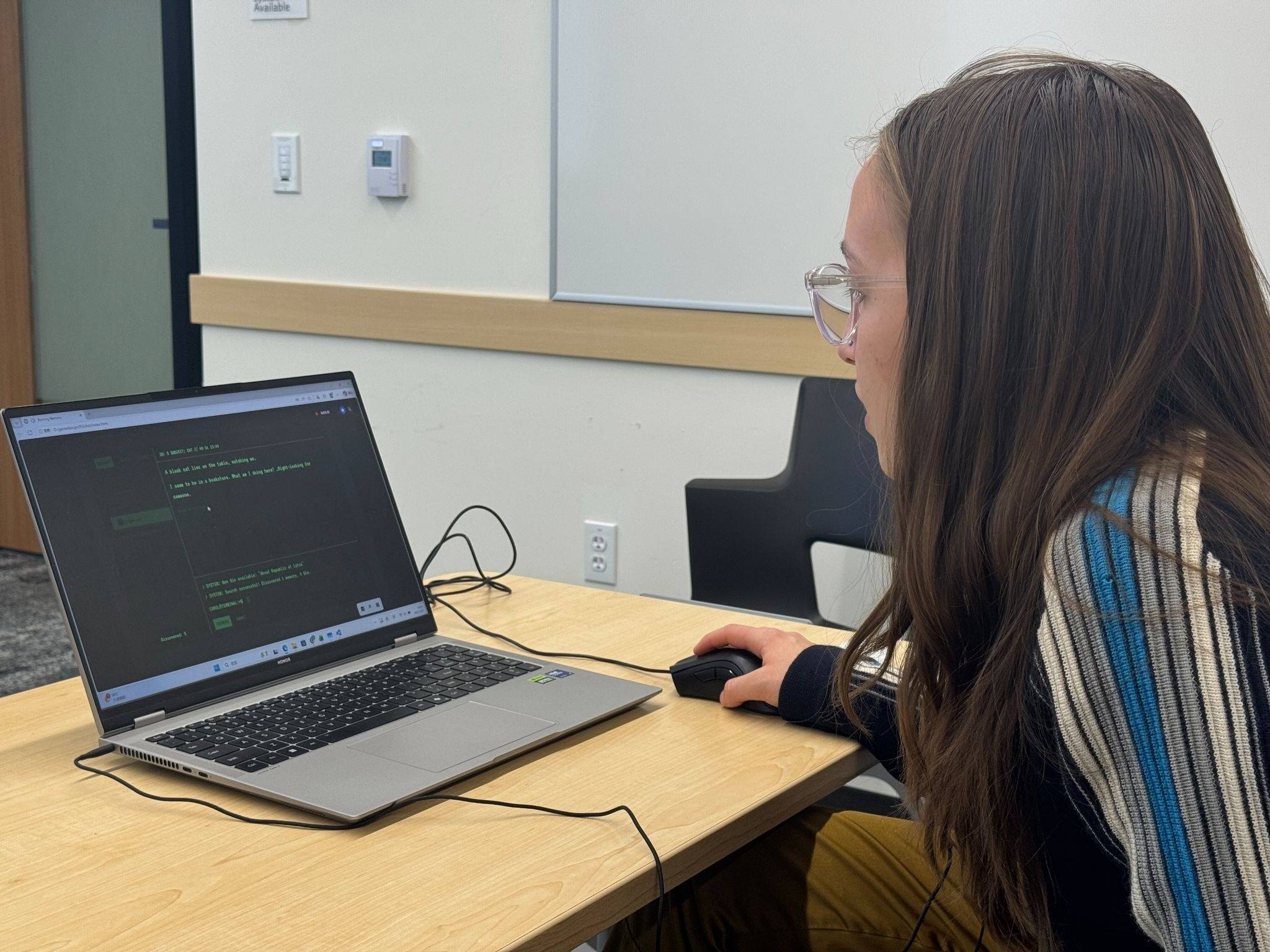
Image: Brydie in the playtest
Then, I gathered the courage to invite Christina to participate in the test. Despite being pressed for time, Christina patiently played through the entire game—thank you so much! During this process, I observed:
- Christina also did not realize she needed to press Enter to search and instead tried clicking the [search] button (Recurrent issue!).
- She did not actively read the files unlocked during the process, resulting in a large volume of file reading late in the game (Recurrent issue!).
- Repeatedly scrolled the list up and down.
- Remembered that search was locked; she could click clues but was prohibited from searching.
- Clicked the mouse too frequently, leading to hand pain.
- “Alzheimers” should also be a valid input.
- “yes/no” and “y/n” should also be accepted.

Image: Christina in the playtest
In the post-game interviews, both players stated that “the visual effects were good, and there were no obstacles regarding reading.” However, regarding the interaction system, certain issues appeared repeatedly. The most critical was the “Press Enter to Search” logic. While natural to me, it was unfamiliar to players and required prompting. Regarding the pacing of reading files, I attempted to prompt players via a blinking light, but this cue was insufficient to interrupt the player’s motivation to “continue exploring memories.” Based on these issues and other observations, I formulated a revision plan.
In game testing, offline observation of actual player behavior is crucial. During P2 testing, I conducted only one offline observation, with all other tests done online. Consequently, I only reached the conclusion that “interaction was not smooth,” but I did not see the process of “non-smooth interaction.” This time, however, I could further optimize the interactive experience based on the actual behaviors I observed.
V2: Polish and Localization (12.3 – 12.10)
Based on the observation results mentioned above, combined with my own reflections during the observation process, and the problem list accumulated from P2 (peer review, Butch’s suggestions, and known bugs), I synthesized these contents into a single document, categorized into Visuals, Interaction, and Debugging.
To my surprise, interaction-related issues were the most numerous, totaling about 30 items. Interestingly, in my rubric, Interaction only accounts for 10%. However, interaction was indeed the area where I lost the most points in P2, and it is also one of the areas I am least proficient in. Well, let’s solve these problems one by one!
- “Enter to Search”: When a term is auto-filled into the terminal, a system prompt now pops up to instruct the player.
- Documents: Upon unlocking a document, the interface now forcibly switches to the file list.
- Clues: If a clue in a memory has been used, its color now dims to indicate its status.
- Scrolling: When switching lists, the view now automatically scrolls to the bottom (to facilitate seeing newly unlocked content).
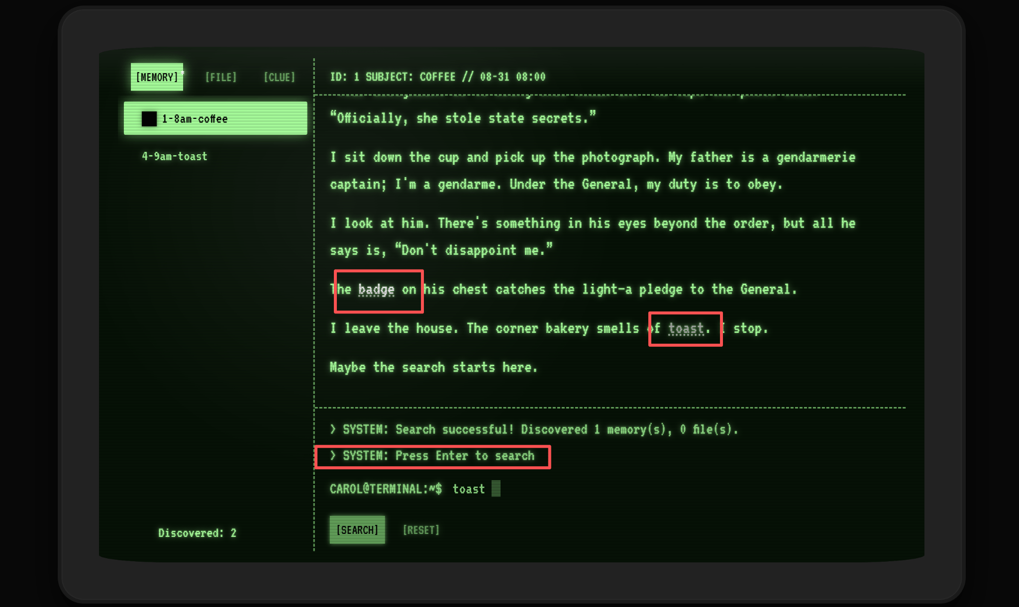
Image: Marker for Used Clues; Prompt for “Press Enter”
Regarding these modifications, I essentially responded item by item, but I lacked some systemic thinking—for example, what is the core contradiction of the current interaction system? Some modifications also felt slightly rigid (e.g., forced scrolling to the end).
To verify whether these changes were effective, I designed a questionnaire. Based on the observation experience from the first round of playtesting, I realized that the questionnaire content should focus more granularly on “Interaction” and “System Elements,” rather than focusing on emotions and subjective feelings as I did in P2 (because the purposes of the two were different: P2 focused on “whether empathy was evoked,” while P4 focuses on “whether iteration improved the game experience”). The link to the questionnaire is here.
Specifically, this questionnaire included questions such as:
- Operational Understanding: Did you encounter the following specific problems? [Multiple Choice]
- No problems encountered
- Did not know how to enter Sort/Delete mode
- Did not know how to execute a search
- Did not know what to input in Sort/Delete mode
- Did not know to press Enter to search
- Other
- Puzzle Difficulty: Which puzzle caused you to spend a lot of time/feel difficult? [Multiple Choice]
- Answering “Project Iron”
- Answering “If you lose your memory”
- Finding the contradiction / Answering “Bookstore Father”
- Answering “Alzheimer’s”
- Finding the ID to delete memory
- Finding the keyword to delete (Camellia/Carol)
- None of the above, very smooth
- Visual Discomfort: Which visual elements made you feel uncomfortable? [Multiple Choice]
- No discomfort
- Flashing effects
- Text color/contrast
- Scanline effects
- Overall brightness
- Some text is too small
In addition, I implemented important modifications promised in the rubric:
- Save System: The game now saves to localStorage. There is only one save slot, and no manual saving is required. If the page is closed mid-game and reopened, game progress remains unchanged, allowing for a smooth continuation.
- Reset Function: This is primarily to allow players to start over from the beginning after finishing the experience, without having to manually clear localStorage (which has a technical barrier and risks accidentally deleting other information). This feature also provides a way for players to restart if they encounter an unknown bug that causes the game to soft-lock—although I hope this situation does not occur, from the perspective of system robustness, this function is crucial.
- Content Warning: Added before the game starts.
- Audio Fixes: Fixed the repetitive playback of the startup audio; adjusted volume, music looping, and other details.

Image: Confirmation Screen for Reset Function
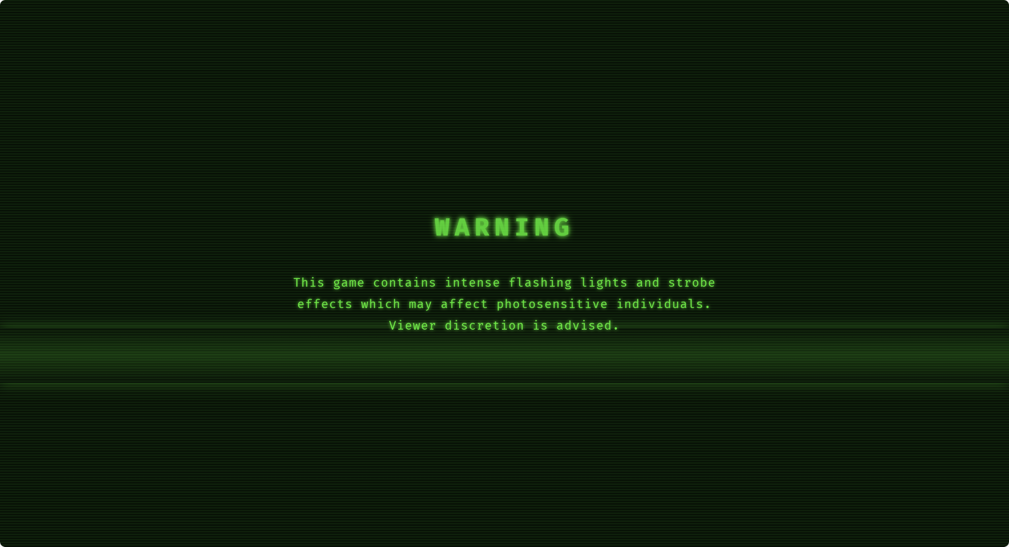
Image: Content Warning
Finally, I also performed Chinese localization. Since most of my friends are in China, and the P2 testing had already mobilized most of my English-proficient friends, localization was necessary to collect data extensively.
Second Round Testing (12.10 – 12.11)
This round of testing primarily utilized surveys, supplemented by interviews. It involved a total of 8 players. Among them, 6 were “friends of friends” who do not know me personally, chosen to avoid bias; the other 2 had played P2, and I conducted follow-up interviews with them. The raw data is here (in Chinese), The stats report is here(in English, processed with Claude).
1. Visual Feedback
The visual iterations received unanimous approval from testers. Data shows that 100% of players expressed a liking for the “Retro Terminal/CRT Style” (Q15), and 85.7% considered the interface to display perfectly normally on their devices (Q11).
Among specific elements, players most appreciated the “Retro Terminal Background” (85.7%) and the “Block Cursor Effect” (71.4%) (Q17). This proves that the Cool-Retro-Term style and the “screen nesting” concept inspired by Her Story, introduced in the V1 phase, successfully established the expected sense of immersion.
2. Interactive Experience
The strategy of changing the command system to button-based interaction yielded significant results: the overall rating for the “Interaction System” reached 3.86/5 (Q23), and 57.1% of players stated they “got started quickly” (Q22).
However, the data also exposed a “last mile” hurdle in the interaction flow: despite the prompts I implemented, 28.6% of players (Q6) still stated they “did not know they needed to press Enter to execute a search” in Search Mode. Subjective feedback further confirmed this issue:
“Clicking the button didn’t work; I had to press Enter. This design isn’t very good… it should support both mouse clicks and the Enter key.”
3. Q&A and Narrative
The biggest bottleneck in gameplay appeared during the puzzle sections. A staggering 71.4% of players indicated they spent a significant amount of time on the “Finding the Contradiction (Bookstore/Father)” segment (Q9), constituting the largest blockage in the game flow.
Corresponding to this was a conflict in the assistance system between “functionality” and “experience.” Although the Q&A system provided Hints, some players felt these hints were “too direct and broke the fun of puzzle-solving.” More critically, one player’s feedback keenly pointed out the disconnect (or ludonarrative dissonance) between the UI text and the narrative world:
“The design of the answer box feels a bit detached from the connectivity of the terminal and the world-building (you are Camellia, operating a terminal). Directly showing information for the player turns the terminal into a simple interactive interface rather than a part of the world.”
This feedback revealed the core issue through contrast:
- When a memory cannot be viewed, the system says: Locked — This is a game term.
- When input is incorrect, the system says: Hint — This is a puzzle term.
This blunt phrasing constantly reminds the player, “You are playing a game,” rather than, “You are reading the memories of an Alzheimer’s patient via a brain-computer interface.” This directly led to the core task of the V3 iteration: reconstructing the system’s feedback text using the worldview of neuroscience.
It is worth noting that a player who had played P2 stated in the questionnaire that the new version had “little visual change and the interaction was harder to use.” This disheartened me, so I conducted an interview with him. During the interview, he gradually clarified his experience: he believed the new version was more complete, but the original version was more “pure.” He actually found the new interaction interesting (the color switching caught his eye), but his prior knowledge from P2 made him maladapted to this input method in the new version (also related to the error handling prompts). Ultimately, he clarified: the new version had indeed improved; he simply liked the emotional experience brought by the previous version’s story and had subconsciously bound that emotional experience to the visuals and interactions of that time.
To find hidden bugs, I conducted a “stress test” with a friend, Kuma, who did not fill out the survey. Kuma had played P2 and his primary role this time was to test the system’s robustness through various unconventional operations. Thanks to his relentless efforts, we indeed discovered responsive design issues (the system prompt area was obscured when the screen ratio was enlarged) and a bug where animations would repeat if the Enter key was spammed. I fixed these bugs and verified that the build runs correctly locally and on itch.io. Compared to P2, he felt the new version made visual progress (“especially the part where the screen turns yellow in Sort Mode”), and regarding interaction, he felt it was “dumbed down a bit (more foolproof), which is better than before.“

Image: Kuma in the playtest and discovering a display bug
V3: Textual Polish and Final Check (12.11)
In the second round of testing, I received relatively rich data. These data drove me to think seriously about how to “refine a game.” My previous method was to list a long to-do list and cross items off one by one. But this feedback data pointed to deeper, systemic problems.
First, regarding the interactive experience, I realized the real issue was the “conflict between mouse and keyboard input.” In the earliest version, I hoped for “full keyboard input,” but quickly shifted to mouse input because it hindered players’ understanding of the story. However, I still held onto the subjective notion that “pressing Enter after typing is cool.” Even when I found players weren’t using Enter, I chose to “remind players to use Enter” rather than “accommodating the players’ natural operations.” The richer data this time exposed this issue. Therefore, I made clicking the [Search] button equivalent to pressing Enter. Now, all game operations (except answering questions) can be completed via the mouse.
Second, I discovered that the negative feedback regarding the Q&A system was interconnected with the earlier feedback that “the locking system felt immersion-breaking” (out of character). They should be viewed as a whole. I realized that although previous iterations gave the game a retro “skin” (Visuals), the underlying structure still revealed the rigid logic of modern software. To solve the “last mile of immersion,” I finally found the direction of “textual polishing”: reconstructing all system feedback using terms from neuroscience and psychology.
In the P2 version, the file #Lock, used to explain game mechanics, was a pure operation manual. It used computer terms like “Locked,” “Input box,” and “Press Enter,” and even directly broke the fourth wall to tell the player: “Note: The answer is not necessarily a clue.” This phrasing constantly reminded the player: “You are playing a game, and here are the rules.”
In P4, I changed the file title from #Lock to #Defense Mechanism. I removed all tutorials regarding keyboard operations and instead explained the phenomenon of “locking” through the perspective of neuroscience:
- P2: “There are two types of locked memories… Unlock automatically after discovering a certain number of memories.”
- P4: “From a neuroscientist’s perspective… Synapses. Impulses. Acetylcholine… Isolation: You need to find more associated memories to lift this mechanism.”
By introducing atmosphere-enhancing terms like “Synapses” and “Impulses,” as well as Freud’s theories of Defense Mechanism, the original mechanic of “unlocking by collecting a certain number” was packaged as “lifting the patient’s psychological defenses by finding associated memories.” This not only eliminated the feeling of being “out of character” but also built a “neuroscientist” identity for the player, paving the way for the subsequent revelation that “the player is Carol.“
Additionally, in P2, to prevent players from getting stuck, I wrote directly: “Hint: check memory 5, 10, 21.” While useful, this destroyed the atmosphere. In V3, I rewrote this prompt as: “Neural pulses detected in Memory 5, 10, 21.”
Furthermore, regarding the description of the puzzle itself, I implemented more detailed and immersive expressions:
- P2: A plain listing of two contradictions, “A” and “B,” with a rigid hint: “/sort time may help you.”
- P4: Introduced the “Iceberg Theory” as a metaphor: “Freud once said that memory is an iceberg… evidence suggests key memories still exist, repressed beneath the surface.” I also added the prefix “Based on EEG analysis,” making the process of finding contradictions no longer a simple “spot the difference” game, but a professional interpretation of the patient’s brainwaves.

Image: Answering questions is transformed into “breaking the psychological defense mechanism of repression”
Third Round Testing (12.11 – 12.12)
Although the sample size for the third round of testing was small (n=3), the data showed remarkable consistency, indicating that the iteration strategy of V3 precisely addressed the previous pain points. The stats report is here.
1. Interactive Experience
In the previous round of testing, the “last mile” hurdles in interaction (such as not knowing to press Enter to search) were major points of deduction. In V3, these issues have been resolved:
- 100% of players stated they “got started quickly” (Q22), representing a qualitative leap compared to 57.1% in the previous round.
- In the “Operational Understanding Issues” section, feedback regarding “did not know how to execute a search” or “did not know to press Enter” dropped to zero.
- The player rating for the interaction system rose to 4.67/5 (Q23), with no technical issues reported.
2. Q&A Experience
The strongest contrast in data appeared in the feedback regarding the core puzzle “Finding the Contradiction (Bookstore/Father).”
- Obstacle Elimination: In the previous round, 71.4% of players viewed this as the biggest sticking point; in this round, 0% of players found this puzzle difficult (Q9).
- Understanding Mechanics: 100% of players considered the [File] documents “very helpful” (Q37)—whereas in the previous round, this figure was only 57.1%. This proves that after rewriting #Lock from a “game manual” into a “neuroscience defense mechanism document,” players not only understood the rules but were also more willing to actively read and utilize them.
- Positive Feedback: 100% of players felt the Q&A system “prompted me to organize information and understand the story better,” and no one felt it disrupted the game’s pacing.
When “inputting commands” is no longer a cold, mechanical operation but becomes “interfering with memory via a brain-computer interface,” the player’s experience undergoes a qualitative change. One player’s feedback perfectly captures this sense of immersion:
“The feeling of the story becoming clearer step by step was done very well… when deleting ‘Camellia’, I really trembled and couldn’t press Enter for a long time.“
This sentence serves as proof of the validity of the entire P4 iteration process: from the operational confusion of “not knowing how to delete” in P2, to the emotional struggle of “not bearing to delete” today. This marks my transition from “making an interactive webpage” to “telling a story through interaction.”
Furthermore, a player who had played P2 mentioned in an interview: “The original Enter key affected the immersive experience quite a bit. Now that full mouse interaction is possible, it helps maintain a flow state. The visuals have a great sense of immersion, especially the color changes in different modes; the green-and-black color scheme ‘fits our imagination of that era perfectly’.”
Conclusion
Looking back at the development process of P4, the question that initially troubled me—“P2 is already very complete; what else is there to change?”—now has a clear answer. The core value of P4 lies not in adding new plot branches or rewriting the code architecture, but in enabling me to complete the perspective shift from “Developer” to “Researcher,” leading to the following key conclusions:
1. Eliminating the Disconnect Between “System Logic” and “Narrative Experience”
The most essential improvement from P2 to P4 lies in completely hiding the originally exposed “programmer mindset” beneath the narrative skin.
- Visual Level: By using CRT filters and screen bezels (the Her Story paradigm), I camouflaged the webpage as a “physical terminal.”
- Interaction Level: By supporting mouse operations and visualizing buttons, I eliminated the operational barrier caused by hardcore commands.
- Textual Level: This was V3’s biggest breakthrough—reconstructing Error/Hint into Defense Mechanism/Neural Pulse.
Data proves the effectiveness of this strategy: the stuck rate for the core puzzle plummeted from 71.4% to 0%. This was not because I lowered the difficulty, but because I endowed the puzzle with a reasonable “in-world explanation.” When players no longer view “Locked” as a system rejection but as “the patient’s subconscious resistance,” friction transforms into immersion.
2. Data-Driven Systemic Iteration
Unlike P2’s intuition-dependent development mode, P4 established a scientific loop of “Observation-Hypothesis-Verification.” Without offline Observation, I would not have discovered the micro-behavior of players “attempting to click the Search button with no response.” Without Survey data, I might have mistakenly thought the frustration with the Q&A system stemmed from the puzzles being too hard, ignoring the root cause of the text breaking immersion. The 100% onboarding success rate and 100% positive rating in the final test were not accidental luck, but the scientific result of repairing over 30 interaction details one by one.
3. Elevation from “Function” to “Emotion”
The ultimate goal of iteration is to serve emotional expression. In the P2 phase, the problem players faced was “What command should I input to delete?” (How). In the P4 phase, as one player stated, the problem became “My hands are trembling; I can’t bear to press Enter” (Why). Only when interaction is no longer an obstacle to reading the story but becomes a carrier of emotional experience, have I truly completed the production of a “finished game.”
In summary, through rigorous testing and iteration, the P4 project successfully polished an “interactive fiction prototype” into an “immersive narrative experience.” It also allowed me, through this refined work, to deeply understand “how the various elements of a game interact with each other,” and to savor the fun and sense of achievement found within that process.

