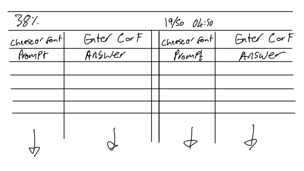
- The key elements of ‘cheese or font’ are the score, the timer, the prompt, and the answer.
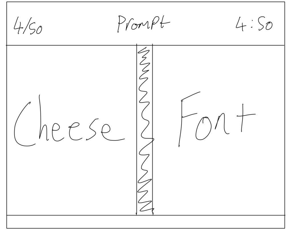
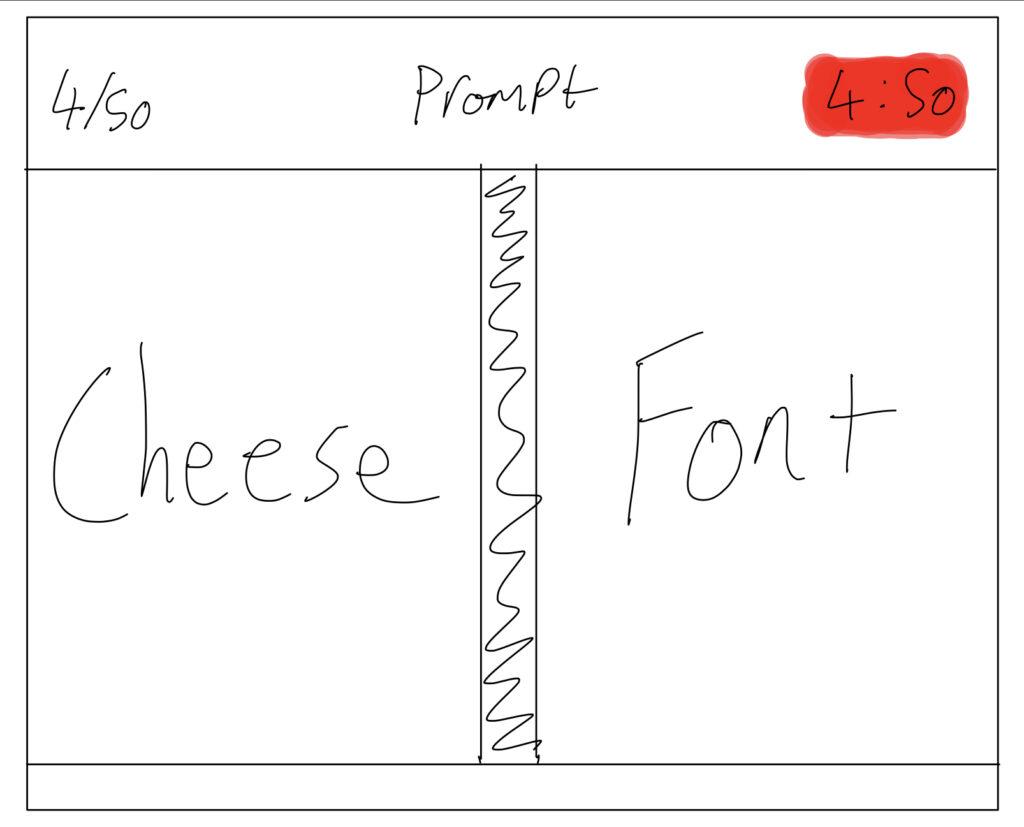
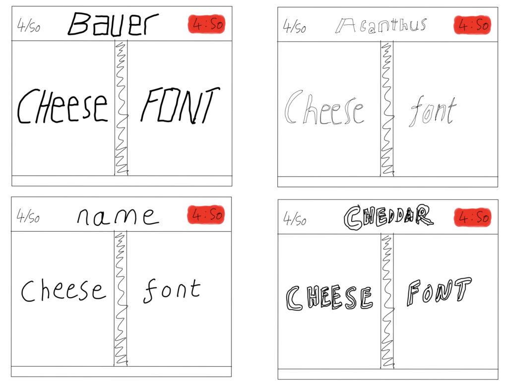
- I had the thought of moving the prompt to be larger, but instead settled with the idea of the prompt being smaller but the font that was being given as a prompt (or a random one if the prompt was a cheese) being used to display and show the larger options for ‘cheese’ or ‘font’, showcasing more letters across the two words than potentially in just the prompt.
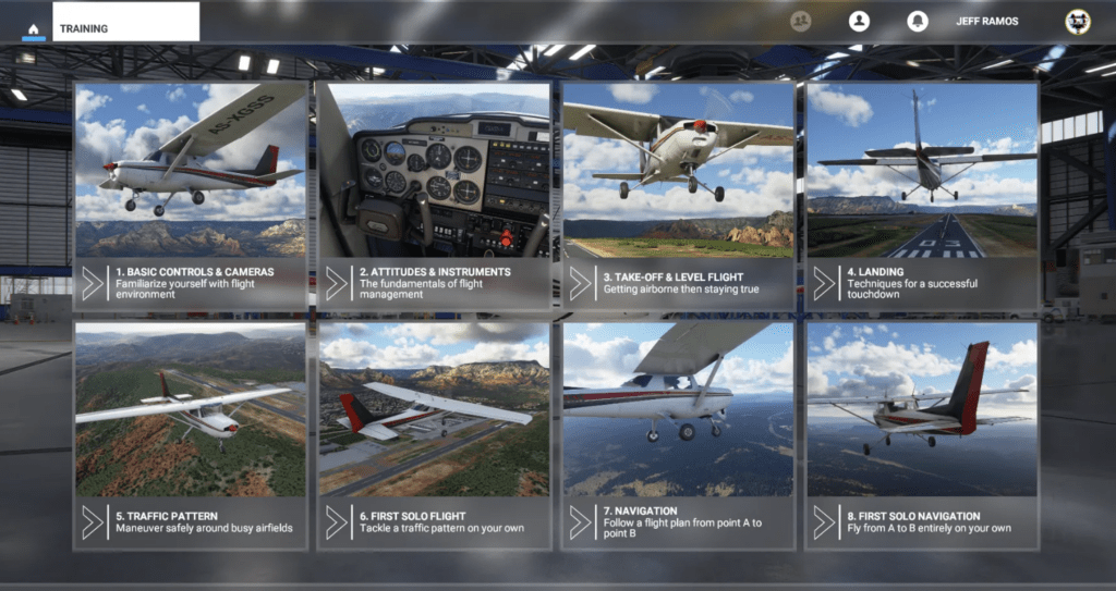
- I think that Microsoft Flight Simulator is an extremely visually beautiful game due to its graphics, attention to detail, and realistic rendering of the world. The key graphic design ideas it leverages to achieve this are: realism; lighting; texture quality and detail; scale and perspective. These all stick out within the gameplay, but the beauty extends to the menu design and the renders used within those. The iconography, layout, form, spatial positioning, and labeling all add to the beauty of every element of Microsoft FSX that greets you from when you enter the game and its system menus, right through to flying around the 1:1 render of the globe.


The Mechanics of Magic
Game Design Writings by Students at Stanford taking 247G and 377G


