Exercises

A Game I Think Is Beautiful
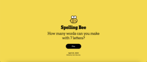
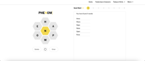
A game that I think is beautiful is The New York Times’ Spelling Bee game. I believe it uses color, typography, and proximity really, really well to achieve a minimalist style that makes the game interface extremely easy to use while also being really stunning. The designers only use grayscale colors with yellow as a bright accent color, allowing certain elements to be highlighted while giving the website a really clean look. In terms of typography, the title screen uses a serif font which effectively draws the player’s attention, while within the game the font is a sans-serif font which contributes to the feeling of sleekness. Additionally, the letters that a player inputs are always uppercase, in contrast to the normal-cased other wording on the page. In my opinion, this helps emphasize the importance of the word being typed in, as this is the core mechanic of the game. Finally, all of the hexagonal letter options that can be used to make words are placed in proximity to each other which makes a lot of sense, and these letter options are set far apart from the word list. The letter that must be used in every word is also placed in the center of all of the options, further showing its importance.