I also attached a PDF if the writing is a little bit small.
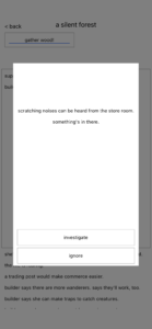
One game I find much beauty in is a Dark Room (the iOS adaptation). Even though it is truly minimalistic in design, the way they utilize color and space really speaks to me. In this review, I’m focusing on the main page.
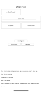
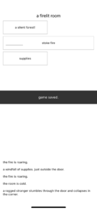
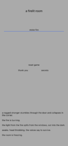
There are only 4 colors: black, white, gray and blue. Blue is pretty much only used to stoke the fire, which also saves the game. The screen dims to varying shades of gray until black if you haven’t stoked the fire enough. All of the typeface is pretty much the same, everything sans-serif in lowercase, even when there are sentences. Occasionally, an exclamation point will pop up in a box, forcing you to focus attention on that detail.
Because everything is pretty much the same font size and there is a gross lack of color, you hyper-focus on where there is color and on the other graphic elements such as the sizing and proximity of the boxes, lack of things with a box, and layout. For example, the title and the activities at the bottom are unconstrained by boxes, and interestingly enough form their own visual hierarchy. As for the stuff in the boxes, they are similar enough to where you can group them together mentally, despite each containing its own world within it. That’s a brilliant way to handle the complexity of the game as well, by compartmentalizing other features not just mechanically, but aesthetically by putting them in compartments— boxes— to be explored later despite being present now.
Although at first glance, a Dark Room looks extremely plain game, there is a quiet elegance when playing it and discovering the relationship the graphics have to the game. This makes it a true beauty in my eyes.




I love this game, and I love the minimalism of it! I agree 100% with your comment.