

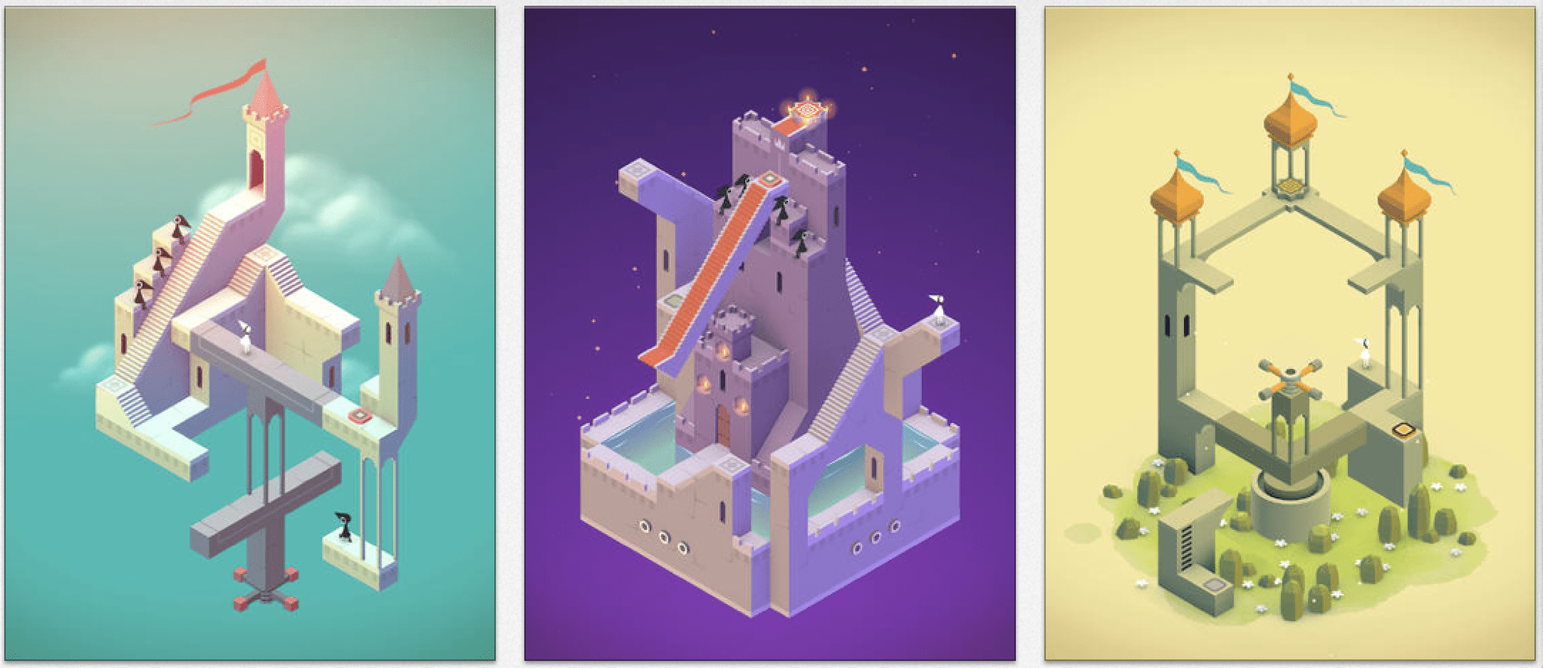
The game I chose is Monument Valley! Monument valley uses a lot of color palettes that make the game very cohesive and easy on the eye for the players. The colors also contrast each other so that important areas of the game don’t bleed into each other. The typography used in this game also contributes to the overall feeling of the game–simple and straightforward. The minimalistic design plays into the visual hierarchy of the game where color plays a more dominant role versus text.
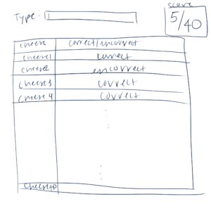
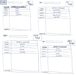
Identify elements of cheese or font
- Core (parts you need for gameplay):
- typing in the player’s answer
- Differentiation between correct and incorrect
- Tracking the ones you’ve gotten right and wrong
- The cheese/font to guess on
- Supportive (hints and instructions):
- Instructs us to type c for cheese and f for font
- One hint was there were 19 fonts
- Extraneous (things you could remove):
- The timer
- The average score of users
- The witty responses to when you guess wrong
Sketch out the core elements
Make one element in a NEW thumbnail sketch HUGE.
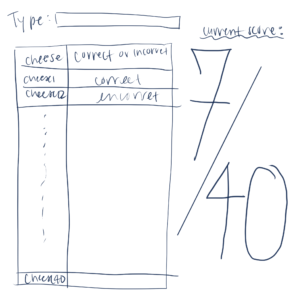
Try taking ONE color and using it in your thumbnail sketch along with black.
Make 3–4 thumbnail drawings that use type in different ways
Explore proximity in your design (short descriptions answering the questions is ok).
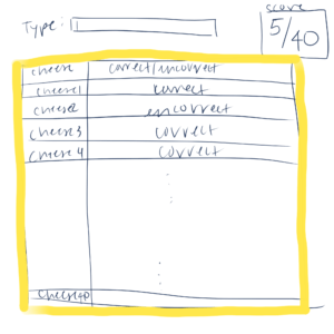
- The start of the type box is not aligned with the end of the box where the cheese name is. For the score box, it starts way too early that it overlaps with the box where you have to guess. Overall, the line organization could be improved. The box where the type box and the options box should be closer together since that’s where the bulk of the action lie.
