Proximity:
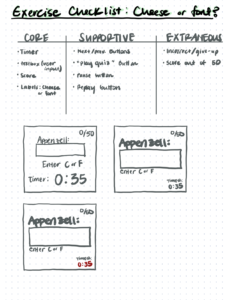
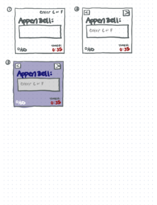
I choose to remove the table from Cheese or Font because it’s an unnecessary design choice and is repetitive: the words appear above the input box. I felt that removing the table would make it easier to read and emphasize the important/core elements of the game. I grouped the stats of the game (score and timer), made them the same size, and placed them at the bottom of the screen to show that they are related. I made the word and input box large because those two are the main components of the game. I placed the instruction (“enter c or f”) as placeholders inside the textbox and the previous/next buttons on the top in an attempt to not leave the top bare.
A Well Designed Game: 2048
I am a big fan of the game 2048. Although not the most visually appealing game out there, I believe the visual design is done well.
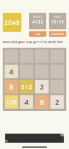
Visual hierarchy — 2048 has a clear organization of information. The top of the screen shows supportive elements of the game (i.e. score, link to the leaderboard, etc) while still pressing the main play screen “above the fold.”
Color & Contrast — The different coloring of the blocks signify value. The color of the numbers on the blocks contrasts well with the color of the block. The color of the board is clearly visible against the background color.
Alignment & Proximity — With half (and center) of the screen occupied by the gameboard, the design clearly encourages us to focus on the game. The stats of the game (current score, score to beat, etc) are grouped together and are at the top of the screen. This makes them easy to view without distracting players from the game. By limiting what’s presented on the screen, the designers have allowed us to focus on the game and quickly understand the objective of 2048.

