

The Maker’s Minute
Aalaap Hedge & Marielle Zheng
Overview
Our P1 project centers on the creation of an interactive design drawing and pitching game that teaches players to think creatively about accessibility while practicing fundamental design principles. The game combines elements of storytelling, improvisation, and visual thinking to engage players in designing for real-world accessibility challenges. Through timed drawing and pitching rounds, players are prompted to generate imaginative, creative, yet practical solutions for diverse user needs and populations, from those with visual impairments to learning disabilities.
The primary goal of our game is to encourage creative and inclusive design thinking by placing players in scenarios that require empathy, adaptability, and ingenuity. Too often, accessibility is treated as an afterthought in the design process; this game brings it to the forefront in a way that is engaging and approachable. By gamifying the process of user-centered design, players gain both awareness of the barriers faced by populations with accessibility needs and hands-on practice in applying design principles to address them.
The game is designed for individuals who may not be deeply familiar with universal design but are interested in creativity, collaboration, and communication. It appeals especially to players who enjoy fast-paced, story-driven games– those that challenge participants to think quickly and express ideas effectively rather than rely on strategy or competition. Each round encourages drawing, improvisation, and pitching, creating an environment that rewards curiosity and imagination over perfection.
By the end of gameplay, players will walk away as more creative and equitable designers and communicators. They will have practiced applying core design principles to accessibility-focused problems and honed their ability to generate ideas under constraints. Additionally, the process nurtures flexible, empathetic thinking– essential qualities for innovation in any design context.
Ultimately, the project aims to bridge creativity and inclusivity through play. By transforming accessibility design into a participatory and imaginative experience, the game not only builds design skills but also fosters an enduring mindset: one that values designing with and for all users.
Assessment Goals
There were two main purposes of our assessment goals for the game. First, we aimed for the assessment to evaluate how players responded to the game experience itself post-playtest, and to help flesh out and identify any potential areas for improvement within the MDAO framework (future updates to post-playtest interview assessment were made after receiving feedback about ensuring assessment needs to be easily understood by those without game design background; please refer to later section “History Versions of Game” for more details). Second, we seeked to determine whether players achieved the intended learning outcomes– specifically, whether they became more creative and empathetic designers who can apply core design principles to accessibility-focused challenges.
To measure these goals, we employed qualitative interviews and direct observation during play sessions. Specifically, the pre- and post-game interviews allowed us to capture players’ evolving understanding of accessibility design, and how the game impacted their understanding of designing for accessibility. During each playtests, we also conducted in-depth observations as moderators, examining player interaction, communication, and engagement with the MDAO framework serving as our lens. Together, these qualitative data sources informed the revisions that were made in the different iterations of the game, and greatly improved the design and pedagogical effectiveness of the game’s learning goals.
History Version of the Game: From “World’s Worst Design Factory” to “The Maker’s Minute”
Our game, initially called World’s Worst Design Factory (WWDF), began as an ambitious attempt to teach creative design thinking through humor and inversion. The main concept revolved around encouraging players to think about better design by first designing poorly. The premise was simple yet provocative: players would compete to come up with the worst possible design ideas, and in doing so, reflect on what makes a design effective.
The first prototype of WWDF consisted of two decks of cards: a topic deck (e.g., “tent,” “car,” “toothbrush”) and a component deck (e.g., “must be edible,” “can travel long distances”). Each round, players drew one card from each deck and were challenged to create a ridiculous design that met both criteria. We envisioned the humor and absurdity as incentives for creative thinking among players. Looking back, however, it was clear that the learning outcomes lacked clarity and the mechanics were loosely structured. Yes, the game encouraged laughter, but it did not meaningfully connect to our educational intent for the game to teach creative and user-centered designs.
Playtest 1 (October 1): The Confusion of the ‘Edible Tent’
Our first playtest revealed the gap between intent and execution. The idea sounded great in our minds at first, and while playtesters were initially amused by the idea, many left the game largely confused. When asked to design an “edible tent” from the cards that were drawn, most struggled to find purpose or educational value in the task. At the same time, the judging criteria were ambiguous– as one player put it: “how could one evaluate bad design meaningfully? What is considered “bad design”?” Another player also admitted, “I didn’t know how to add a water bottle to an edible tent, so I just drew one on the side.” What we saw and intended as a design challenge felt instead like random chaos to the players.
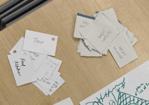
(Figure: first game card prototype; random topics and components, lack of alignment with learning and education objective)
Mechanically, the game was also overcomplicated. Players drew one component card at the start and another mid-round, a feature we initially believed would simulate creative constraints, therefore pushing players to think more outside the box into the unconventional land of design. Instead, it disrupted flow, and caused immense frustration. Many players complained of pitching times that varied too much, with some ranging from a few seconds to others over a minute, which added further tension to the game by creating pacing issues. Furthermore, rounds dragged on, particularly with larger groups of 6-8 players.
Our post-session reflection made it clear that the game at that time was entertaining though not educational. To address confusion, we refined the topic and component combinations, removed the second mid-round card draw, and standardized the pitch time to 15 seconds. We also reduced the ideal player count to 3-4 for smoother pacing. However, we still had not solved the fundamental issue: the learning goal itself was still weakly defined.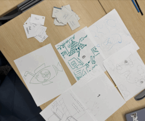
(Figure: the first batch of designs from playtesters; innovative and creative designs, though many players left confused about the learning and educational purpose of the game)
Playtest 2 (October 5): Discovering the Real Learning Objective
The second playtest provided a turning point. We again observed confusion among players, but this time the source became clear. Participants struggled to connect the idea of “worst design” to meaningful learning. One playtester noted, “If I played this with strangers, I’d find it weird saying one design was the worst.” Another echoed, “It’s hard to judge because everyone has a different style.” Without a rubric, many players reported that the evaluations conducted on the judge’s part felt arbitrary.
At this point, we decided to reimagine the purpose of the game entirely. Rather than prompting players to create poor designs, we would challenge them to create feasible, imaginative solutions for accessibility, grounding creativity in empathy and real-world design principles for real world problems. This marked the birth of our new game, “The Maker’s Minute”.
Now, the new learning objective became:
“Teaching players to think creatively about designing for users with accessibility needs while practicing core design principles.”
To support this, we redefined our learning outcomes so that players would leave the game as more creative, equitable, and user-centered designers, who are capable of generating feasible ideas quickly and communicating them effectively.
Mechanically, we recalibrated the system by replacing the “component cards” with “user cards,” each representing a unique accessibility context, which shifted the focus toward designing for real-world needs. We reduced each round to one minute to maintain a fast-paced, engaging flow, and added clarity to gameplay by selecting the judge clockwise each round. Additionally, we created more specific and engaging topic cards paired with user cards– for example, pairing a “toothbrush” with a “person with one hand” –to ensure that each round prompted meaningful, feasible, and creatively challenging design tasks.
We tested this new version with four college juniors from non-design majors. This smaller playtest was a breakthrough. The gameplay flowed smoothly, and players quickly grasped the objectives. Some “odd” combinations actually led to surprisingly rich insights. For instance, one player decided to design a toothbrush that can easily be used because “how useful is a toothbrush if getting the toothpaste out of the tube is hard?”, so as to make this daily task more accessible to one-handed users instead of reimagining the toothbrush itself.

(Figure: a creative design of toothbrush from an ‘odd’ topic + user card combination)
During this session, we also revised our assessment methods. Observations showed that players understood the rules quickly as they became self-sufficient in carrying on with the game without the moderator’s aid after one round, and post-game interviews revealed that all participants felt the experience deepened their understanding of accessibility and user needs.
Still, refinements were needed. Some user cards were too specific, creating infeasible combinations (e.g., “a chef who can’t see or hear” + “umbrella”). We simplified these to broader users (“a person who can’t see or hear”). We also expanded each deck to 20 cards, a decision that was made to avoid repetition of the same card combinations over longer sessions. More importantly, we wanted to ensure that each topic card could pair with each user card. We could have added more cards than 20 per deck, but this would have resulted in exponentially more combinations, which we would have had to manually test over an extended period of time.
Playtest 3 (October 6): Engagement and Empathy in Action
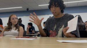
The third playtest was both validating and enlightening. Players’ engagement was evident. They reacted audibly (“what?” “oh wow!”) when drawing eccentric card combinations, used expressive body language to bring their ideas to life, and laughed often during pitches. It was apparent that the intended aesthetics– narrative and expression– of the game was experienced by the players, as many shared they feel a sense of fun and fulfillment in self-expressing and communicating their visions through the narrative storytelling that was brought by the pitches.
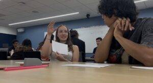
(Figure: open body language demonstrated by player during pitch)
(Figure: player on left uses hand gestures during pitching, while player on right listens attentively)
Table of Topic and User Card Combinations
| Topic | User |
| Toothbrush | Person with one arm |
| TV | Person with motion sickness |
| Mirror | Person who only sees in a shade of red* (need revision, population doesn’t exist) |
| Bike | Color blind person |
| Car | Person who can’t taste or smell |
(Table: documented topic + user card combinations to evaluate if the combination made sense for players to generate creative yet feasible designs)
One player, tasked with designing a TV for someone with motion sickness, proposed a pair of adjustable VR-like goggles that physically extended toward the screen to stabilize visual input, which drew reactions of amusement and admiration from others. The pitching process was fast-paced and fun, yet underpinned by a genuine consideration for accessibility on the players’ part.

(Figure: the creative designs (VR goggles included) during Playtest 3; drawing and pitching processes worked to drive fun yet considerate designs for accessibility)
Our post-playtest interviews confirmed that our learning objectives were being achieved. Players consistently reported feeling challenged to think creatively within realistic constraints and more aware of accessibility issues. However, a recurring concern emerged: when players encountered user populations they were unfamiliar with (e.g., “people who are color blind”), many reported that the lack of background knowledge impacted their ability to design confidently.
To address this, players suggested giving judges an informational “Judging” criteria containing:
- Background on the user population.
- Current accessibility gaps.
- Evaluation criteria for assessing player designs.
This suggestion was crucial as it added an opportunity for knowledge transfer during gameplay and allowed judges to play an educational role rather than passively waiting their turn in the one minute. Given the time constraints of the project, we attempted to implement this change in the next prototype, though more focus was put on improving the visual design and card layouts in preparation for the one hour playtest session during class.

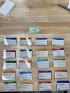
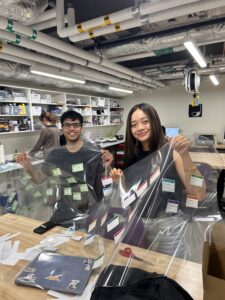
(Upper and Middle Figures: newly designed and laminated topic and user cards; Bottom Figure: team in makery making the ‘Maker’s Minute’)
Playtest 4 (October 8): The Final Hour!
Our final one hour classroom playtest with our peers marked the culmination of the days of development and iterations of our game. Once again, players displayed deep focus and enthusiasm, showing high engagement during drawing and animated gestures during pitching.

(Figure: students deeply engaging with the drawing process, eyes focused on the paper in front of them. )
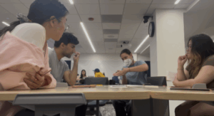
(Figure: player dynamically showing their thought and design process through hand gestures while other players listen attentively)
From this round of student feedback, it was clear that our game had become both enjoyable and intellectually stimulating. However, several new insights emerged. First, players and observers noted the need for more formalized and specific pre- and post-assessments, especially surrounding questions that draws out the details and nuances of a player’s prior knowledge, experience, and thoughts about the game, whether it be through surveys or interviews, so as to measure knowledge gains more reliably. Second, some participants questioned whether the game focused primarily on accessibility awareness, design principles, or both, prompting us to consider ways to integrate design principles more explicitly into the game in our next iteration. Third, it became evident that judges experienced downtime between rounds, so players suggested a a more structured rubric-based system to keep them engaged and learning throughout the session. Finally, participants expressed a desire for more contextual depth about user populations, recommending a combination of quantitative data, such as “1 in 4 adults live with a disability”, and qualitative anecdotes to make users feel more real and grounded.

(Figure: an evolutionary representation of our game card prototypes; final prototype consist of new graphic designs, clearer topics and more specific user populations, more organized format, and lamination for polish)
Next Steps
In response to this feedback, we have implemented these changes to the digital prototypes of our game with several key improvements. In the next round, we added “Design Principle Cards”, where three universal cheat sheet-like design principle cards are placed for players to draw inspiration and guidance from as they approach the drawing phase of the game. Each design principle card will contain a core design principle, and how to apply it in drawing (we also included a quick reminder on the card for players for when they need a quick prompt during the drawing phase). User cards were also enhanced with in the fact section, this time containing one quantitative (i.e educational numerical statistic) and one qualitative (i.e anecdotal story from person impacted by specific accessibility issue) fact related to the user population. Judges are also given a new structured rubric to guide them to more meaningfully assess each design. With the changes, the rulebook was updated to clarify the judge’s role and include the rubric-based evaluation process. It was especially interesting to find out post-playtest in our interview from our players that many drew their own life experiences when designing and pitching their inclusive design products. For instance, one player noted how they knew that “40% of blind ppl don’t use braille”, while another said that in China, “we have a similar system that’s toe activated”. This prompted us to strengthen our pre- and post-interview questions with more questions leaning towards capturing how players prior experiences impacted their experiences during the game as they interacted and played, while investing how their understanding of real-world design shifted as the game progressed.
Sample pre-playtest questions (newest version) include:
- “Can you describe some challenges that are often faced by those who benefit from accessible designs?”
- “Can you please describe your experience with designing products for populations in need of accessibility? Please elaborate on your design background, if any.”
- “On a scale of 1–10, how familiar are you with the challenges faced by a particular disabled community?”
- “Can you name a design product that has significantly improved accessibility?”
Post-game questions (newest version) will assess changes in knowledge and mindset, such as:
- “What new insights did you gain about designing for accessibility after playing this game?”
- “How did the game influence the way you think about inclusive design?”
- “What aspects of the game most helped you think creatively under constraints?”
Collectively, this round of feedback marked a pivotal shift in our game: it evolved from a general exercise in creativity design thinking, to a tool that promotes creativity for social good, encouraging players to design more effectively, empathetically, and inclusively. This iterative process has encouraged us as designers of the game to move forward with greater intention and purpose, as we continue refining how creativity in design thinking can be harnessed to foster more empathy and social impact in the accessibility realm.
“Print at Home” Version of “The Maker’s Minute” (PDF): Final P1 PDF
Playtest (3) video & artifacts: https://drive.google.com/drive/folders/1azagfJGXE3UDmT6SvGU9Gimoa8IUUyoo?usp=sharing

