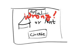
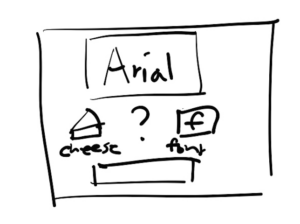
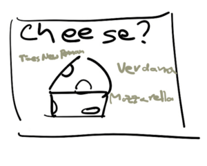
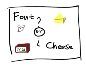
Proximity:
I wanted to separate between the words Cheese and Font in order to show that they are the two contrasting elements that need to be distinguished in this game.
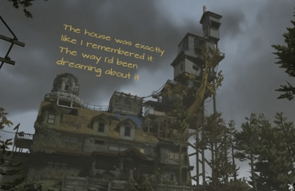
My game and why it’s beautiful.
What remains of Edith Finch is incredibly beautiful and is one of my all time favourites.
The reasons are that:
- The design really emphasises Edith’s grotesque family house where everything takes place.
- The font is reminiscent of a handwriting in her diary, which is the way that this narrative works.
- There is a great contrast between ominous vs. glorious in the scene about Lewis.