

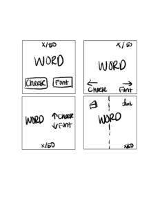
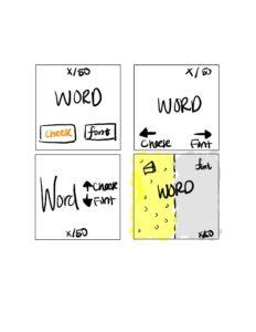
Core Elements:
- Words
- User Input (C or F)
- Result (correct or incorrect)
Supportive Elements:
- Buttons C and F
- Contrast for table
- Timer
Extraneous Elements:
- Unique responses such as: “Oops-a-daisy, it’s a font!” and ” Would you believe me if I told you Kacst is a font? Well, it is.”
- Prev and Next buttons to navigate through the list
- Color of the background
- “Give up” button
- Player statistics
- Share button
- Paid features
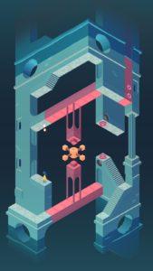
A beautiful game I played is Monument Valley. The aesthetics and colors are very pleasing. Colors are beautifully weaved into the design and gameplay. The goal of the game is to help your characters (mom and daughter) reconnect with each other (physically through a maze) and emotional (through story progression) . The designers artfully uses different shapes and similar colors to create optical illusions. Each chapter also has its own color theme and contributes to the cohesiveness or individuality of each chapter. The colors also become brighter and more saturated as the chapters progress, signaling a climax and maturation of the story development.
The shapes employed are also very simple – mostly squares, triangles and circles. The simple shapes are the basis for the optical illusion. Directions are minimal – distinct shapes and colors designate the end point / exit of each map. Contrast helps draw the foreground from the background and different the moving pieces from the static pieces. The characters’ clothing stay consistent throughout the chapters and create continuity for players.
