

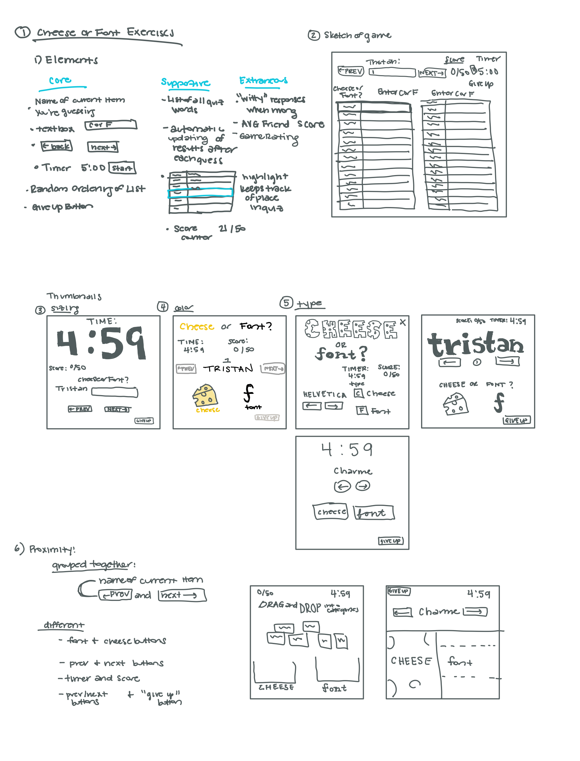
Exercise Responses:
Beautifully Designed Game:
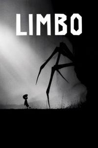
Limbo was I game I played when I was in middle school and I remember the graphic design of the game being hauntingly beautiful. The intentional design choices made in the game gave it a dark and eerie atmosphere. I think the principle best employed here is color and contrast. In terms of color, there is none, which I think is a very bold choice. The game is completely in grey scale which creates the scary and lifeless atmosphere. Most of the game is incredibly dark, the landscape and characters are all black. This makes contrast a key principle that the designers use expertly with their sparse use of light. At times all you can see is the two white dots of the characters eyes, which gives the player a feeling of anxiety as they move around in the dark with no idea what will pop out. The lack of light also allows them to make light a game element that spices up the game play. Sometimes there are only sparse directed sources of light that you have to follow in order to know where to jump, etc. The background graphics notably have a lack of contrast and are incredibly hazy and faded. This portrays a depth and vastness to the landscape that makes the character feel small in this big, scary world. That feeling of being small is also exacerbated by the use of sizing in this game. In terms of screen space the main character is incredibly small in comparison to the rest of the environment and the other monsters. This adds to the scary experience the game creates. The player is made to feel that they are this small, defenseless child left to survive in a vast, terrifying landscape where everything is bigger and badder than they are.
