

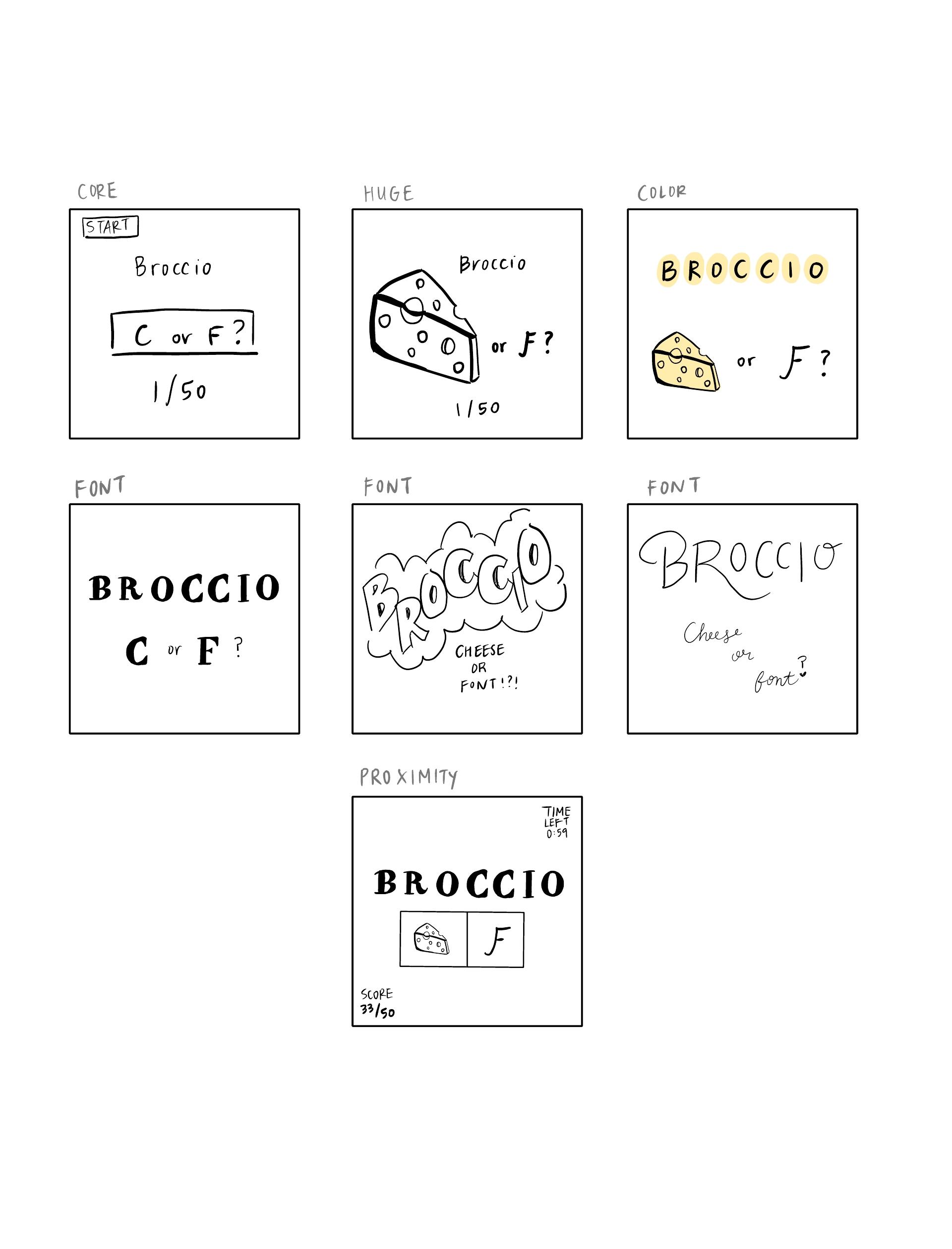
Core
- Title of the game
- Cheese or font name
- Input box in table to enter guess
- Scoreboard
- Start button
Supportive
- The subheader, “Can you name the cheeses and fonts?”
- The “more info” dropdown button with “classic”, “forced order”, and “wrong answers” –> don’t need a legend to tell that answers marked in red in the table were wrong guesses
- Average score among players
- Timer
Extraneous
- Snarky (sometimes funny) comments
- “Correct! Just kidding, it’s a cheese.”
- “I’d give you a second guess, but there are no second guesses. It’s a cheese.”
- Next and previous button
- “Give up” button
- Snarky comments after receiving your score
Cooking Mama: A Beautiful Game
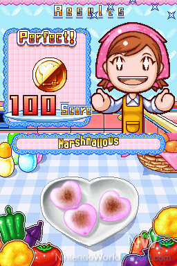
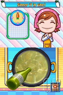
Cooking Mama is a beautiful game. I used to play this game on my Nintendo DS with my brother when we were kids, so it brings back a lot of good memories. Another huge reason why I still remember the game, years later, is because of its incredible graphic design. Cooking Mama has a unique font that you’ll see in the images below — it’s used consistently for giving the user a score upon completing their dish, naming ingredients, and within instructions. Doing so keeps the player focused on the content of the instructions themselves and able to play the game well. The choice of bright and pastel colors is strategic because they’re comforting to look at and encourages the user to keep going even if they make a mistake in their cooking. In the images below, you’ll also notice how expressive Mama is, which is a positive reinforcement to continue mastering new recipes in the cookbook and trying recipes again if the user has scored below what they were aiming for. The game also does a great job in prioritizing the core elements in any given screen (e.g. the pot and wine bottle) so as not to distract from the main event, while still ensuring that supportive elements (e.g. the radish icons next to “Simmer it in wine!” instructions) have a secondary purpose in guiding the player through the game. I also appreciate the level of detail when a user is cooking. For example, the wave marks when pouring the wine into the pot almost make it look like real-life, while staying true to the lighthearted nature of the game. Cooking Mama ensures that the elements that they want the user to pay attention are huge (e.g. the 100/100 score on the left) to keep them engaged and want to come back to play more. Overall, they’ve done an excellent job with designing a game that is lighthearted yet competitive, and detailed yet organized.
(Images sourced from here)
