

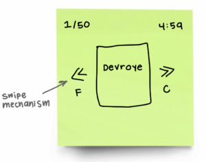
Cheese or Font Elements
Core: critical for gameplay
- Name of font or cheese
- Mechanisms for selecting either font or cheese
- Timer
- Score
Supportive: hints and instructions
- Header: “Cheese or Font?”
- Yellow background color for correct answers
- Punny/sarcastic/funny remarks for incorrect answers
Extraneous: things to remove:
- “PREV” and “NEXT” arrows
- Past and future questions (only focus on one at a time)
Sketches
Core Elements:
Size:
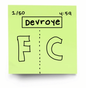
Color:
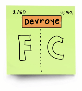
Type:
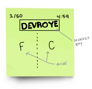
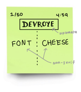
Proximity:
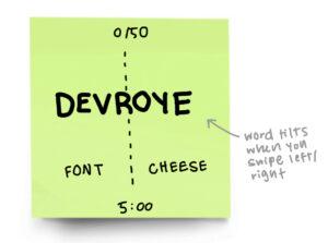
In exploring proximity, I wanted to get rid of the box around the name of the cheese or font to get rid of the separation between that title and the two options. Aside from removing the box, I brought the title closer to the middle to centralize it and de-emphasized the “FONT” and “CHEESE” options. I did so by scaling them down and bring them closer to the bottom. I also aligned the score and timer to the center to create a linear focal point which keeps the user’s eye in the same general area. This helps the user get all the information they need with a simple glance up or down the screen.
Beautiful Game: 2048
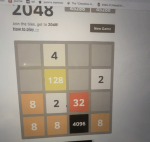
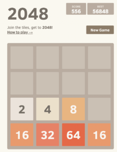
2048 is a game that I play every single day because 1) I have a problem and 2) it is so visually satisfying. 2048 makes use of several graphic design principles to achieve such beauty. The most notable, and obvious, graphic design principle is the use of a 4×4 grid to confine the movement of the tiles. The grid is position in the center and takes up most of the screen real estate which draws our eyes to it. There are no distracting elements outside of the grid that take our focus away from the main part of the game. Within the grid we see even more design principles at play which are alignment and proximity. The tiles are evenly spaced out on all 4 sides and all vertically and horizontally aligned with one another. 2048 also makes a great use of color to denote the different numbers on the tiles by saturating the color more or changing the hue altogether but still making sure it fits in the game’s color palette. These colors make the game feel cohesive. We can see the use of these principles outside of the main grid as well! The “SCORE” and “BEST” tiles are aligned with one another and are featured in boxes that pop in contrast to the light background. The type of the title is perfect because it is simple yet bold but, at the same time, doesn’t distract us from the game. The same goes for the instructions below it.

