

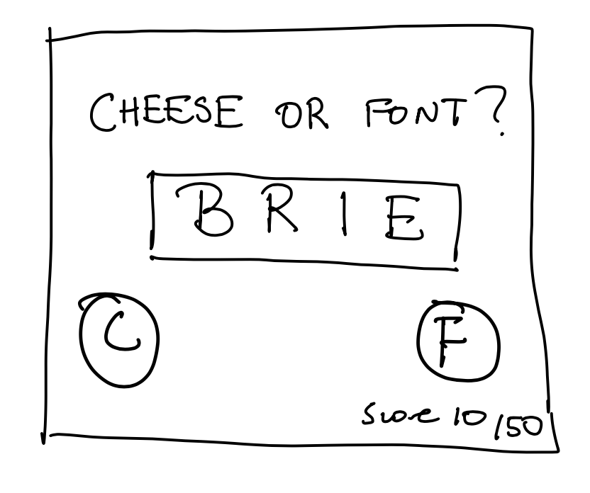
Exercise
- Identify all the elements of Cheese or Font. Label them as core, supportive or extraneous. Core is the parts you need for gameplay, supportive is things like hints and instructions, and extraneous are things you could remove.
- Core
- Selecting cheese or font (“C or “F”) on keyboard
- Score
- Questions
- Supportive
- Demarcation of Correct or Incorrect after answering
- Header
- Subheading: Can you name the cheeses and fonts?
- Grid column headers with instructions
- Extraneous
- Average score
- Timer
- Playlist
- Motivational quote
- Seeing past answers
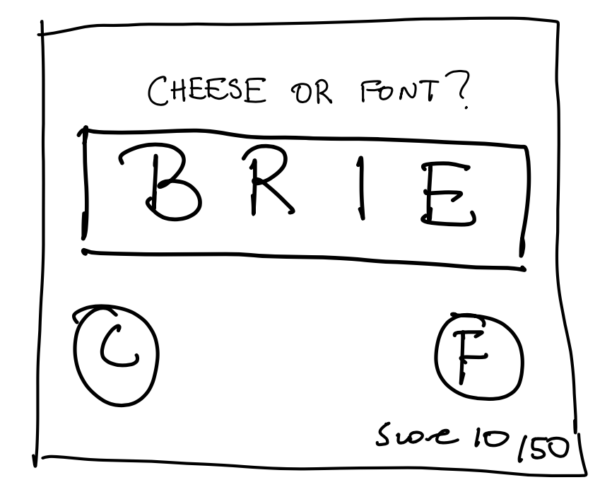
2. Do a quick, small sketch of the game on a small piece of paper. Only use core elements. Small matters, because it constrains your ability to get fiddly. Standard 3×3 or 3×4 is good. If you must draw on an ipad, don’t zoom. Suck it up and stay small.
3. Make one element in a NEW thumbnail sketch HUGE.
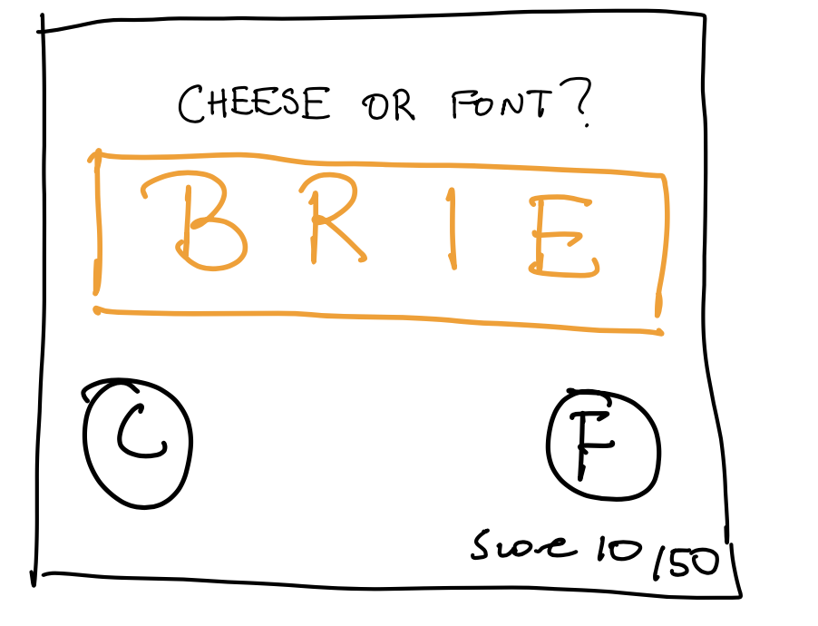
4. Try taking ONE color and using it in your thumbnail sketch along with black.
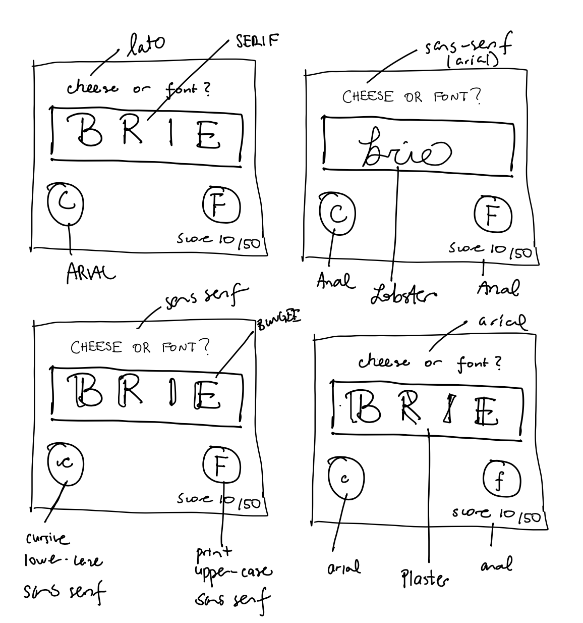
5. Make 3–4 thumbnail drawings that use type in different ways
6. Explore proximity in your design
What should be grouped? What is different, and thus should be separated from gameplay?
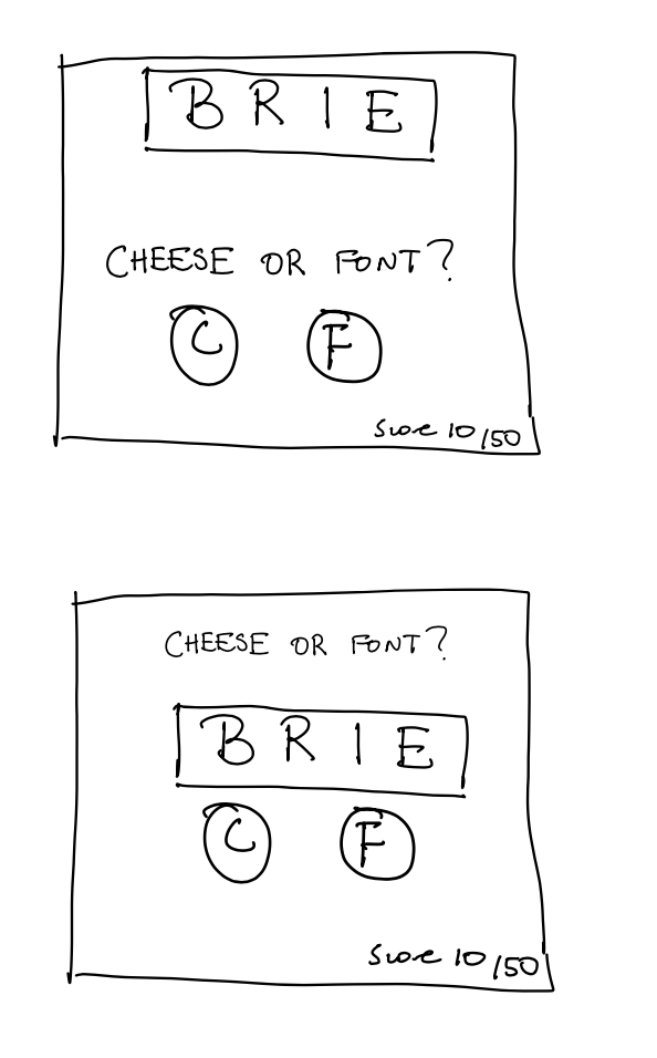
There are two ways I approached proximity. In one iteration, directions should be grouped with buttons because the instructions inform you how to use your buttons. This separation emphasizes the core gameplay which is the question.
In another iteration, the question is grouped with buttons with the header/instruction of “cheese or font” at the top away from the rest of gameplay. The header/instruction is the first thing players see, and thus should be separated from gameplay, and tells them how to play the game (questions and selection buttons).
Beautiful Game Graphic Design Analysis
Pick a game you think is beautiful, take a screenshot and explain what graphic design principle(s) they used to make it great.
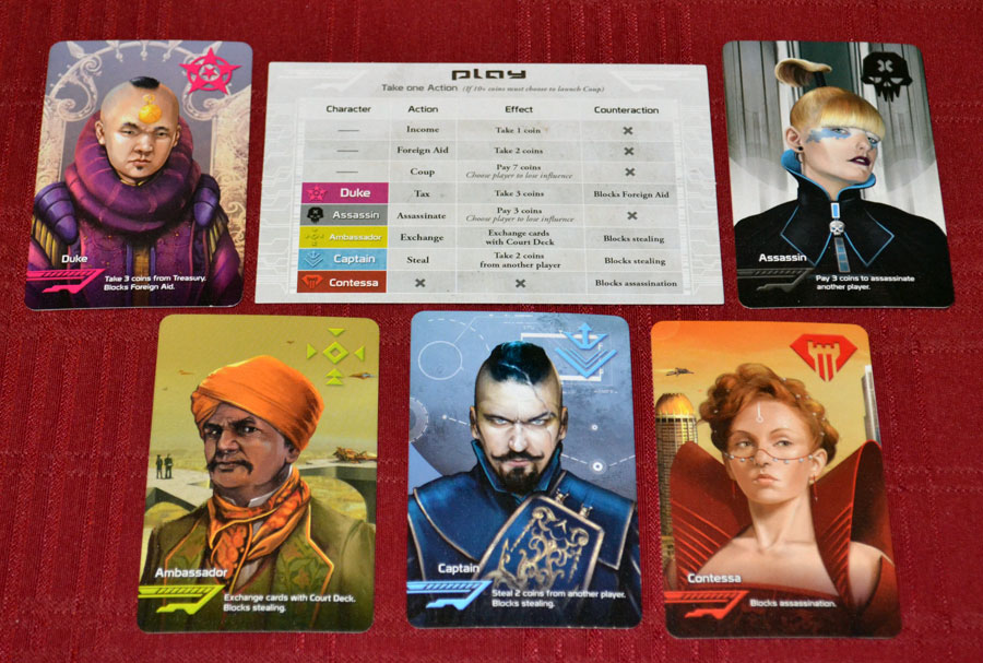
A game I think is designed beautifully is Coup. First off, the individual role cards do a great job of size, color and contrast, and type. The focus of the card is the unique drawing of each role (they take up nearly the entire card) in comparison to the name of the role and its power. This is extremely important because roles create the aesthetic of “narrative” in the game, and these cards reinforce that. The powers/text are also found on the instruction sheet so there is no need to emphasize it on the role card. To reinforce the different roles, each role card has its own unique color scheme. For example, the Contessa is red and orange whereas the Duke is mainly blue. Through color, the graphic designers differentiate different roles which even carries over to the instruction card, making the game easier to understand and follow. Finally, the type used for all game materials is Serif for headers and Sans-Serif for explanations (mainly on the instruction card). This creates a visual hierarchy of the important information to pay attention to when reading the text and makes the design even more cohesive. I truly believe Coup is one of the most pleasing games I’ve had the pleasure of playing because of it’s graphic design. Through graphic design, the game delivers on its aesthetic of “narrative.”
