

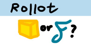
Cheese or Font: Elements
1. Elements
Cheese and Font employs the following elements:
Core
The names of each cheese or font and the ability to input whether something is cheese or font.
Supportive
Score system, revealed answers after answering, and instructions (“Enter C or F” and “Cheese or font?”).
Extraneous
Colors (the orange, yellow, and gray columns), quiz stats (average score and your score), the cute comments, and timer.
However, the timer is debatably core or extraneous element, since one can argue that the core game includes the challenge of answering before the timer runs out (or that the core game is just answering “Cheese or Font?” regardless of time).
2. Thumbnail and Design
Here are 6 layout redesigns of “Cheese or Font?” including the size sketch, one-color sketch, 3 type explorations, and proximity exploration, with usage of size, contrast, type, and proximity. I used “VERDANA” as a placeholder for the mystery text.
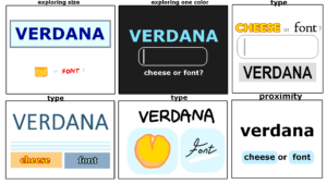
In some thumbnails, size is explored by making “VERDANA” much larger than the other elements.
Notice that proximity is used by grouping buttons together (“cheese or font”), separated with white space from the actual prompt and title. This creates a distinction in type between the different elements in the design, such as prompt (text) and interactable elements (buttons / choices). Thus, you should group elements by what they are and how people should interact with them, and also to place emphasis on certain things.
Omori and Visual Design
Omori makes wonderful use of color, contrast, type and proximity to be thematically consistent in all its design decisions.
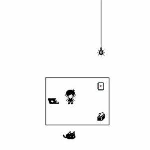
When opening the game, players start in the “White Space”. The room is a small black-lined square bordered by abundant white space, making the player feel small and lonely. With black and white colors, this room gives off serious and mildly depressive vibes, fitting the themes of the game.
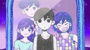
Omori, the black-and-white boy, stands emotionless while his friends surround him in a dreamy purple. Through usage of color and placement of Omori in the center, Omori is clearly different from the rest.
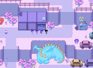
A blissful, neater, and warm dream world shown through many pastel pink hues.
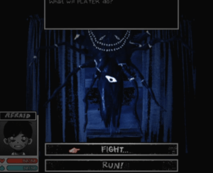
Scrawled font shows the pain from within. The darkness and frantic messiness contrasts with the calmer and happier parts of the game.
In terms of type, the game uses larger font when NPCs shout, and use scrawled font for the more horrorful elements, making players feel scared like Omori, the main character.
In short, Omori is a visually stunning game.
