


Download Print-and-Play Version
Overview
Here is the description from the gamecrafter posting of Sunnyvale, CA, which will be some people’s initial impression of the game:
“You are a resident of idyllic Sunnyvale, California. You care deeply about the housing crisis currently afflicting the state, and strongly support the construction of more affordable housing. You just have some very reasonable concerns about these specific affordable housing projects, at this particular time, in your neighborhood. Luckily, there’s plenty of space in all those other neighborhoods to get these projects built!
This game features a unique anti-space-packing mechanic (think reverse Tetris). Players give Affordable Housing project cards to their opponents as they place concern tokens across a map so as to efficiently block any new housing from being added.”
Sunnyvale, CA is an educational systems game about how NIMBY-ism prevents affordable housing from being constructed by putting the players in the shoes of the worst city for affordable housing: Sunnyvale. (NIMBY: Not-In-My-BackYard)
Each of the three players takes turns playing cards, which primarily consist of affordable housing cards and obstruction cards. The affordable housing cards are projects that you give to neighboring players to build. The obstruction cards allow the player to take actions to prevent projects from being built in their own neighborhood. These cards have often humorous flavor text which are based on real reasons that NIMBYs reject housing projects.
This game was originally the P1 project of myself (Sam Jett), Seamus Allen, Nils Forstall, and Jennifer Lin. Seamus and I decided that we wanted to revisit this game for our P4, as we saw a lot of potential in improving the visuals of the game. We had built a very fun systems game but had not put a lot of time into making the graphics professional quality. It would be really awesome, we thought, to have a game that was of publishable quality at the end of this class. Thankfully, Houston and Shirley were interested in working on the game as well and stepped up to help with the visual design.
P1 Sunnyvale had excellent mechanics and fun dynamics, with the learning outcome already present. The part of MDAO that we needed to tackle in the P4 iteration of Sunnyvale was aesthetics, to make sure the experience is communicated to the player upon their first impression of the game (especially important for potential buyers of the physical copy we released).
History of Versions of the Game, Photos of Design Iterations
Our P1 final-submission version of the game was complete in terms of the gameplay and mechanics, but had room for improvement in the visual design. We had made a fun game which educated players on housing projects and NIMBY-ism, which was the goal at the time. Although we made a lot of changes to the visuals over iterations, we did not spend a lot of time ensuring it was self-consistent, and we definitely did not have a box design. Jennifer made wonderful wooden tokens for our final polish, but our last playtest in P1 (pictured) still used components from other games (tokens from Cascadia and card bases from our Magic decks).
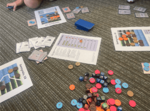
This was a lot more developed than our initial playtest which was done on a miniature whiteboard with markers and hand-written cards.
Some things that we determined needed help were:
- The cards looked really nice but were a little difficult to read. Also the “Housing Crisis Worsens” cards were not really matching the rest of the design.
- The player boards did not look quite right, and based on feedback this seemed to be because of the side-view as opposed to a top-down view which is what one would expect in a map-type game.
- Our physical tokens were not fully developed and we needed tokens that matched the symbols to make the gameplay smoother. During playtesting players would have to stop to determine what color to use after another color ran out.
Some new things that we knew we needed to make were:
- Box. We did not have any box design for P1.
- Card backs. Since we used Magic decks as our base, the backs for the P1 cards were just our sleeves.
- Something besides 8 ½ by 11 printouts of the boards, i.e. something more professional.
- An online listing which we can direct people to so they can purchase the game.
One of the first things that we got in the new artstyle was the first iteration of the box from Shirley.
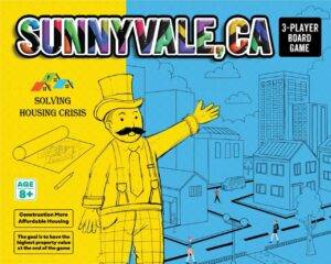
The style is very much in the right direction for what we were striving to convey with the game: residents of Sunnyvale are content with the town they have with their homes and tech offices. They have their utopia, why change anything by bringing in more residents and lowering property values?
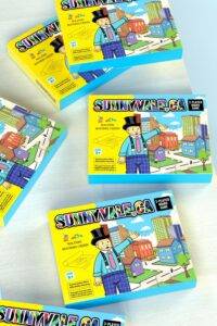
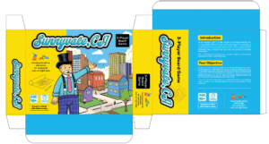
We fiddled with the box design quite a bit to get things right. We wanted things which looked like a proper off-the-shelf game but also were within our time/ability scope to make.
We messed with fonts as well as contents and placements of text to make things readable and nicely presented.
It was tricky to find a font that wasn’t too busy, looked good, and was easily legible. The original font, while good, was difficult to read (the “unnyv” portion of the word was very self-similar) and a little busy with the three different colors.
We also considered a wooden Sunnyvale logo, but determined that it would not be a good idea to convey the idea of construction in the game to the player, since the point of the game is that affordable housing projects aren’t being built. It would be odd for this to be the case while the primary logo of the game invokes construction vibes.
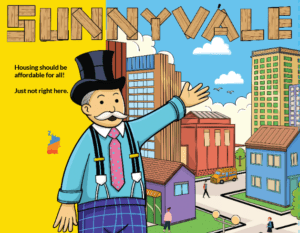
Here is the final version that we settled on:

Houston worked on getting good board designs.
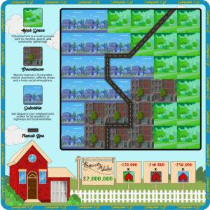
The style was already matching our box design, we only had to make a few tweaks to get it just right. We had to make sure the fonts amongst all the components were consistent, and we had to make sure the components had tolerance for the manufacturing process (cutting boards and cards has an error range of about ⅛ inch). This meant we had to remove the Sunnyvale logos from the edges. Another change we made was to make the transit line more clearly indicative of public transit, so the road was replaced with a solid line. I also at first neglected to mention the feedback which we had received on our board square design. Houston fixed these things in the second iteration of the board. Here is the final version:
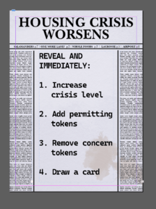
The Housing Crisis board also went through a few minor changes since it is essentially all text, and we ultimately ended up on a pretty effective component:
![]()
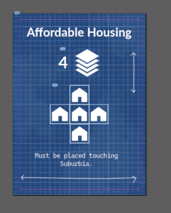
Next, Seamus introduced the new card design for obstruction cards (previously known as concern cards and activism cards)

We put a lot of effort into getting good-looking cards, since players will be spending a lot of time looking at their hands. After a lot of designing one evening, we came up with several good designs for the different types of cards, each of which are interesting to look at but also convey their critical information to the players. We also updated some of the flavor text so there is more variety in cards that do similar things. A keen eye will notice that we slightly updated the icons for housing, permitting, and concern blocks. Some of the open-source SVGs from the original version were not in fact SVGs and had to be redrawn. They are also more in-style with the current version of the game and easier to read.

We had to spend some time considering what to put on the backs of the cards. We considered the Sunnyvale logo, the wealthy landowner man from the box, as well as a scene of the city from the box (tech offices, homes, stores).


We considered also the district image from the front of the box, but ended up going with the town image seen above.
In the design process, we tried to stick to some key design principles:
- consistency
- recognition rather than recall
- aesthetic and minimalist design
Consistency amongst components was already mentioned. It makes sense to have components of one game look similar to each other. Symbols should be recognizable (e.g. tokens should clearly represent their things). We tried to stick to an aesthetic and minimalist design which also reflected the aesthetics of what we wanted the game to invoke.
We also kept game-publishing and packaging concepts from lecture in mind when working on this. This included things such as clearly and accurately communicating what the game is about, communicating critical information about the game (age, time, number of players) to a potential buyer, and the box itself having good style and being interesting. Oddly some of these things were missing from our P1 version of the game, such as the number of players. The age range was also not in P1, but it was assumed at the time that the target audience would be college students or other adults.
Overall, the resulting game is an aesthetically-pleasing game which accomplishes learning objectives through fun mechanics, humorous flavor, and interesting dynamics. Each member of the P1 and P4 teams contributed amazingly to make this game as great as it is.
Credits
Sunnyvale, CA was made by: Seamus Allen, Nils Forstall, Samuel Jett, Jennifer Lin, Houston Taylor, and Shirley Wei.
Content in the final version of Sunnyvale, CA was either created by our designers or is public/allowed for commercial use.
Thanks to all students in 377G and outside of class who helped us by playtesting!
Thanks to Amy and Christina for being awesome throughout the class and for providing feedback in the process of making Sunnyvale!