

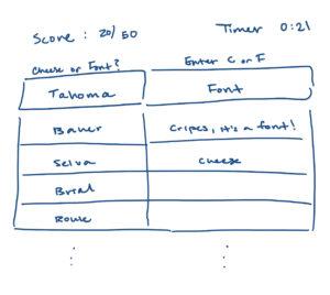
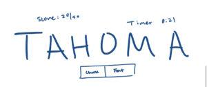
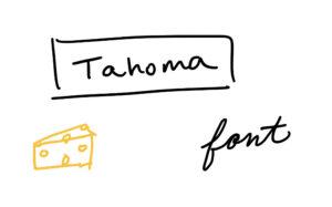
Elements (core):
- Name of cheese or font
- Space/way to guess whether the name is a cheese or a font
- Time
- Score
Elements (support):
- Start button
- Replay
- Next quiz
- Playlist
- Quiz stats
- Challenge friends
- Random quiz
Core elements sketch:
One element HUGE:
Black + One Color:
4 thumbnail drawings:
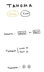
Proximity in design:
I used a few different layouts to play around with proximity in the designs. The first used the proximity between the circular buttons to each other to show them as alternatives and then to the name above it to show that it’s a choice for the name above it. For the next three thumbnails, I used some form of visual cue to show that the options are for the name by using either a : or a |. This addition of the visual cue immediately creates a level of proximity between the choices and the name. The second and fourth thumbnails follow a one line format whereas the first and third follow a more grid like format with a y axis involved. In the first example, the different coloration of the buttons goes to highlight the difference in the choices by color but not by size or style of design, whereas the other thumbnails’ options are both very similar to show that they are the same as options. But, they are distinct as units to show that they are different options to one another.
Walkr:
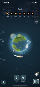
The game that I chose is a mobile game called Walkr. The premise is that walking steps are converted into tokens that can be used to purchase new planet which produce goods that you can use to build things. The game design is done very well and the artwork is very meticulous and cutely done. Each planet that you can buy/discover is unique and has a feature of the planet that is highlighted. For example, there’s a smoothie planet that looks like a large smoothie and a panda planet with a large panda. You have a little rocket ship that signifies the player that circles the planets and moves through the planets as you swipe through them. The design is very cute and uses great proximity. The planet and its elements are all within the circle of the planet and the rocket orbits it to show that you are there. You can see the next planet in the background, slightly grayed out so that when you swipe to the next planet, it’s brought into focus in the middle of the screen. Each of the planets use different graphic design principles and usually have a mix of them. For example, contrast is used to highlight specific features of the planet and usually a single object is made very large in a way that doesn’t represent real scale on a planet but allows for the main point to come across. In this way both contrast and size are used. Color is also used very well in the game design. The outer space world is a nice dark blue that allows for everything else to contrast well against, and the planets each have a set of complementary colors that are based on the name of the planet.

