Graphic Design Exercises
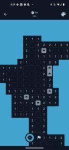
Minesweeper Design
I like this modern/minimalist version of minesweeper primarily because of the color choices. I like that the scheme is very saturated but not too vibrant — it feels very sleek and moody. There also is very strong contrast between the unexplored map and the revealed squares so your progress through the game is very evident. Its really rewarding at the end of the game when they animate all the moves you’ve made and you see the grill fill up.