

Short exercise_ visual design of games
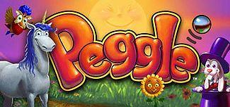
An underrated game I think is beautiful is Peggle. I played Peggle when I growing up on xbox 360. It’s one of those brick breaker games that came free with an xbox live subscription, so I had to give it a try. I remember playing for hours, even with friends. The gameplay is somewhat addictive (the creators basically were riding the “in app purchase wave” before that was really a big thing), but what stood out to me was how well crafted its visual design was. The typography is really friendly and inviting, nothing screams or yells at you. When you get certain combos, brightly colored bubble letter text will pop out at the screen and it gives off a very supportive and nurturing vibe.
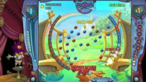
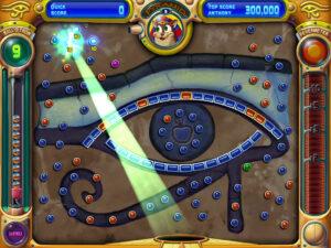
Peggle also uses proximity well. Since this is a kids game, it should be pretty intuitive to know how well you’re doing or how much time you have left. Therefore, they cluster all the game statistics towards the top and put them outside of the main gameplay area. These vital stats are large, super easy to read, but fortunately not too distracting as to take away from the main gameplay. Of course, color is used very well too. They use bright and neon colors to pop out at the user. Colors are also coordinated throughout the game, so all the balls and bricks that are red are the same amount of points, all the balls and bricks that are blue are the same amount of points, and so on…
Overall, Peggle is a well designed game with very intuitive but well thought out typography, proximity, and color.

