

Elements of cheese or font:
Procedures (core):
The player being presented with a series of words, and they must correctly guess whether each word is the name of a type of cheese or a type of font. The player selects their answer by typing “c” for cheese and “f” for font.
Rules (core):
The player must correctly guess whether each word is a type of cheese or font. They are not penalized for guessing incorrectly, but they will not receive points for that round.
Resources (core): the words presented to the player. These words are randomly generated and pulled from a pool of cheese and font names.
Boundaries (supportive):
The boundaries in Cheese or Font are limited to the game screen. The player cannot interact with anything outside of the game screen. Additionally, the player is limited to guessing whether the presented word is a cheese or font, and cannot input any other information.
Objective (core):
The objective of Cheese or Font is to correctly guess whether each presented word is a type of cheese or font. The game does not have any levels or other objectives beyond this.
Outcome (supportive):
The outcome of Cheese or Font is determined by the player’s score. The player receives one point for each correct guess, and the game ends when all the words have been presented. The player’s final score is displayed on the game screen.
EXERCISE:
(https://mechanicsofmagic.com/wp-content/uploads/2023/04/Note-Apr-19-2023.pdf)
To apply the principle of proximity, we should consider grouping related elements in close proximity to one another. This helps to create a clear visual hierarchy, with the most important elements taking priority in terms of size and placement.
Other design elements, such as menus, buttons, and instructions, should be separated from the gameplay elements to avoid confusion. By separating these elements from the gameplay, players can focus their attention on the task at hand without being distracted by unrelated information.
Elements that are too close together can create visual clutter, while elements that are too far apart can make it difficult for players to understand how they are related. By finding the right balance between proximity and spacing, designers can create a design that is both visually appealing and easy to use.
Game: Plant vs Zombie
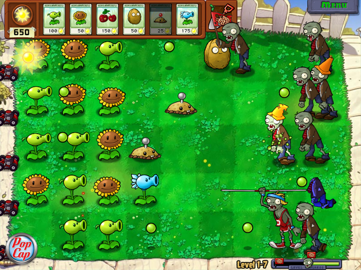
They use the following principles:
- Color Theory: The use of vibrant and contrasting colors helps to create a visually stimulating and attention-grabbing game that is both enjoyable and easy to navigate.
- Balance and Hierarchy: The game’s user interface is designed to prioritize important information such as the number of suns available or the health of the plants, creating a clear hierarchy that guides the player’s attention.
- Consistency: The game’s visual style is consistent throughout, using the same color palette, typography, and character design to create a cohesive and recognizable brand.
- Contrast: The use of contrast between light and dark elements, as well as between large and small elements, helps to create depth and visual interest within the game.
- Proximity: Related elements within the game, such as the plants or zombies, are grouped together visually to help the player easily understand their relationships and interactions.
- Alignment: The game’s user interface is carefully aligned and structured to create a clear visual hierarchy and aid the player’s navigation.

