

Graphic design for game designers
A game that I find to be very visually nice is Two Dots.
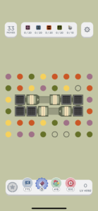
This is a screenshot of the game when a level is being played.
One feature that they use strongly is alignment and proximity. They split the screen into 3 main rows. The top row shows how to beat the level, including information about the number of moves and the goals for the level. The middle row is the largest, which includes the actual area in which the gameplay occurs. The bottom row shows more extraneous information that the player does not necessarily need to see prominently or use during regular gameplay, including power ups and the score. They further utilize alignment by using white rectangles within the top and bottom rows to denote individual groups within the larger row. This separation also demonstrates very clear use of a grid.
Another feature that they use is typography. The game is largely visual and relies on matching things of the same color. Therefore, the text on the screen is not that important in the gameplay, which the designers capitalize on by keeping all of the font fairly small and simple so as to not distract from the other visual elements of the game. The only information that is largely important to gameplay is the amount of moves that the player has, so that is displayed in larger text in the top corner to draw the users attention. It is a fairly simple and colorless font though, so it still does not distract from the visuals though it is larger than other text.

