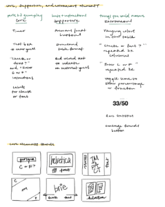
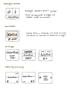
Below are some notes exploring the visual design of games through identifying core visual design elements in the game cheese or font.
We can apply these design principles to the popular game Everdell by game designer James Wilson.

The game’s design works well in a few different ways.
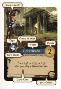
To begin with, there’s a sense of visual hierarchy with the playing cards, with numbered point tokens colored brightly to stick out from the rest of each card, and each playing card’s label colored differently.
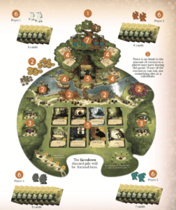
Despite being visually “busy” complete with illustrations and natural pieces that tie in to the game’s nature theme, the game manages to utilize negative space to display information on the playing cards and board, utilizing both color and contrast and negative space to accomplish this task.
Additionally, the cards utilize typography with a heading labeling the cards “Post Office,” “Fairgrounds,” “Monk,” etc. and utilizing a more readable font from the same family to make the card more reader-friendly for the rest of the card.
The effect is a game that flows organically, and this hybrid organic-digital environment constitutes the games I love most, which is why Everdell sticks out as a particularly well-designed game to me.

