

Design is a very ancient practice, but graphic design really found its core principles post World War One. Games are also very ancient but video games are still finding their feet. I think graphic design has a few things to teach people who make games, so here are the big concepts every graphic designer learns. You should learn them too!
First, studying graphic design is about building the skill to see things other people just accept. More importantly, it’s learning to see and name things ordinary people just are annoyed or repulsed by but can’t say why. You can’t just read about it, you have to look at many examples and practice making them. Over time your eye and hand become smarter.
Good graphic design makes games more trusted (increase sales) and more pleasurable to play (NPS) and when done right, fades into the background so players can focus on the game (higher DAU/MAU.)
This essay has instruction and exercises. We’ll be working with this game, Cheese or Font. It could use the help. Before you read on, please do two small exercises.
- Identify all the elements of Cheese or Font. Label them as core, supportive or extraneous. Core is the parts you need for gameplay, supportive is things like hints and instructions, and extraneous are things you could remove.
- Do a quick, small sketch of the game on a small piece of paper. Only use core elements. Small matters, because it constrains your ability to get fiddly. Standard 3×3 or 3×4 is good. If you must draw on an ipad, don’t zoom. Suck it up and stay small.
In this video, I am only focusing on the most core to the game (it was made quickly so I hyper-simplified. You can use more core elements.)
In design, this is called a thumbnail sketch (they can be even smaller!) It’s a way to quickly explore different layouts.

Come up with at least six more ways to arrange the most important elements. Read though the below to get ideas of more ways to redesign Cheese or Font. I’ve already used at least one technique in my short example!
Start with Visual Hierarchy
The Law of the Conservation of Complexity (sometimes called Tesler’s law) states that “for any system there is a certain amount of complexity which cannot be reduced” only moved to the user or the designer. It is the designer’s job to make the complex clear for users and players.
The designer must communicate what is most important in a design so that a player doesn’t have to think about anything but playing well. Visual hierarchy is a way to do that. Untrained designers tend to make things just look bigger, and graphic designers learn there are many ways to do this.
Size
But let’s look at size. Don’t just make things bigger, make some things smaller also. When one elements changes, everything else should be reconsidered.
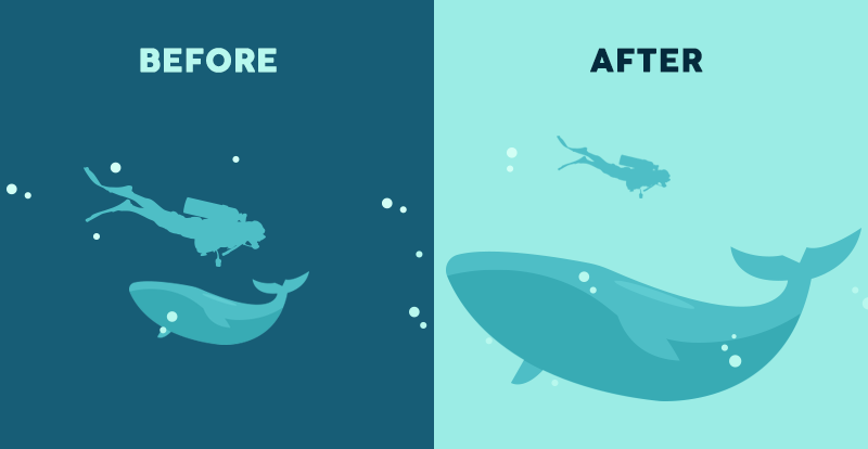
How would the above look if the diver was huge and the whale tiny? Would it tell a different story?
EXERCISE: Make one element in a NEW thumbnail sketch HUGE. What else do you want to change? What can get smaller?
Color and Contrast
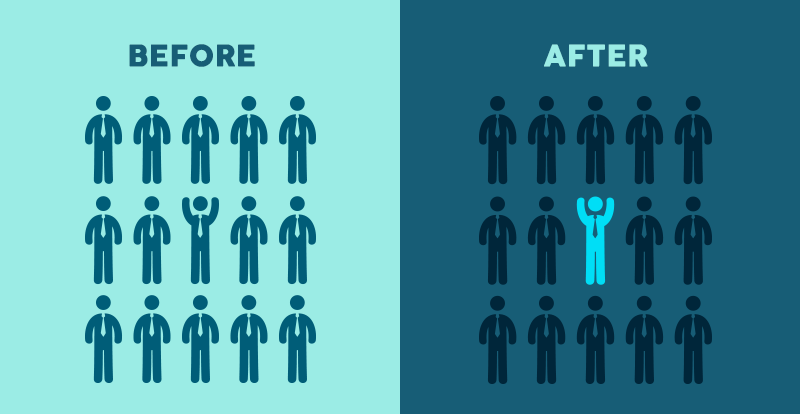
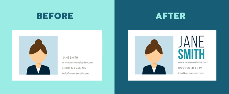
You may have noticed in the above image that the happy little guy is now a lighter blue. Did you also notice that by changing the background color to a dark blue and making the sad men a darker shade they fade into the background? This an example of what I mean when I say, if you change one thing, you have ot reconsider everything. It’s not enough to just change the happy blue man, though that does work (look at the photo below!)
Designs get better when you combine the elements in this essay.
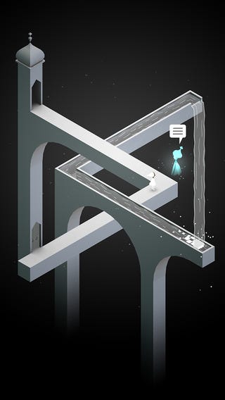
Below we see it in practice in Monument Valley, widely thought to be a truly beautifully designed game. Our protagonist almost disappears into the gray-scale, but the blue pops in a black and white world, despite being a light blue. As well the flat white of the word balloon, along with it having the only horizontal lines helps draw the eye to dialog.
EXERCISE: Try taking ONE color and using it in your thumbnail sketch along with black. You can also use gray and white, if you have the tools.
Typography
Speaking of blending techniques, type is never just type. There is the font choice, but also the weight, size and alignment that shapes a successful design.
So what do you need to know about fonts?
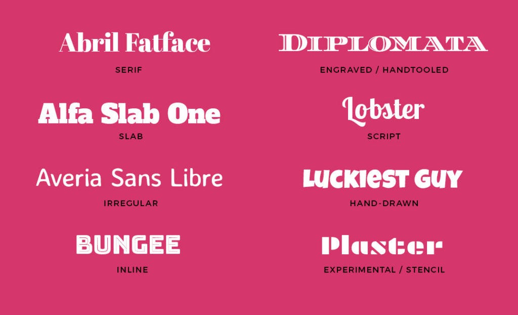
Display Fonts: usually elaborate and often hard to read, they are best reserved for headlines or logos. Learn more Typography series: What is a Display font? Do NOT use them for body text or interface text; they will be miserable to read.
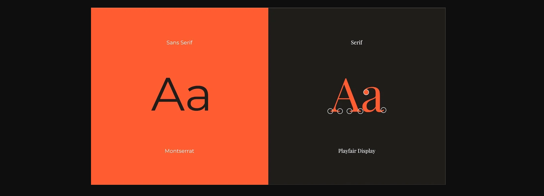
Pairing fonts: One trick I lean on is pairing a serif and a sans-serf. You are actually experiencing now; Medium.com uses serif for the body text and sans-serif for the headers. Serif has those little decorative elements you see below.
Be careful in pairing fonts! They can clash like a plaid suit with a flower pattern shirt (also, please don’t wear a plaid suit.) Good rules of thumb
- Chose two fonts in the same font-family.
- Pick a serif and a sans-serif
- Big personality for headlines, subtle for body text (or interface)
Always consider size when picking fonts. If it’s going to be tiny type in a HUD, make sure the font has been designed for readability at small sizes (like Verdana.)
One game that is spectacular in its font use is Device 6. Fonts can convey mood and set you in a place and time, as fonts change with fashion.
To learn how to pair fonts, play this game. It’s so fun! (at least for me.)
Please watch We Use Way Too Many Fonts. There is a comfortable power that you can enjoy (as well as working faster) once you find font pairings that make sense to you. Then you can spend your time on creative type uses.
EXERCISE: Make 3–4 thumbnail drawings that use type. Make it less about choosing a font and more about size, positioning and contrast. Typefaces will be important when you move to digital styletiles.
Alignment and Proximity
Take a little time to look at this image.
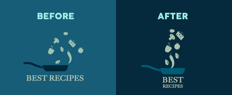
You notice the ingredients are now aligned. But the type below the pan is also. Alignment not only organizes the page, it also leads the eye.
Most design work uses grids to align elements effectively. Designing with grids is a huge topic, so I’ll just make a nod to them here, and say that they are a thing. An important thing.
Grid tl;dr
Use grids. Turn on the grid in your designing software and/or use grid paper to sketch on. You can also make your own grids with a pencil and a ruler (or side of a book). Align objects up to the edge, when you turn off the grid it will look <kissing fingers gesture.> You can do a lot with a grid.
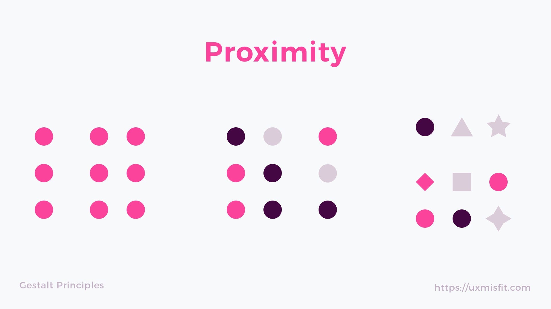
Ok, so what about proximity? Gestalt principles(from gestalt psychology) state we assume things are part of a group when the are close to each other, and different when they are separated by space.
Looking at the image below, we assume the group on the left is one group, and the group on the right is actually made up of 3 groups. Now look at them for a bit longer. The bigger spacing between the left and the right makes one think one is seeing two examples… proximity and distance is a powerful way to message what goes together.

Even when the objects are very different, (see below) we assume they belong together because of the visual grouping.
One of the single biggest mistakes young designers do is put buttons too far apart from the object they are effecting.
EXERCISE: explore proximity in your design. What should be grouped? What is different, and thus should be separated from gameplay?
Finally
I have come over the years to believe one of the most important rules is
“Same things should look exactly the same, different things should look very different.” Christina Wodtke
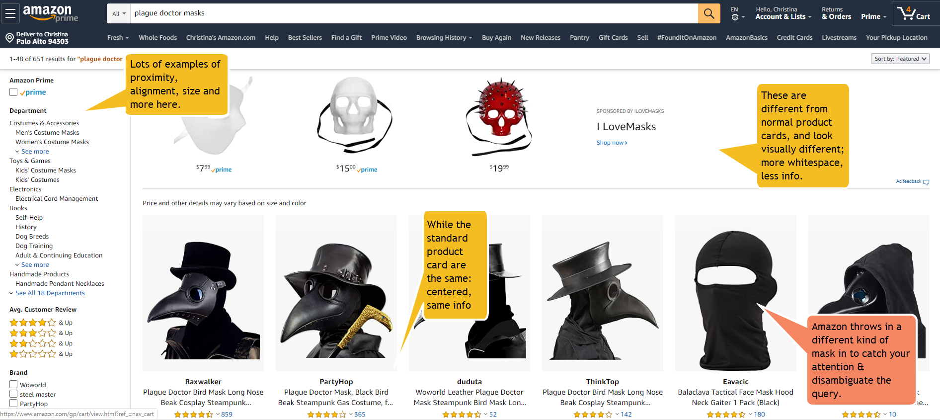
Amazon is not gorgeous, but they do know how to use visual design principles to communicate effectively.
When you’ve finished your thumbnails, go look at the Kerning game and see the choices they made. It’s deliciously designed!
Learn More
GDC talk on negative space, a gestalt theory graphic design principle
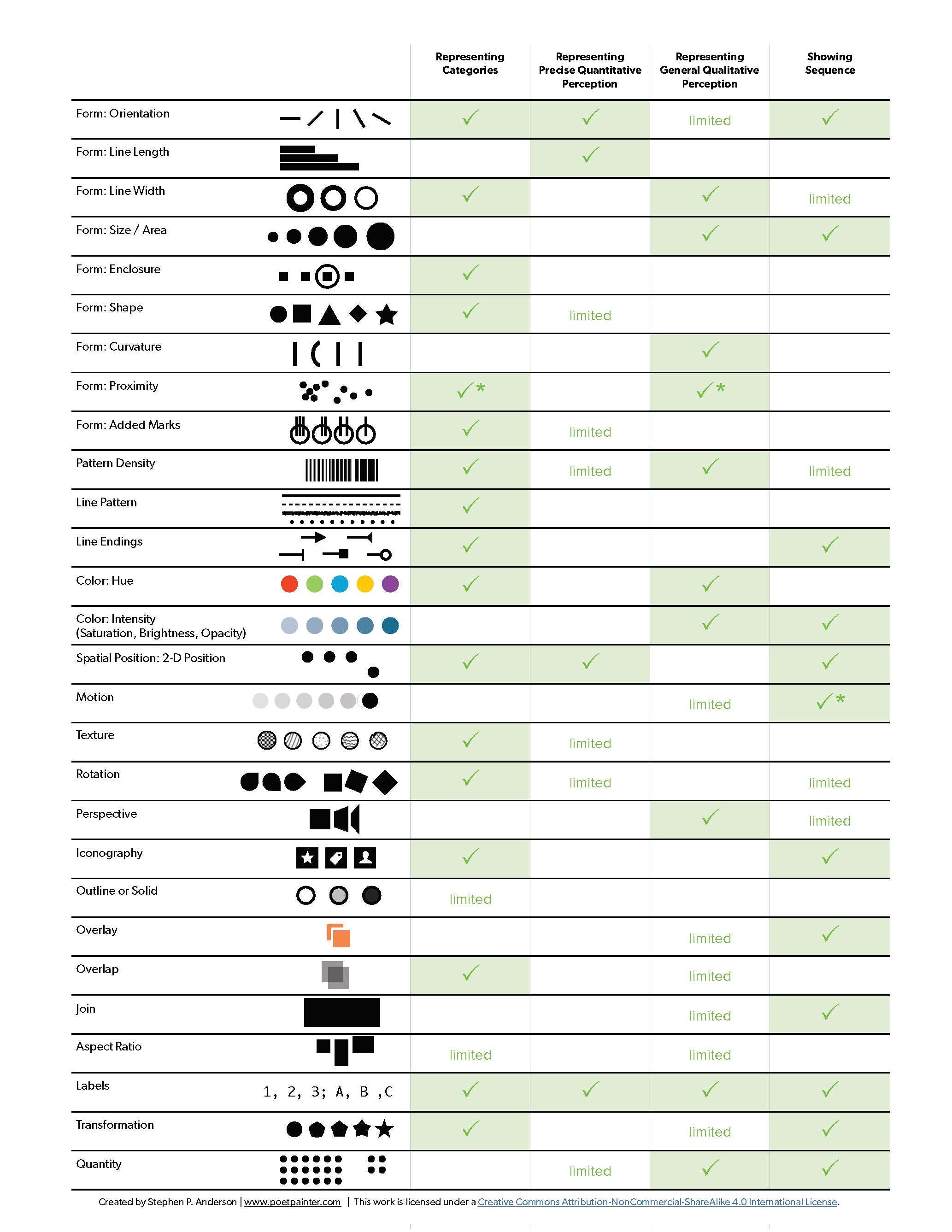
More way to differentiate from the delightful Stephen P. Anderson
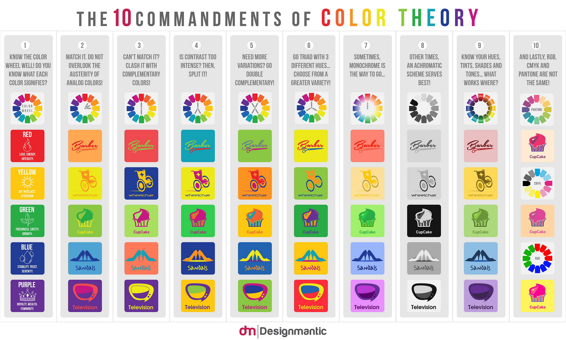
And from Designmantic
(these are like Pirate rules; they are really more a suggestion)
https://mechanicsofmagic.com/2022/03/04/graphic-design-for-game-designers-3/
https://mechanicsofmagic.com/2022/03/06/cheese-or-font-thumbnails/
https://mechanicsofmagic.com/2022/03/06/graphic-design-cheese-or-font/
https://mechanicsofmagic.com/2022/03/06/graphic-design-for-game-designers-4/
https://mechanicsofmagic.com/2022/03/15/graphic-design-reading-cheese-or-font-vicky/
https://mechanicsofmagic.com/2022/03/15/cheese-or-font-thumbnails-by-cynthia/
https://mechanicsofmagic.com/2021/04/21/visual-design-of…t-typeconnection/
https://mechanicsofmagic.com/2021/04/21/visual-design-of-games-cheese-or-font-typeconnection/
https://mechanicsofmagic.com/2022/03/17/rachel-naidich-graphic-design-for-game-designers/
https://mechanicsofmagic.com/2022/03/17/graphic-design-for-game-designers-5/
https://mechanicsofmagic.com/2022/03/17/exercise-graphic…-for-game-design/
https://mechanicsofmagic.com/2022/03/18/graphic-design-for-game-designers-6/
https://mechanicsofmagic.com/2022/09/24/graphic-design-for-game-designers-8/