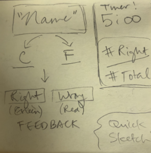
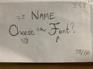
Following the exercises explained here, I sought to draw sketches of Cheese or Font by hand!
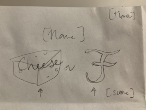
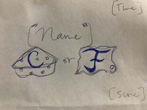
Elements of Cheese or Font
- Core: names of cheeses or fonts (e.g. Mascares)
- Core: input field, either C” or “F”
- Core: timer (introduces risk / scoring)
- Core: red / green feedback
- Supportive: game instructions and introduction
- Extraneous: table row/column format
- Extraneous: yellow header, light green input field
Core Elements Sketches
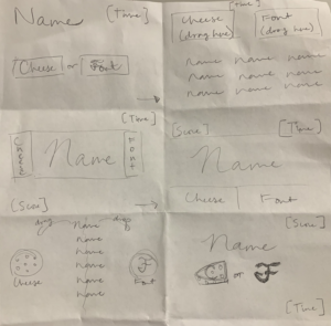
Extra-Huge Element Sketch
One-Color + Black Sketch
Three Typed Sketches
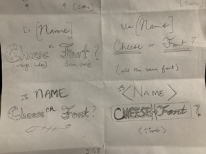
Proximity of the Elements
Visual Design of a Game Analysis
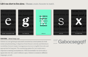
Springing from Christina’s article, I checked out TypeConnection, a “typographic dating game” that creates a backstory and personality (based on historical roots) for a main character font, and then asks you to find this font’s perfect match! Though the game is built with basic web app elements such as boxed divs, headers, and text boxes, this streamlined presentation emphasizes the inherent beauty of the typographic font, which indeed is the star of this “dating game.” The eye is first drawn to the five boxes spaced evenly in a row and grouped together by proximity, and each individual box has a large letter in the selected font against a dark background with high contrast. When you hover over a box, the div transforms into teal (also a cool shade that is complementary with the yellow-white parchment and black) with a written “statement” from the font, in the font, such as “I am a structural engineer who dreams in grid formation.”
Each font has its own attributes which further lends itself to the overall design of the page; 1) Adobe Garamond Pro’s “e” is firm, lean, and multi-purpose, 2) ITC Century’s “g” is a modern serif revival with newspaper leanings, 3) Univer’s “k” is simple with linear direct letter tails, 4) Archer’s “s” presents gentle curves and bouncy tips, and 5) ITC Stone Sans’s “x” is reminiscent of brushstroke and an energetic pop. While the “beauty of language” in English class would be discussed in terms of the form and meaning of the words, I find beauty here in the distinctiveness of each font and how each has their own “character” traits and appearances suited to their trade, whether artist or engineer.