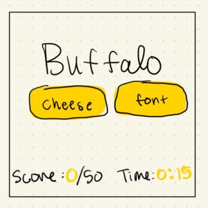
Cheese or Font?
Elements of Cheese or Font?
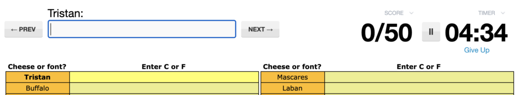
The core elements of the game include:
- Text box for answers
- User’s score
- Timer
- Prompt (“Tristan” in the image above)
- Give up, previous, next buttons
- Replay button, after finishing
The supportive elements include:
- Explanations when the answer is incorrect
- How to play explanation
The extraneous elements include:
- Commenting on the final score
- Jokes about cheese and font that are discoverable when incorrect
- Related games
Sketching Core Elements
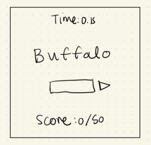
Size
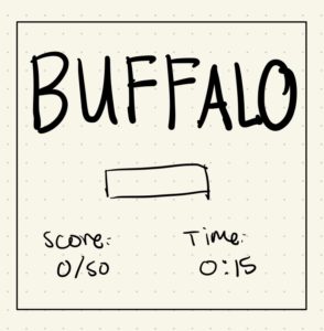
Color and Contrast
Typography
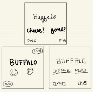
Proximity
I grouped Cheese and Font together because they are related ideas, buttons where the user clicks one of the two. The other elements have more flexible relatedness so I played around with whether score and timer stand together for clarity or apart to give a less crowded feel. I left the cheese and font buttons near the prompt, Buffalo, so that it was clear that they were referring to that specific text.
Visual Analysis of Mario 3D World

I really enjoy the look of Mario 3D world because for me, “cuteness” is an essential factor I look for in the aesthetics of games. I love the color choices in Mario, they opt for really bright colors and contrasts that give a warm feel to the overall game. Often, they use size and proximity to indicate to the user where their character can go. For instance, The tree in the back of the image above is so far in the background, the user can assume that that area is off-limits. This makes the game more straightforward and provides clarity without needing to explicit instructions.