One game that I think is beautiful is a mobile app called True Surf. The concept isn’t anything crazy –– the game itself is nothing but a surfing simulator. You tap on a wave to start surfing, and then you can control the character by sliding your fingers to maneuver around the wave. There is a chance of wiping out, and you get a score once you’ve either wiped out or ridden a wave to completion. To be completely honest, I don’t actually find the gameplay that enjoyable. However, what brings me back to this game is its simplicity and beauty. First, let’s look at the home page of the app. Instead of showing something like a home page, it immediately displays the most important part of the game: the ocean.
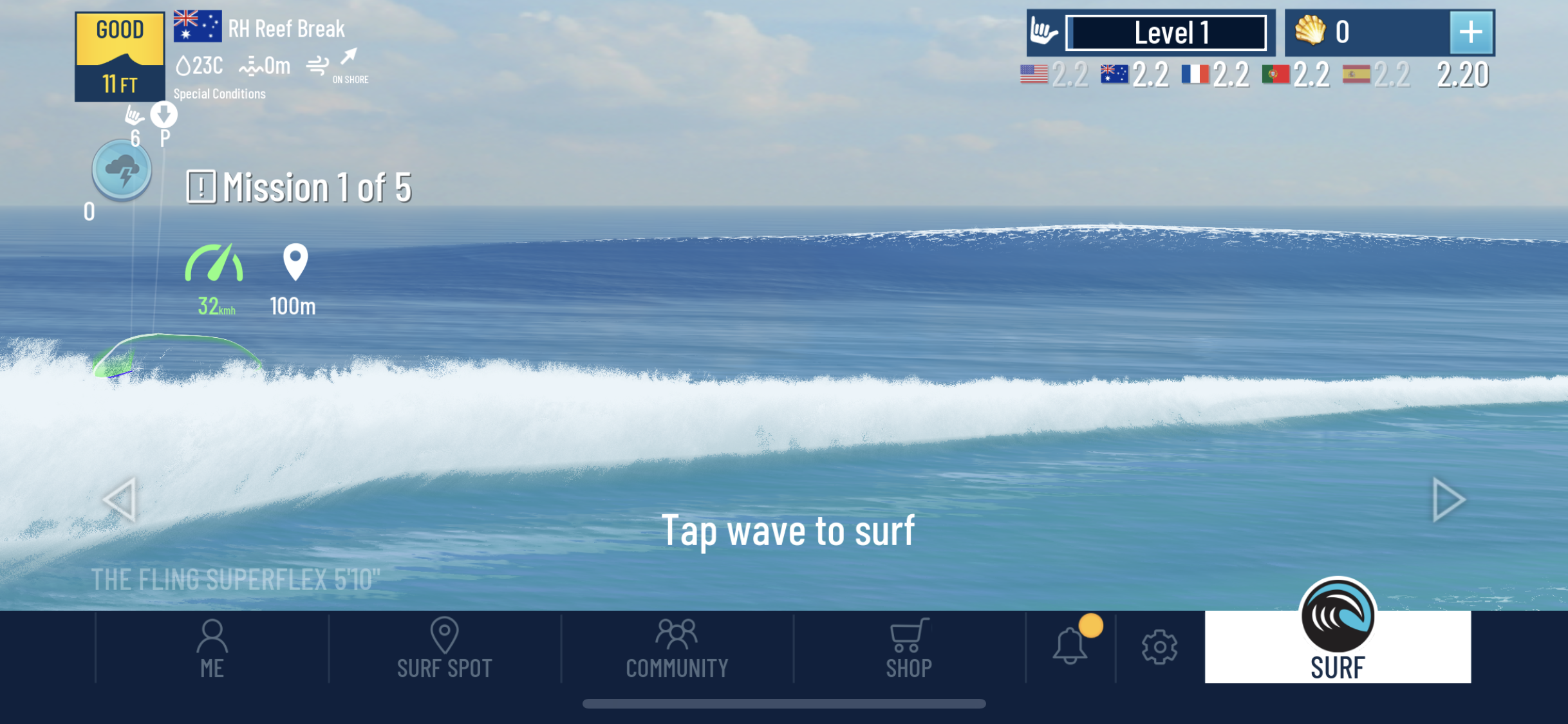
If you need to navigate to something like the profile screen or the shop, all of those options are available at the bottom of the screen. There are also little HUD-type displays in the top corners of the screen. However, the majority of the screen is animated, beautiful water, with no complicated instructions to distract from the beauty, only the words ‘Tap wave to surf’.
This simplistic design carries over to the actual gameplay as well. There are two core aspects to the actual gameplay. The first is actually catching the wave.
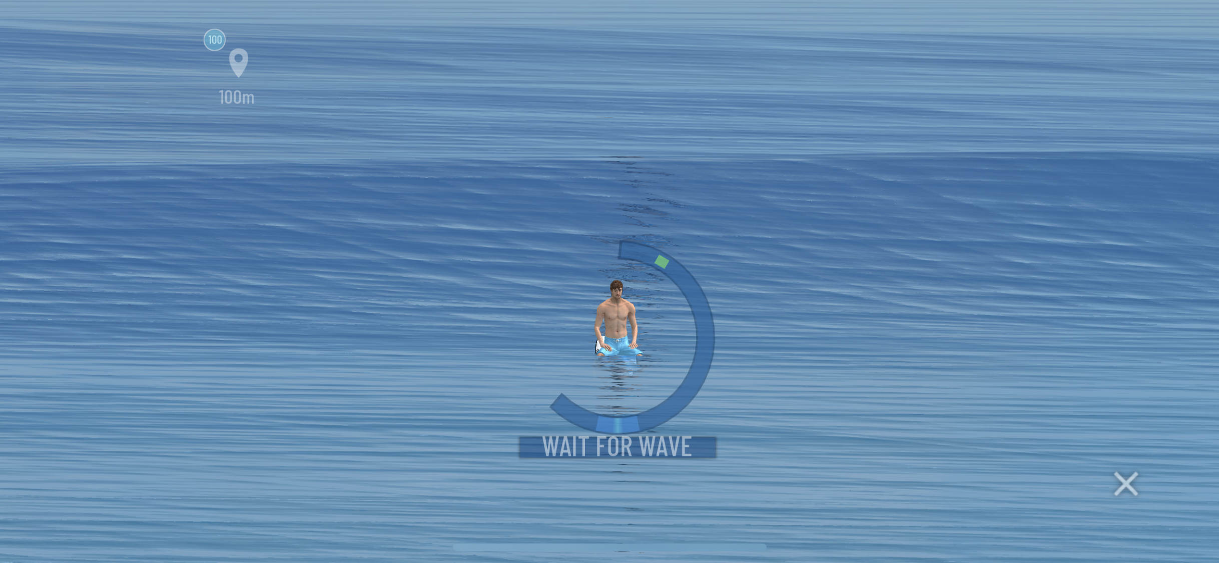
The layout is even more simplified in this section of the game. The zoomed in version excludes the details of the HUD, allowing the player to focus purely on the timing of the wave. In order to aid the player, a ring around the player is shown. While its functionality is not explicitly stated, its design makes it easy to infer that the purpose is to wait until the green dot is in the area at the bottom in order to press the screen and catch the wave.
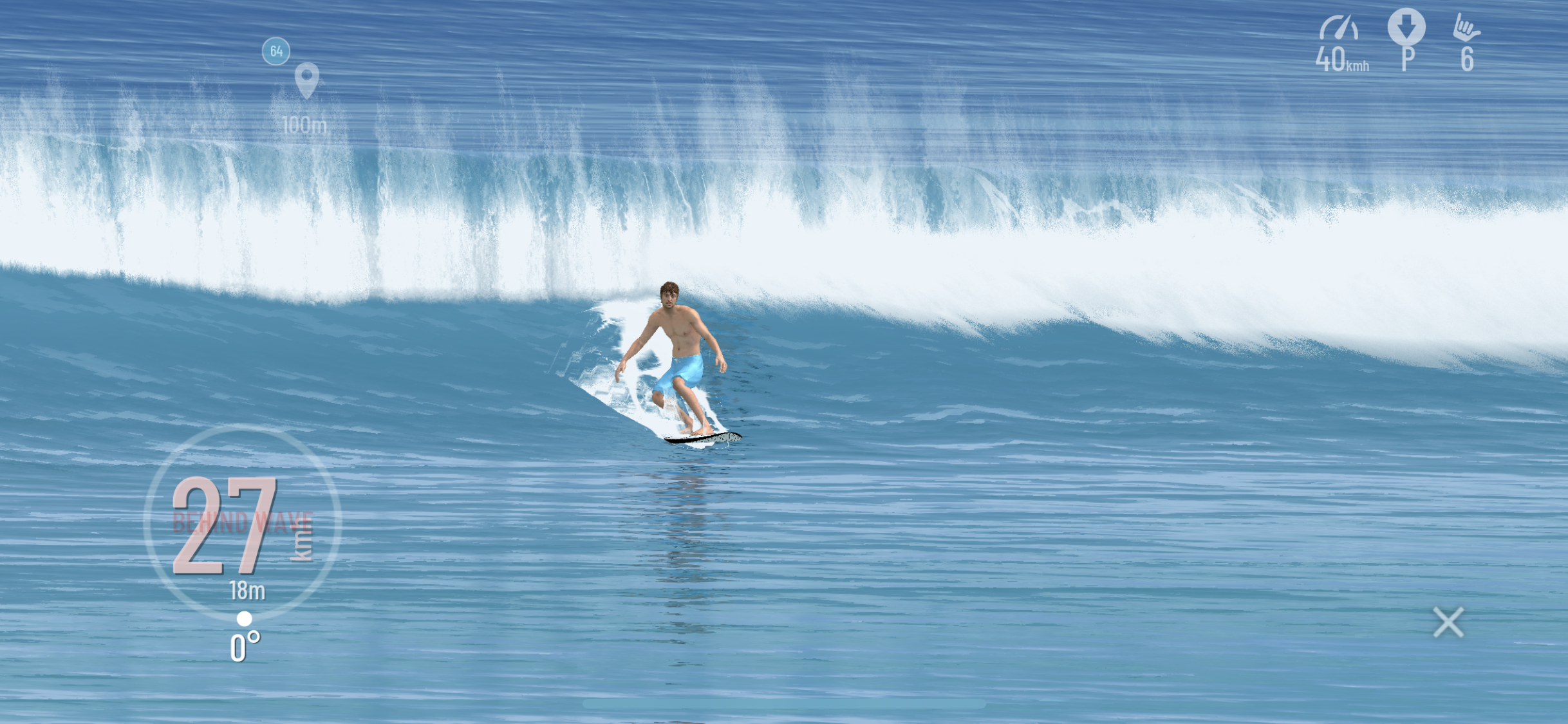
While the graphics are somewhat limiting in this section compared to the others, the game is still able to offer a smooth, pretty feel. With nothing but a speedometer to hinder the view (along with some very light HUD icons in the upper right), the player is able to surf the wave on their own. The controls are intuitive (touch and slide to pivot the board), and the game will offer tips at the bottom if it sees that you are struggling.
True Surf makes some terrific design decisions –– limiting the number of buttons, making the waves the focal point of the game, implementing intuitive touch controls, making text and HUD icons a very light font, and displaying extra information only when it is needed –– which turn the game from a boring surfing simulation into an immersive mobile app that is able to somewhat capture the beauty of actually being in the ocean.
Here are the Fonts vs. Cheese exercises: