

Cheese or Font Elements:
Core Elements:
- Cheese and font names: The primary gameplay element involves presenting players with names of cheeses or fonts for them to identify.
- Correct or incorrect feedback: After making a selection, players receive feedback indicating whether their choice was correct or incorrect.
- Score display: The game keeps track of the player’s score, which is essential for maintaining motivation and engagement.
Supportive Elements:
- Hints: While not directly related to the game’s mechanics, hints could provide clues to help players make more informed decisions.
- Instructions: A brief explanation of the game’s rules and objectives aids players in understanding how to play and what is expected of them.
- Timer: A time might be helpful for players to recognize how much time they have left for the game and give them a sense of pressure.
Extraneous Elements:
- Background images: Although visually appealing, background images do not directly contribute to the game’s mechanics or player experience and could be removed without affecting the core gameplay.
- Music or sound effects: While they can add to the game’s atmosphere, they are not crucial for the gameplay itself and can be considered extraneous.
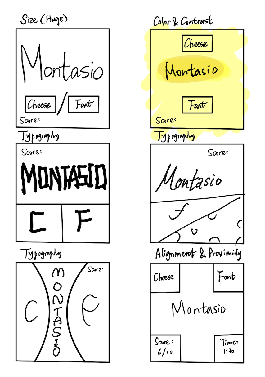
Below are the sketches for Cheese or Font:

In the proximity in the last design, the space among each button is identical, and they are not close to one another, leaving a lot of space in the design.
Beautiful Game:
I think the design of Mario Kart is beautiful. In this screenshot, we can observe the following graphic design principles in action:
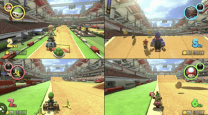
- Size: The game uses size to establish a sense of depth and hierarchy. Larger objects, such as the karts and characters, are in the foreground, while smaller objects, like background elements, are in the distance.
- Contrast: Mario Kart employs contrast to distinguish between interactive elements, such as racers, and the environment. The characters and karts have bright colors, while the background is more muted.
- Typography: The in-game text uses playful, legible fonts that fit the game’s theme and enhance the overall aesthetic.
- Proximity: The grouping of power-up and item indicators on the screen is helpful. When a player collects an item from a mystery box, an icon representing the item appears near the upper corner of the screen. By placing the item indicator in close proximity to the player’s kart and main field of view, the game makes it easy for players to quickly recognize the item they have received without disrupting their focus on the race.

