Proximity: In my design of cheese or font, the user has the option to press one or two buttons: cheese or font. These are core components of the game, and because the user is constantly choosing between one or the other these buttons should be grouped together. The cheese/font name itself does not necessarily need to be grouped with anything, and I would argue that this is the most important aspect of the game and should be alone. The previous and next button can be grouped vertically at the top, but on opposite ends of the horizontal axis. These buttons, along with the timer, are not necessarily a part of gameplay and can be grouped at the top, separate from the gameplay. However, I think the timer button should go in the middle of the top bar, and be aligned horizontally with the cheese name and cheese/font buttons.
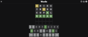
One game that I still find myself playing fairly often is Wordle, and despite its simplicity, I think that Wordle follows graphic design principles fairly well. Wordle’s choices of color for the letters highlights the letters that are correct, and should be focused on. By having the incorrect letters be a dark shade similar to the background, Wordle is able to draw attention away from the unimportant letters. All of the core elements of the game are centered horizontally in the middle of the screen as well, organizing the page and guiding the eye. The size of the letters in the guesses are also larger than the keyboard at the bottom, drawing attention to the guesses.