

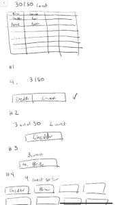
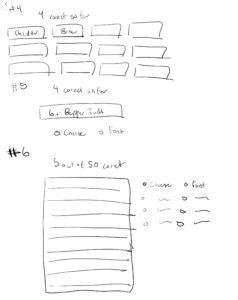
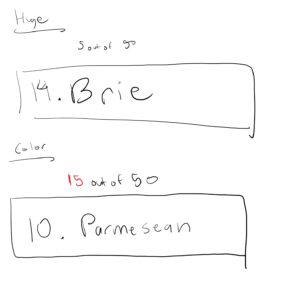
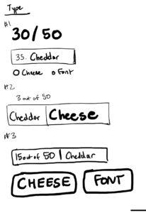
For these designs, I tried to explore placing the user interactive portion next to either the name of the cheese/font that the user was guessing or separating it out as an UI element. I found that it often made the most sense to keep it close to the name of the cheese/font that they were guessing. Then, although somewhat close, I also wanted to keep the number of cheeses/fonts that they’ve guessed correctly as a separate element that was close by but not necessarily combined.

The game that I thought was beautiful both in its layout but also the graphics and storyline was Shadow of Mordor. Shadow of Mordor is an open-world game that takes place within the Lord of the Rings universe and you control a character that goes around swinging and fighting against a bunch of Uruks (orcs).
One of the design principles they use well is the aspect of contrast and color. They stick to primarily three UI colors: red, white and sky blue. Red serves often as an enemy indicator and as a more alerting color as we can see on the right side of the screen. These indicators tell the users that there have been Uruks that are alerted to your presence and that you should be wary of them. The blue is often associated with player-related information such as their magic bar, resources, or skill-tree level ups.
In addition, they do a good job dealing with proximity as most of the important player information is grouped into the left corner: the health bar, magic bar, mini-map, and other status indicators. This allows for the gameplay to be relatively clean and uncluttered and allow for quick intake of status information for the player.

