

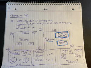
First, here is a picture of my exercises from the blog post. In my final 3 thumb cards sketches , I used proximity to order some of more similar elements together: in 4) I create circular buttons which I put close to each other, in 5) I put all the quantitative data in the top left corner and for 6) I grouped the correct and incorrect cheeses in the same area.
One game that I like is 2048. Two graphic design principles it utilizes well are proximity and alignment. The grid structure makes the game feel very balanced, and leads the eye towards the title of “2048.” The designers also use proximity here to organize the quantitative data in the top right corner. They put your current and highest score together, encompassed by blocks that emulate the blocks used in the game.


