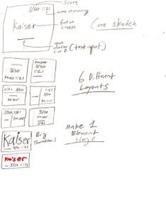
The core and supportive elements of Cheese or Font are as follows:
Core:
- The name of the possible Cheese or Font
- The text entry for whether or not the Cheese or Font is a Cheese or Font
- The time limit on the top right of the screen that informs the player how much time is left.
- The score bar out of 50 on the top right
Supportive:
- The background color used for the Cheese and Fonts
- The text hints titled “Enter C or F” and “Cheese or Font”
- The error message/color which pops up for wrong answers
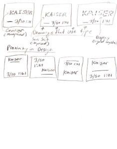
In exploring Proximity in my designs I looked into different ways to group together UI elements on screen. I first thought that the text input should be grouped with the word prompt and the score should be grouped with the time limit remaining. My logic for this was that numbers went together while text coincidentally also went together. However, upon redesigns, it made more sense for me to group together the score, time limit, and answer prompt together and keep the text prompt separate.
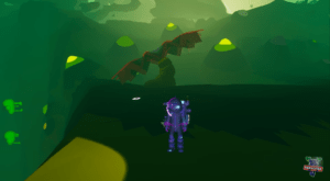
One game I find to be beautiful is Astroneer. I got this screenshot from this Youtube video. For me, the game is especially beautiful as it makes use of the graphic design principle of color theory very well. The contrasting colors of purple and yellow (an example of Commandment #4 of color theory) and the different analog shades of green serve to provide a punchy and cartoony feel for the game, giving it its iconic and stylized look.
