

Cheese and Font Exercises
Elements of Cheese or Font
- Core: name of the cheese or font, a way to guess the answer, and answer confirmation or rejection
- Supportive: timer, score, and instructions
- Extraneous: option to give up before timer has ended, quiz stats, snarky comments when player has gotten the wrong answer
From left to right: core elements, one huge element, one color
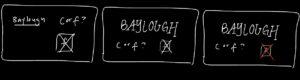
3-4 thumbnail drawings that use type
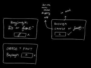
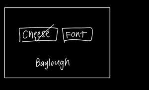
Proximity
I intended for the buttons to be seen as close together, and the name of the cheese/font to be separate from that.
Other Game: Hollow Knight

Game I picked: Hollow Knight
- Color and contrast: The brightness of the main character in white distinguishes them from the darker background. The white pops! The main character is always the most important thing on the screen.
- Alignment: Disregarding the main character, the two of the Mantis Lords are horizontally aligned with each other as compared to one that sits slightly above both of them. This distinguishes the two from the one on top which is also represented in gameplay— the one sitting on top fights first, and after they are defeated, the secondary two fight the main character together. The alignment here portrays hierarchy among the Mantis Lords.
- Proximity: The Mantis Lords are grouped together and slightly blend into the background as compared to the main character who faces them, alone. We assume the Mantis Lords are part of a group separate from the main character. We also are able to assume they are an enemy (which is true until they are defeated :)).
Signing off,
Annabelle

