

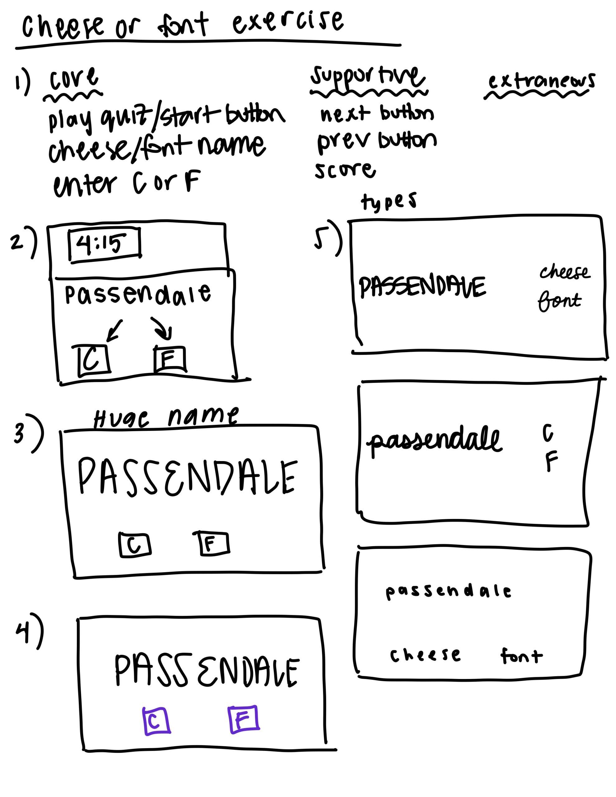
Exercises on Cheese or Font:
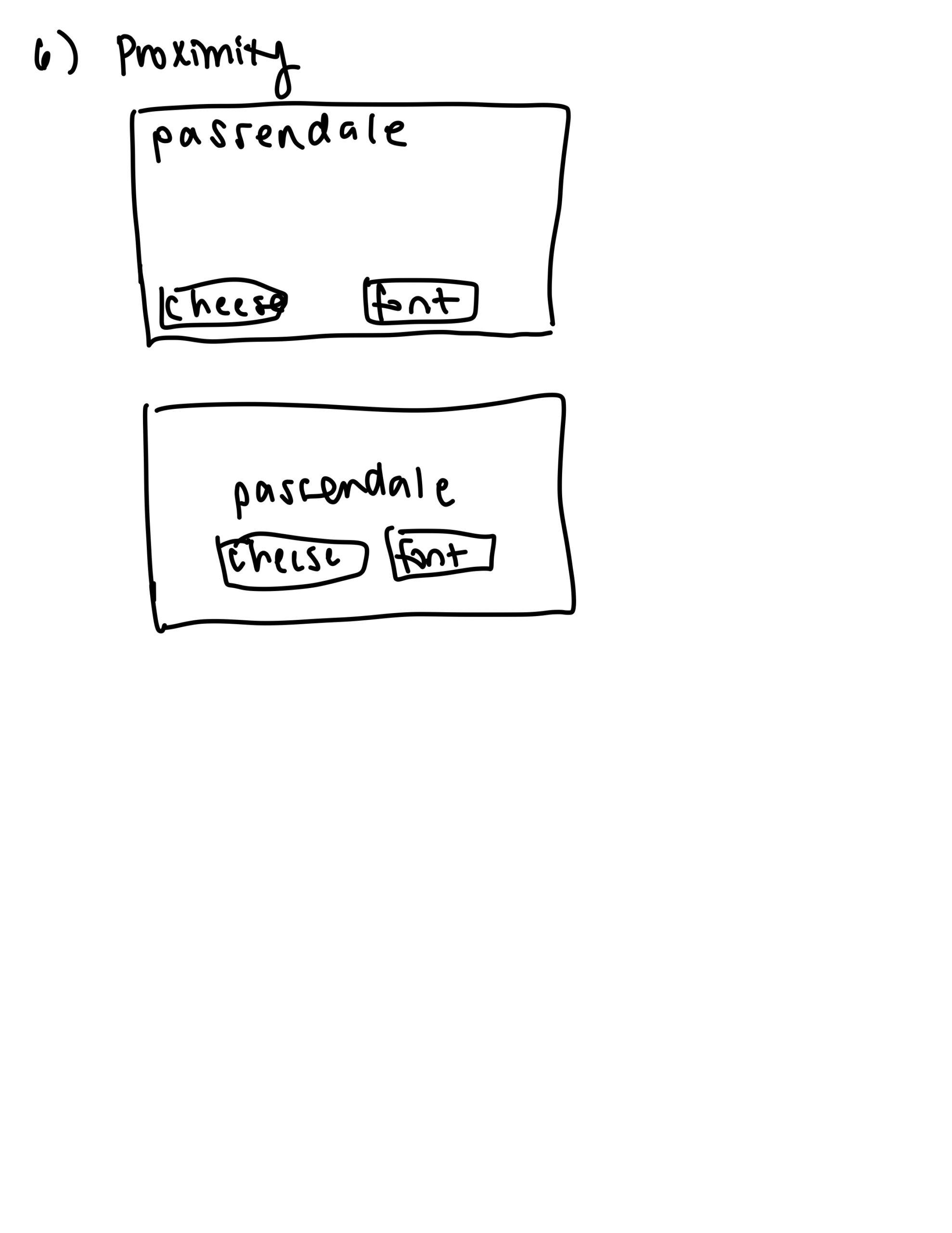
Notes on proximity: When the cheese and font buttons are closer to Passendale, it is easier to see that they are grouped with Passendale instead of being separate entities.
One of my favorite games is BB tan.
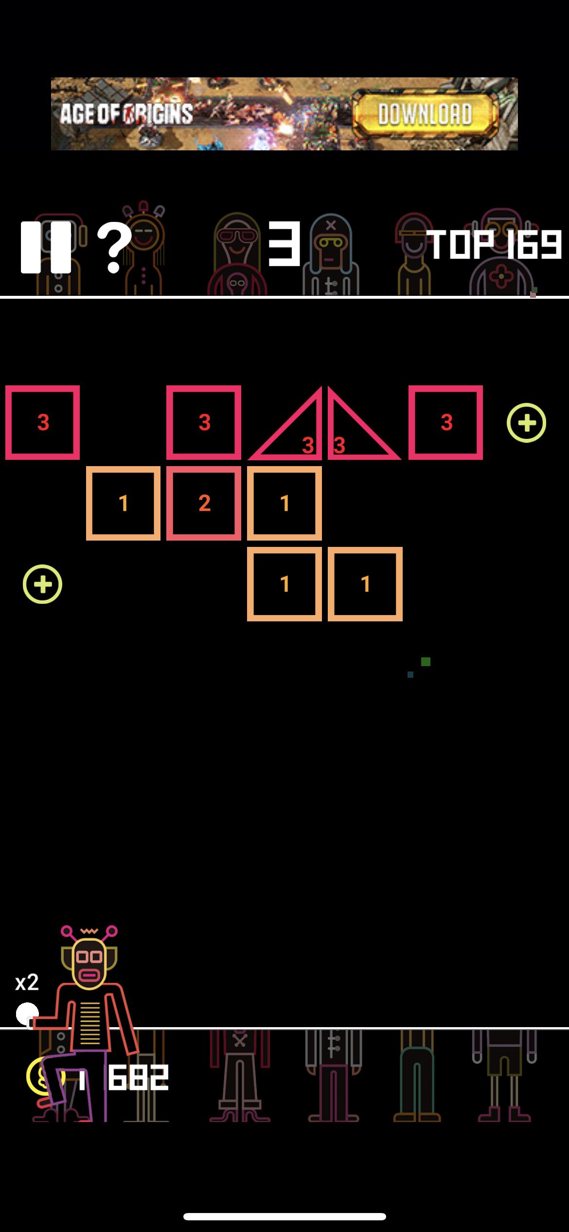
The designers of this game use proximity in a strong way: all the quantitative metrics needed to know are grouped together at the top of the screen. Your current score is in a larger font than your top score, signifying its relative importance. Moreover, the designers make use of a grid structure in the game. There are 3 major rectangles in this game: the top one, the middle one, and the bottom one. Within each of these rectangles, items are organized in some even, grid-like fashion.

