

my thumbnails:
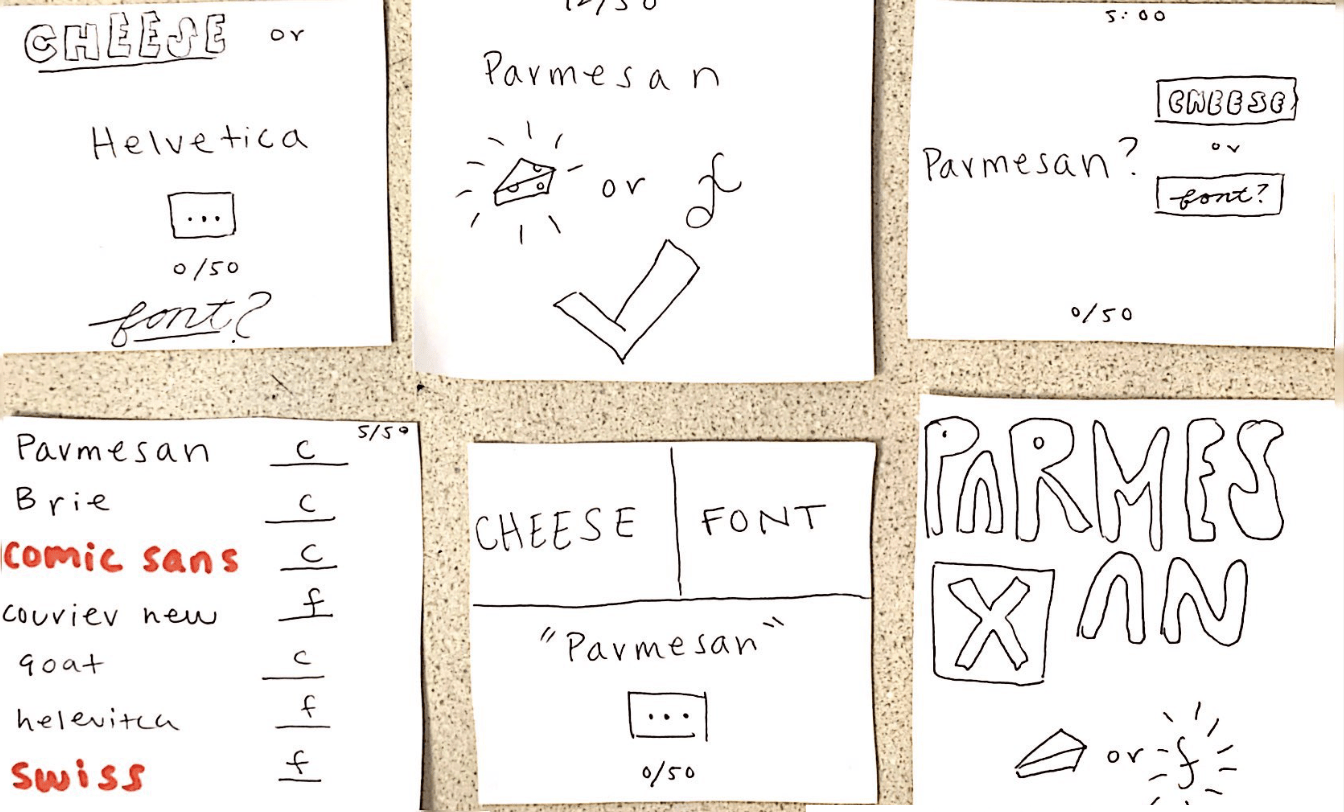
I played with proximity in the second row second column. I decided to just make the buttons huge and right next to each other in hopes this would signal the most important aspect of the core elements.
Core elements:
Cheese or Font choice, name of the cheese or font, and way to tell if the answer is correct
Supportive:
“enter C or F” helpful directions, an indicator that tracks how many the user has gotten right, and a start button, and the timer
Extraneous:
Long list of all the future questions, weird occasional fact with a wrong answer, and all previous answers are still visible
My Beautiful Game: LIMBO
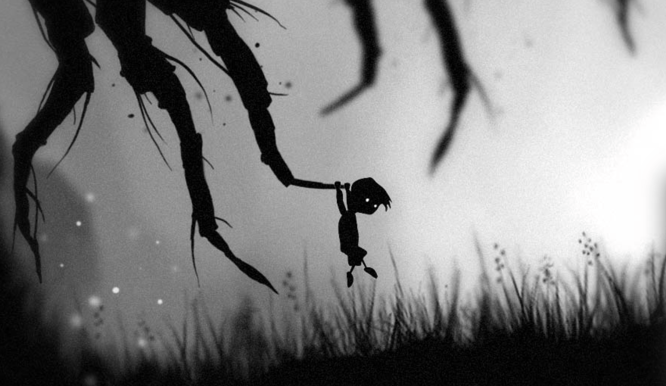
Limbo is one of the most beautiful games I have ever played. It appears simple at first glance, but there was masterful thought behind the design that creates a perfect eerie, but somehow also hopeful ambience that I think is what makes it such a great game.
The first most noticeable aspect of the design is the color and contrast. The only colors Limbo uses are grey, black and white. The use of brightness of these shades are what makes the difference. The boy’s eyes are this bright gleaming white that is only seen throughout the game in little butterflies and near his sister when he gets close to finding her. The occasional gleaming white objects help the user feel hopeful in such an otherwise dismal color scheme. Pretty much everything evil is black, which is interesting because the boy himself is black but his eyes are the gleaming white, and his sister is white, which to me adds to the melancholy of his character.
The other aspect that separates the good guys from the bad guys in this game is size. Again, pretty much everything that is evil is huge. There is a massive killer spider, massive rolling balls, and massive moving gears that stab and crush the boy. Most of the things that the boy uses to overcome these adversaries are small, like little boxes and small traps and thin ropes. Also, just in general there is a lot of white space above or below the boy at most times, which adds to the atmosphere of the game. It is uncluttered but also hectic and chaotic, kind of like a mind. This really adds to the beauty aspect in my opinion.
This white space could also contribute a bit to proximity. Most of the puzzles in this game require things to be moved closer together, and hits to solve things often go from being far away to falling out of a tree at the feet of the boy. There is something about completing a puzzle from seemingly nothing that is very rewarding in this game, and I think keeping the tools far from the character is helpful for this.

