Cheese or Font
- Core elements
- List of cheeses/fonts
- Input for guess
- Timer (I believe that the timer could potentially be considered an extraneous element depending on one’s view of the game. I however believe that the timed nature of the game adds a fair amount of pressure and emphasizes the challenging nature of the game’s fun and it would be very different without the timer.)
- Support elements
- Informing players whether their guess was correct or not
- Instructions that read “cheese or font?” above the list of prompts
- Instructions informing users how to input guesses: “enter C or F”
- Extraneous elements
- Different colors indicating wrong versus correct answers
- Stats about a player’s average score
- Quirky quips about players’ incorrect guesses
CORE ELEMENTS
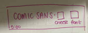
SIZE
For this aspect I thought it’d be interesting to make the timer very large in comparison to the other elements. With this change in particular I feel like the pressure of the time challenge is emphasized and may result in a more stressful gameplay.
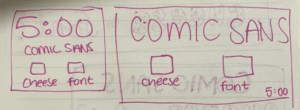
COLOR

TYPE
PROXIMITY
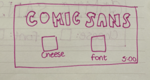
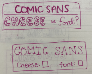
When it comes to proximity, I believe that the selections for cheese and font should be nearby one another since these are both associated with user input. The name of the cheese/font should also be nearby since the input corresponds to that specific name, though it should stand out in some sense to indicate that it too is not some sort of input option. Since the timer communicates ongoing information throughout the game, it is perhaps appropriate for it to be away from the center of focus and somewhere where it may blend into the background more (such as a corner).
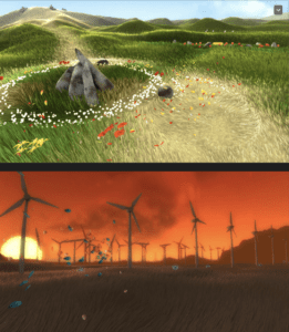
The game I chose for its visual aesthetics is Flower, a game in which the player controls the wind, blowing a flower petal through the air. When beginning the game, the player is placed into a greyscale, dreary world with dead fields and unmoving wind turbines. However as the player explores the landscape and collects additional petals, the landscape begins to transform as fields of plants come to life, color enters the world, and windmills begin to turn. I think that Flower’s use of color and contrast in conjunction with its setting is what makes the game especially striking. Although the game does not really depend on any tasks besides simply exploring the world, the continuous beautification of the landscape is enough to keep the attention of players. And while the game does not hinge on a complex narrative, the artistic visuals lend a hand towards an emotional story that is open to the player’s interpretation. The contrasting greyscale and vibrant colors alone are able to evoke tones of apocalypse and rebirth, leaving players curious to learn more and driven by a desire to explore Flower’s world and to make it even more beautiful.
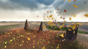
In addition to color, I think size is also an important aspect of Flower’s visuals. Because the game begins with the player manipulating a single, tiny flower petal amongst wide open fields, the game’s world is able to feel quite large. It also serves to create a sense of challenge in which players must take on the task of exploring the vast world as just a miniscule part of it. However as the player collects more and more flower petals, their presence on the screen grows in size. Not only is it pleasant to admire dozens of colorful flower petals flitting across the screen, but this increase in size also serves to evoke feelings of interconnectedness and achievement. As opposed to navigating an undersaturated, dreary world alone, players are able to build up a community of petals with which they can beautify the world together.
