

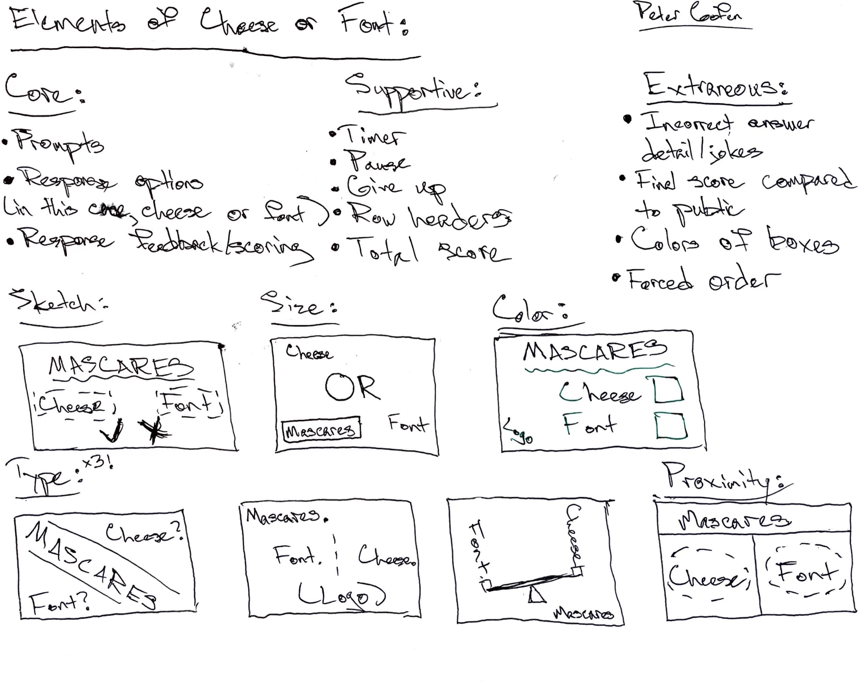
I’d like to highlight the graphic design of Geometry Wars, a top-down multi-directional shooter. The beauty of Geometry Wars comes primarily through its color and contrast; in a fast-paced game where more is going on than one could ever possibly track, crafty design decisions assist the player in navigating the mass of chaos.
Every type of enemy has not only a distinct color, but a different shape as well (a savvy decision from an accessibility standpoint, too!) Vibrant color selection makes for an appealing aesthetic. And even the movement patterns of each enemy feel right when it comes to the way they behave—if you’ve worked to corner those pesky green guys into a corner to hunt them down, you know what I’m talking about.
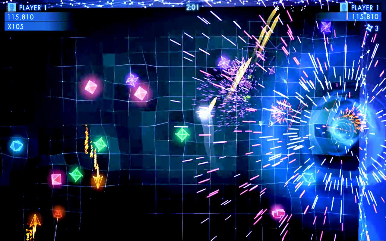
The proximity and alignment principles help guide a HUD in the corners of the screen (and, when applicable, a timer in the top center) that successfully balances giving the player the information they need without being intrusive or distracting due to its small size. Using a blue base that’s similar to the underlying grid/perimeter of the game arena accentuates the surrounding placement. Lastly, spawns and deaths of enemies, in addition to denotation of bombs, make for aesthetically satisfying sparks that linger just enough for a moment of acknowledgement but no longer than necessary.
