Elements of Cheese or Font
Core
- 50 names presented to the player
- Players determines whether a name is cheese or font
- Can go to previous or next name
- Scored out of 50
- 5:00 timer
Supportive
- Instructions/Hints: “Enter C or F”
- Timer and score always displayed
- Can pause timer
Extraneous
- Current name is bolded and line highlighted to show playthrough status
- Past names are filled in either with player’s correct guess or red correction
In exploring proximity, I considered that the word and font or cheese buttons are intuitively grouped because of core gameplay. The timer and score display aren’t part of those core elements, so are separated.
Pikmin 3

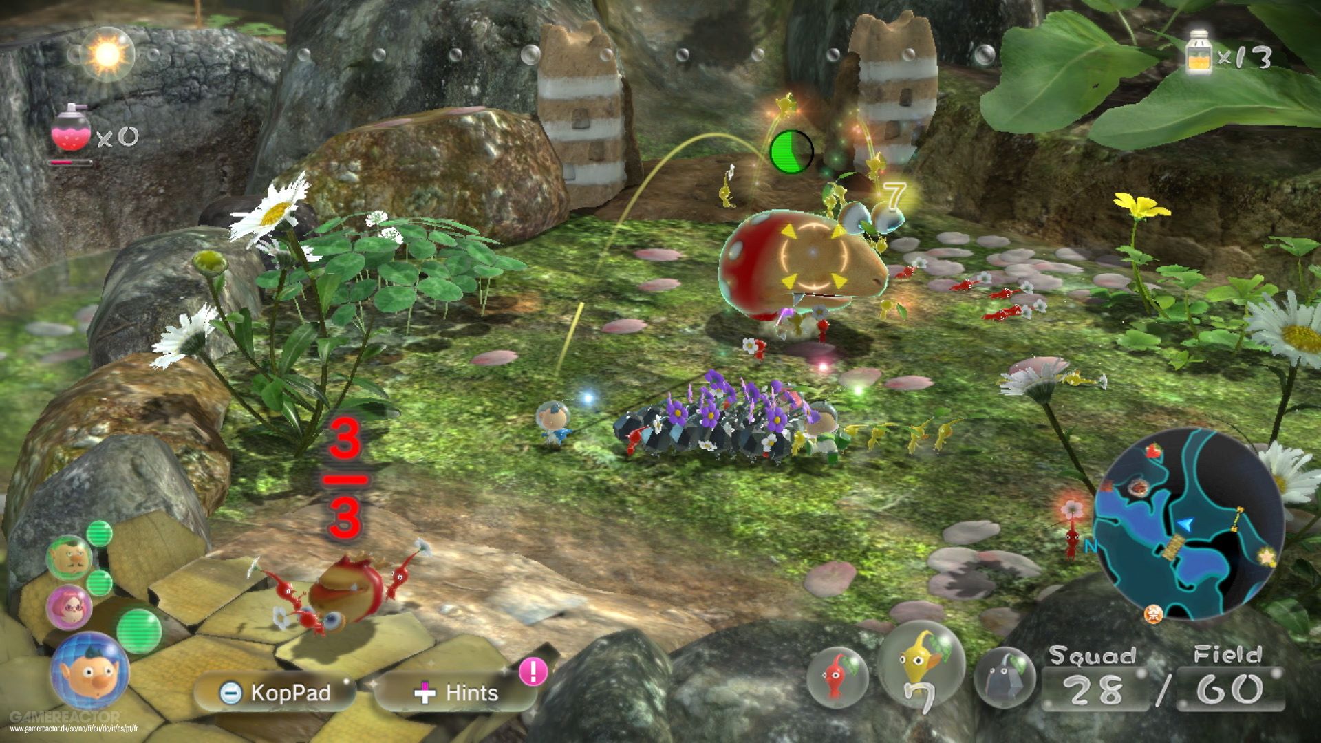
In Pikmin 3, you command a horde of tiny creatures to explore a strange world, defeat enemies, and collect treasures.
Size
The player and Pikmin are tiny, and take up a small portion of the camera to showcase the vastness of the world. All enemies, treasures, and barriers are what we’re really interested in in gameplay, so those elements appear large in the world. Their size lets us focus on them visually, and makes it much easier to aim Pikmin at what we want to aim at.
Important information is also larger. Despite the business of the HUD, there is a hierarchy through size: we know what Pikmin we have selected, which character we’re playing as, and a huge “3/3” over loot to signify “number of Pikmin carrying / number required to lift”.
Color
The player, Pikmin, and enemies are vibrant and colorful and stand out from the rest of the environment. The contrast lets us know what is important and what can be ignored. Pikmin of different abilities correspond to different colors. This means that from the first glance you get an idea of what abilities you have based on what colors you see.
The HUD is notable for its use of transparent buttons (which consolidate information without obscuring the scene) and how color fills those transparent elements with gameplay status. Health above an enemy transitions from green to yellow to red as an enemy is vanquished. The numbers above loot also transition accordingly. When there aren’t enough Pikmin (e.g., “0/3”), the number is a transparent gray. But when enough Pikmin are carrying it (“3/3”), the number turns red as they transport it! The red signifies that they could use more help: adding more Pikmin (“9/3”) transitions the color from red to yellow to green.
But the most helpful use of color is found in the sun on the top bar! It moves from left to right as the day finishes (and keeping track of that time is critical for Pikmin’s survival-strategy model). We are always aware of how much time we have, even from the corner of our eye.
Proximity
Pikmin naturally group up with the player (and can be called back), keeping all “Player” information together. Health and weight indicators are always found right above their respective items.
The HUD groups together alike information. Your Pikmin type is right next to your Pikmin number in the bottom-right. Hints and menu are supporting features, so they stay in transparent boxes at the bottom. The big misstep is that one potion is in the top-left and the other is in the top-right: it seems more intuitive to group those resources together on the top-right, separate from the sun meter.