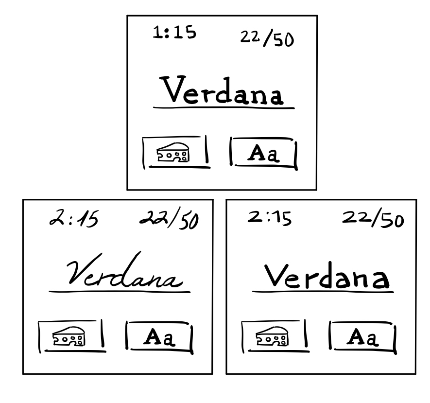
Cheese or Font?
Elements
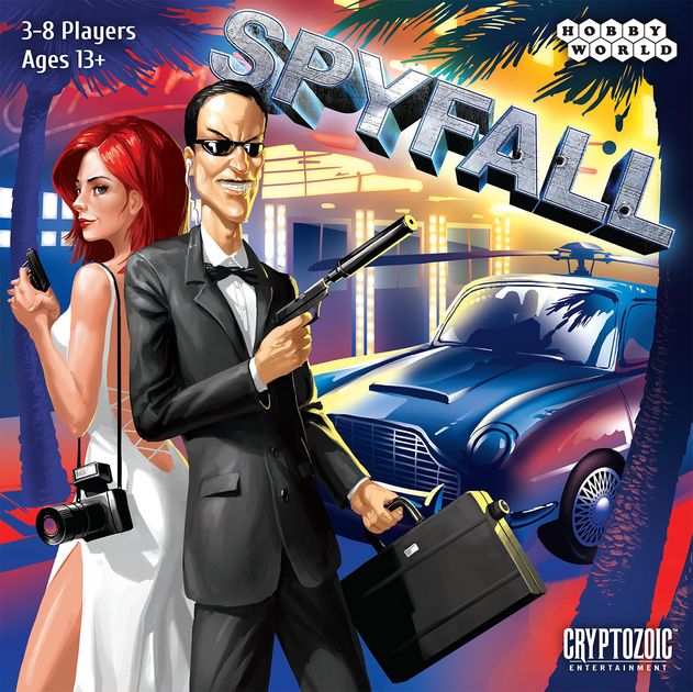
Core: Input box, query name (i.e. “Helvetica”), a way to chose a category, player score, timer
Supportive: how-to-play, hints when player gets too many wrong
Extraneous: Humorous cheese and font facts when player is wrong, average score, quiz stats
Sketches
Core elements
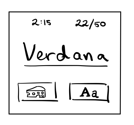
Size
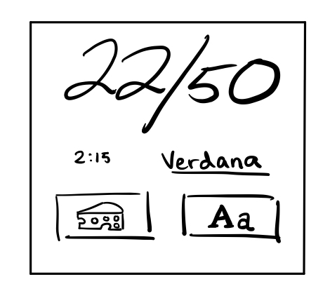
Color and Contrast
Type
Proximity
The timer and score are grouped together because they are state-of-game tracking devices, which should be separated from the playable parts themselves. These playable elements are the query in question as well as the cheese and font button. Within these three elements two are in their own category which are the cheese and font buttons, as these are intractable and thus grouped together as well.
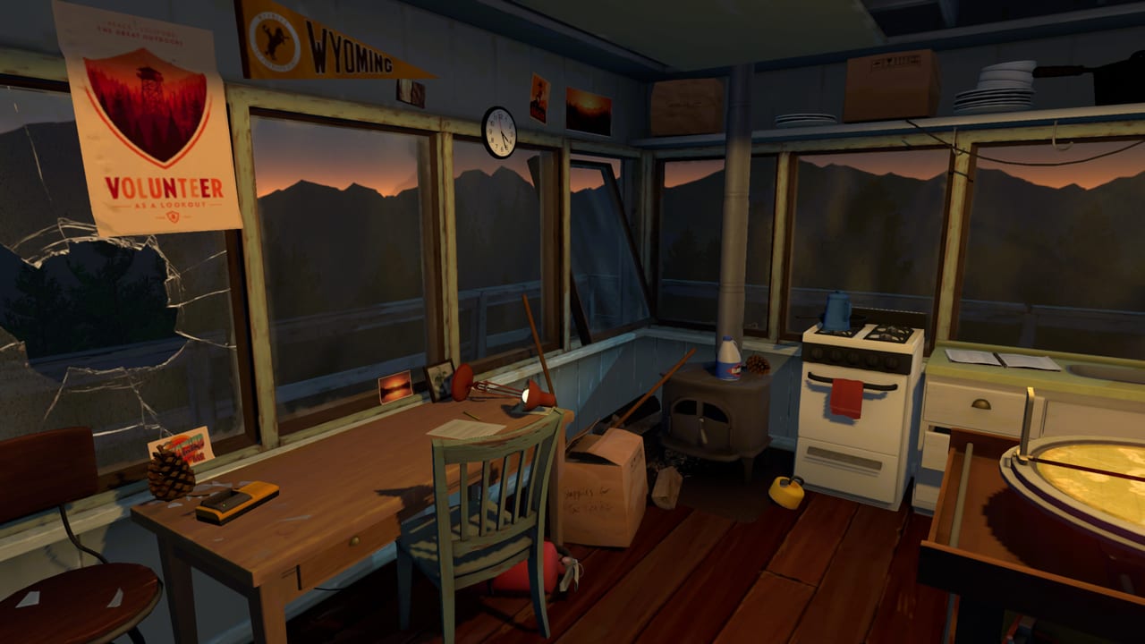
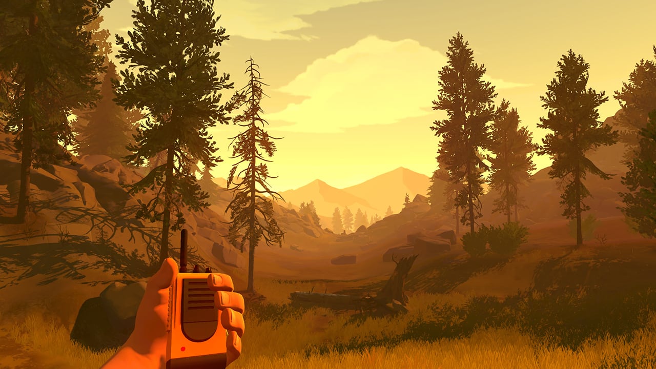
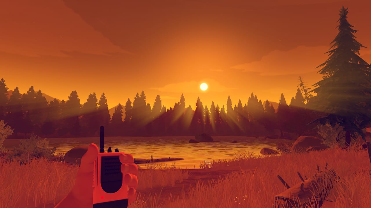
Firewatch
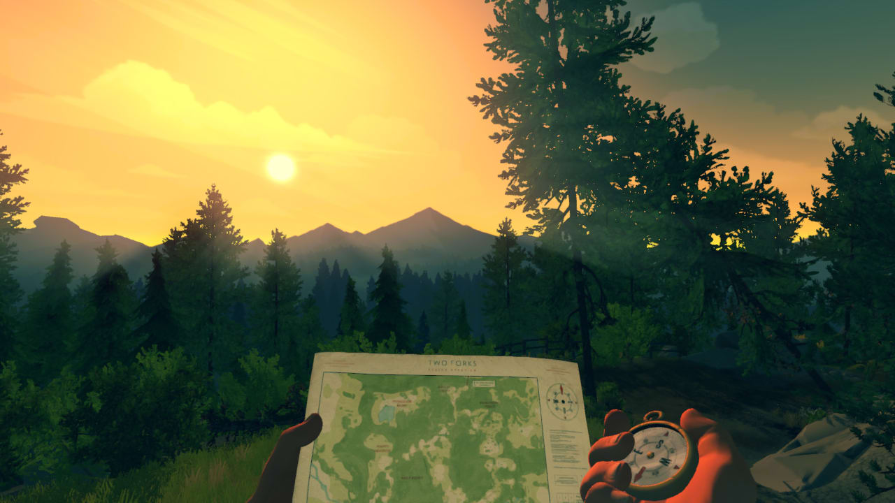
This is a game where you get to play as Henry a man that retreated from a life of tragedy to work as a fire lookout in the Wyoming wilderness, with his only human contact being Delilah, his supervisor, who’s available through a handheld radio. What I really like about the aesthetics of this game is feeling of awe whenever you are navigating this world. Nature is beautifully rendered in a way that makes you feel like you are actually there, but at the same time the beauty of the nature reminds the player of how lonely they are in the middle of Wyoming, with nothing but their own thoughts. Also I like that they fully embraced a kind of animated look rather than trying to male it look overly realistic and failing. In fact, this animated aesthetic allows for more exaggerated landscape scenes that while less true to life, create breathtaking stills.