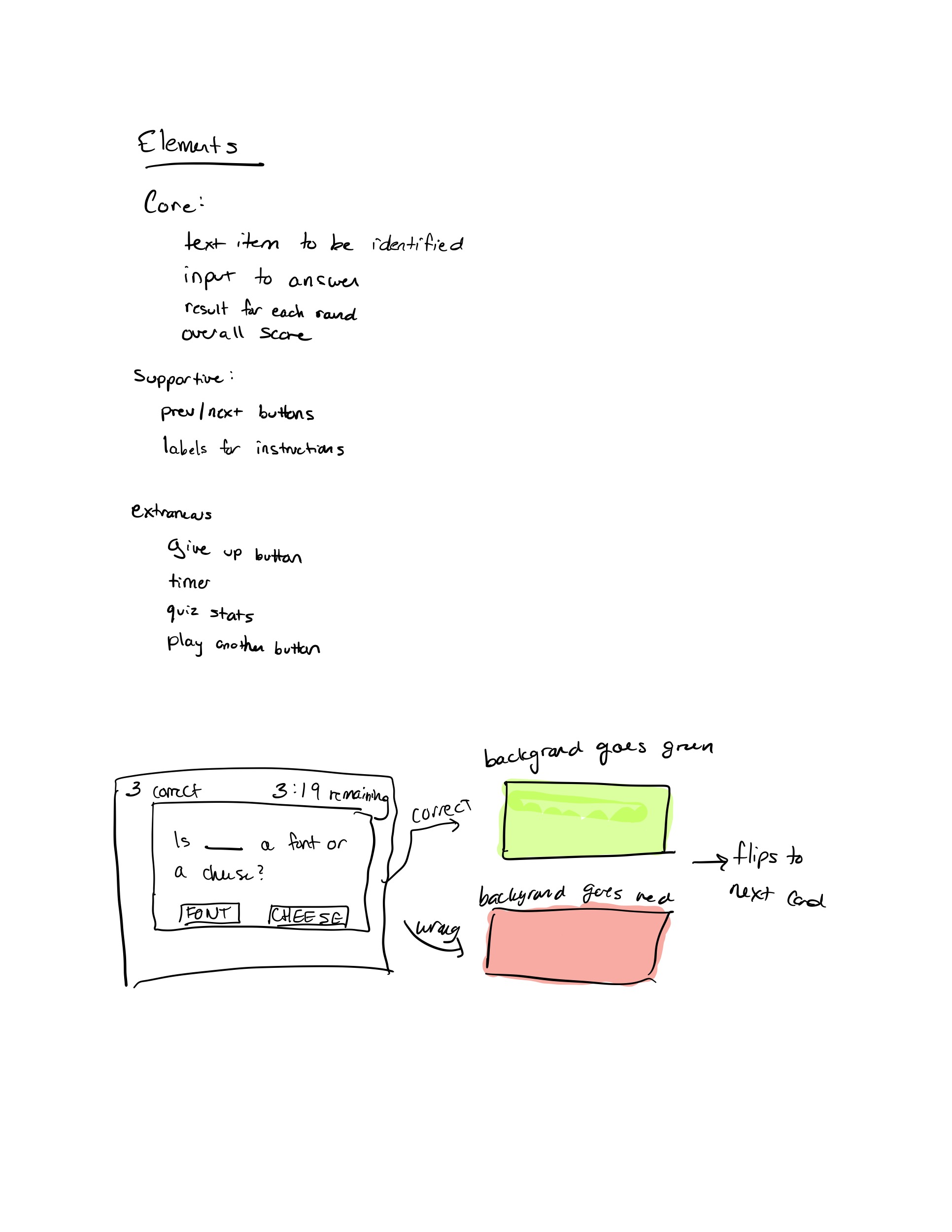
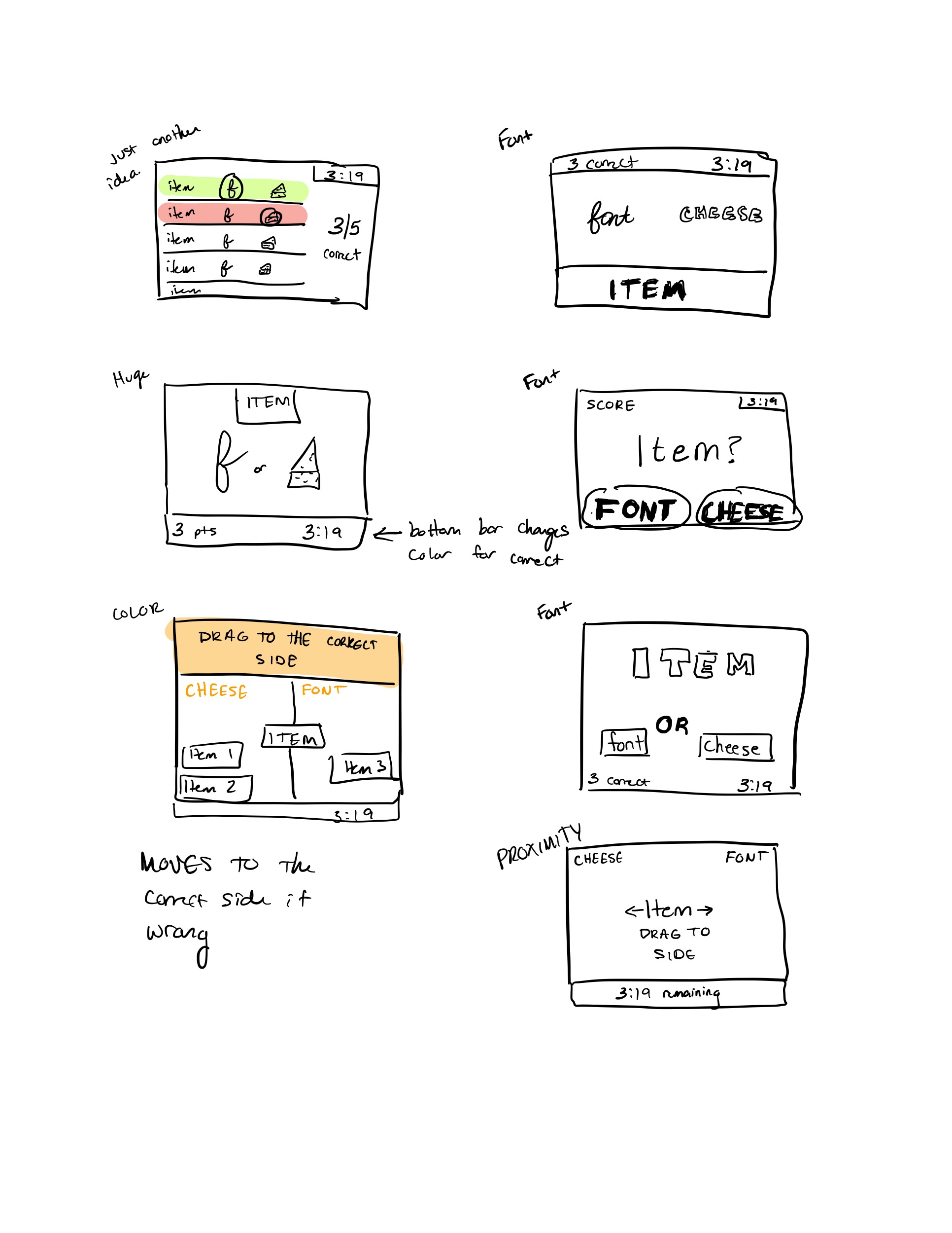
Sketches for Font or Cheese:
Screenshots of Paperback:
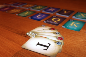
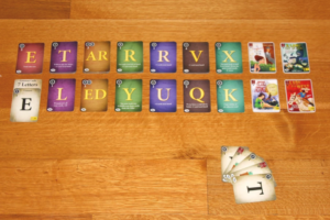
Description of Paperback Design:
One of my favorite games is Paperback. It has an incredible design (done by Tim Fowers!). All images are taken from the Paperback website. The design of the game is reminiscent of an old or antique style, which is carried throughout all the cards. The font of the letters mimics the antique style well, but the spacing and proximity is what makes the cards so beautiful. The letter is giant, at the center of the card. It’s by far the most important element on each card, so it is logical to make it so large. In turn, the informative elements on the side of the card appear much smaller. By putting all the informative elements (such as the cost of the card or how much it is worth) in one line, Fowers showcases the proximity principle, keeping like things together.
Additionally, color is used sparingly outside of the background of cards. The background of cards are used to group similarly priced cards together, which allows you to quickly know which cards to buy and which ones might be especially powerful. Finally, he utilizes color to mark wild cards with a red flag, rather than the typical small letter in the top corner. This allows players to quickly assess what is in their hand and clarify any confusion. On top of all this great visual design, he puts in a bunch of fun illustrations that respect the style, theme, and color palette of the game, which results in a beautiful, clear, and easy to play game.