Elements of Cheese or Font
Core:
- Name of the cheese or Font
- Text entry box to submit your answer/any way to select an answer
- The timer
- The score
Supporting:
- Feedback message displayed when users get the answer wrong
- Instructions to enter C or F
- How to Play button
Extraneous:
- The message that accompanies your final score
- Average score and quiz stats
Iterative Design Exercises:
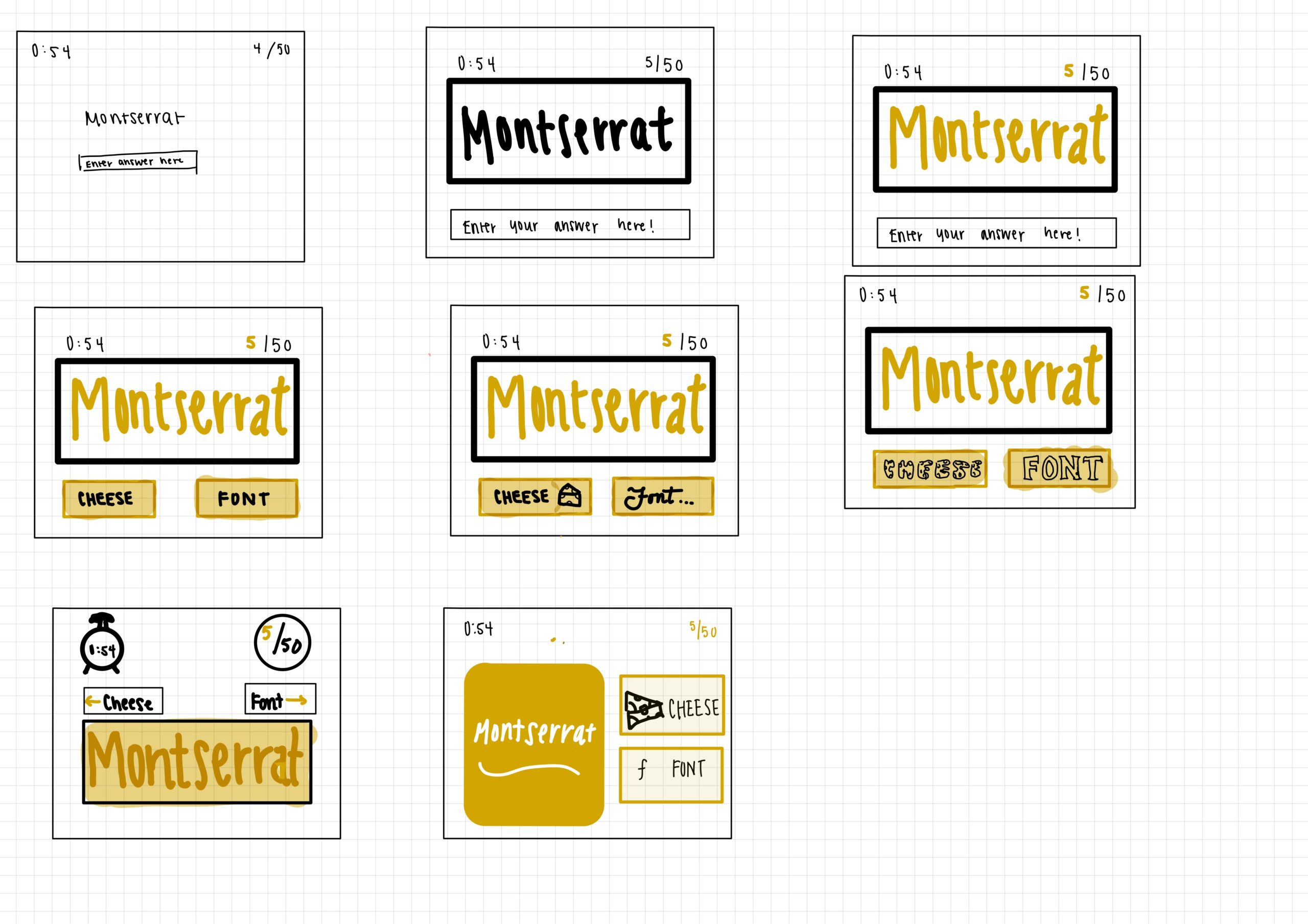
Proximity: When it comes to proximity, we want to keep the prompt close to the individual cheese/font buttons. This is because the action of choosing between cheese or font is directly related to the prompt. The font and cheese should be in the same row/column, yet they should have some space between them to indicate that they are polar opposites in the game.
I place the timer and the point system on opposite sides of the top bar because they aren’t related to each other at all. Although they do provide useful information to the user (which is why I put them at the top), putting them next to each other would imply that they may be directly related, such as gaining more points for answering quickly.
A Well Designed Game: Pokemon Go
When I first downloaded Pokemon Go, it seemed wildly chaotic. The use of augmented reality threw me for a loop. My previous experiences with games that require the use of a camera had been mostly negative because of information overload. Although Pokemon Go still suffers from an excessive amount of information provided to users, the design allows users to quickly and efficiently parse through it.
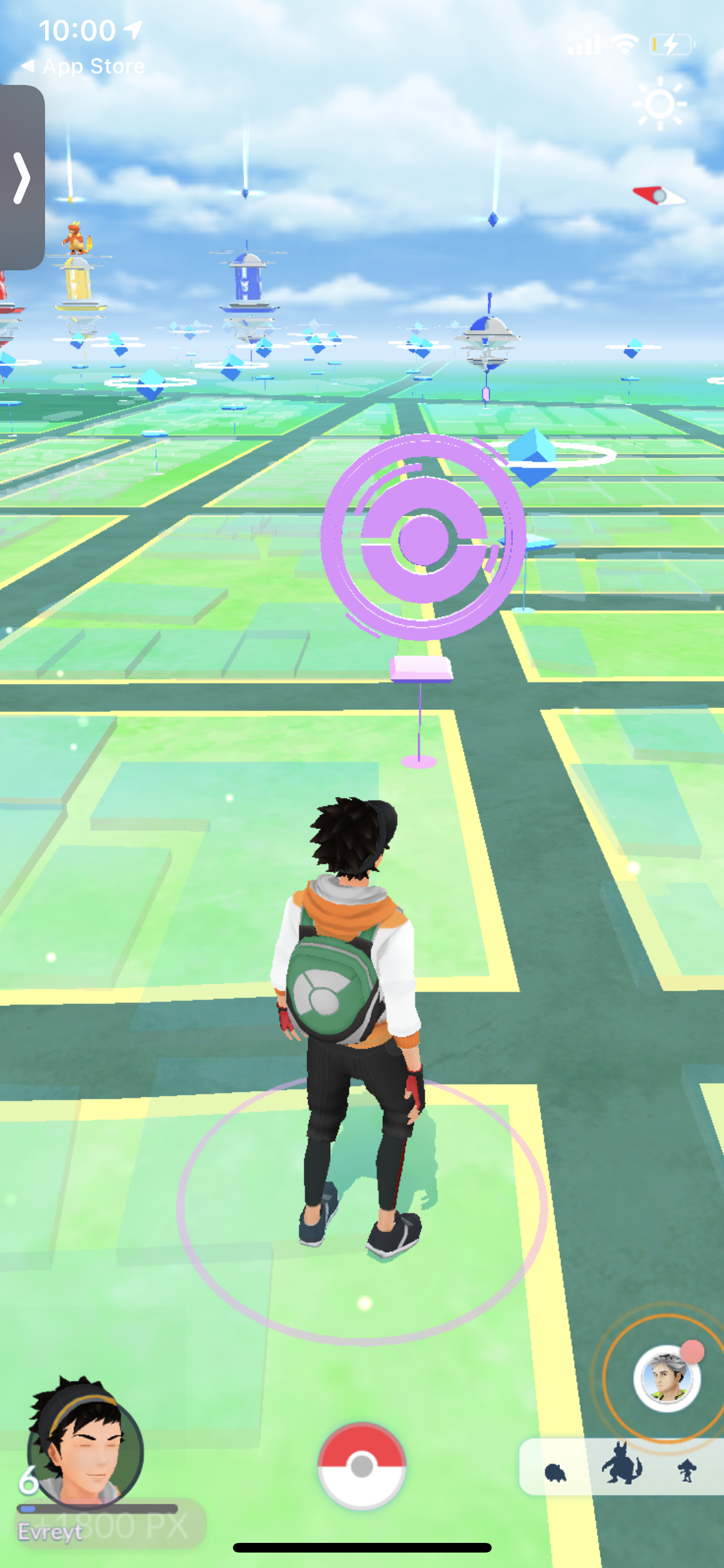
The first thing that caught my eye was the use of contrast in order to designate the state of certain landmarks. Each landmark is blue when it can be used to gain resources. However, after depleting a landmark of Pokeballs and berries, players must wait for a certain period of time in order for it to refresh. To make it clear that the landmark is inactive, the icon turns purple.
Furthermore, the main page places all of the important interaction buttons at the bottom of the display. This makes it easy to access with your thumb, but also makes it clear that the icons at the bottom all have the same interaction: you can click on them! Still, the buttons are spaced evenly, giving players the impression that they supply different menus/feedback.
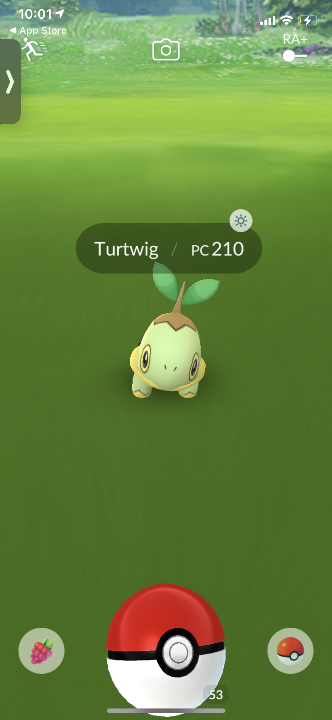
When trying to capture pokemon, the important buttons are at the bottom once again. I really appreciate how the Pokeball is enlarged in order to emphasize its importance. This cues to the player that they must interact with the Pokeball (flick it) in order to capture the pokemon.
On the other end of this display is, the Pokemon is accompanied by a name tag. The dark background allows the white typography to pop out, making it very easy to read. Furthermore, the typography is relatively simple, allowing users to gain information very quickly.
One of the most important aesthetic mechanisms that this app uses is the use of icons to display information. Rather than writing berries in the bottom left, or Pokeballs in the bottom right, they use images to display this information to the user. This makes the interface less tiring to consume.
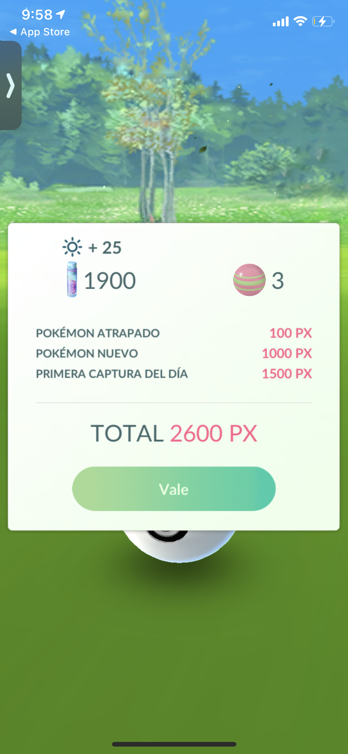
When a Pokemon is caught, the design uses color in order to distinguish between types of information. As shown above, the red color is designated for point values and the black values is used to designate the category. In other words, the designers are distinguishing between static and dynamic variables. The point value will vary with each Pokemon, but the categories will remain the same. It is more important for the point values to stick out, especially with repeated use, as players will begin to memorize what the categories are.
The button contrasts well with the rest of the information in the pop-up, indicating that players should click on it to continue. The green gradient matches well with the grass background, making the aesthetic more cohesive.
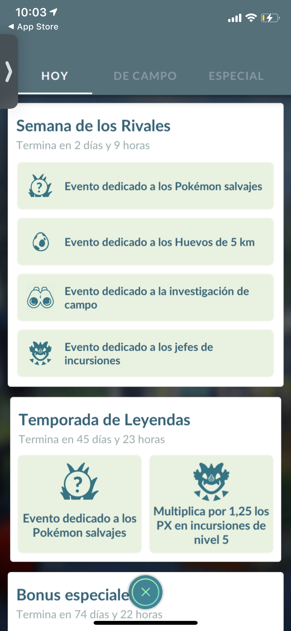
On the page above, the designers make good use of a grid layout in order to display information in an organized fashion. By only having two colors on the page, it makes everything unified, while still allowing images and titles to stick out. Furthermore, I appreciate how the designers prioritize the use of size of text and boxes/grid layouts in order to create a visual hierarchy rather than adding dozens of colors and playing around with complex typography.
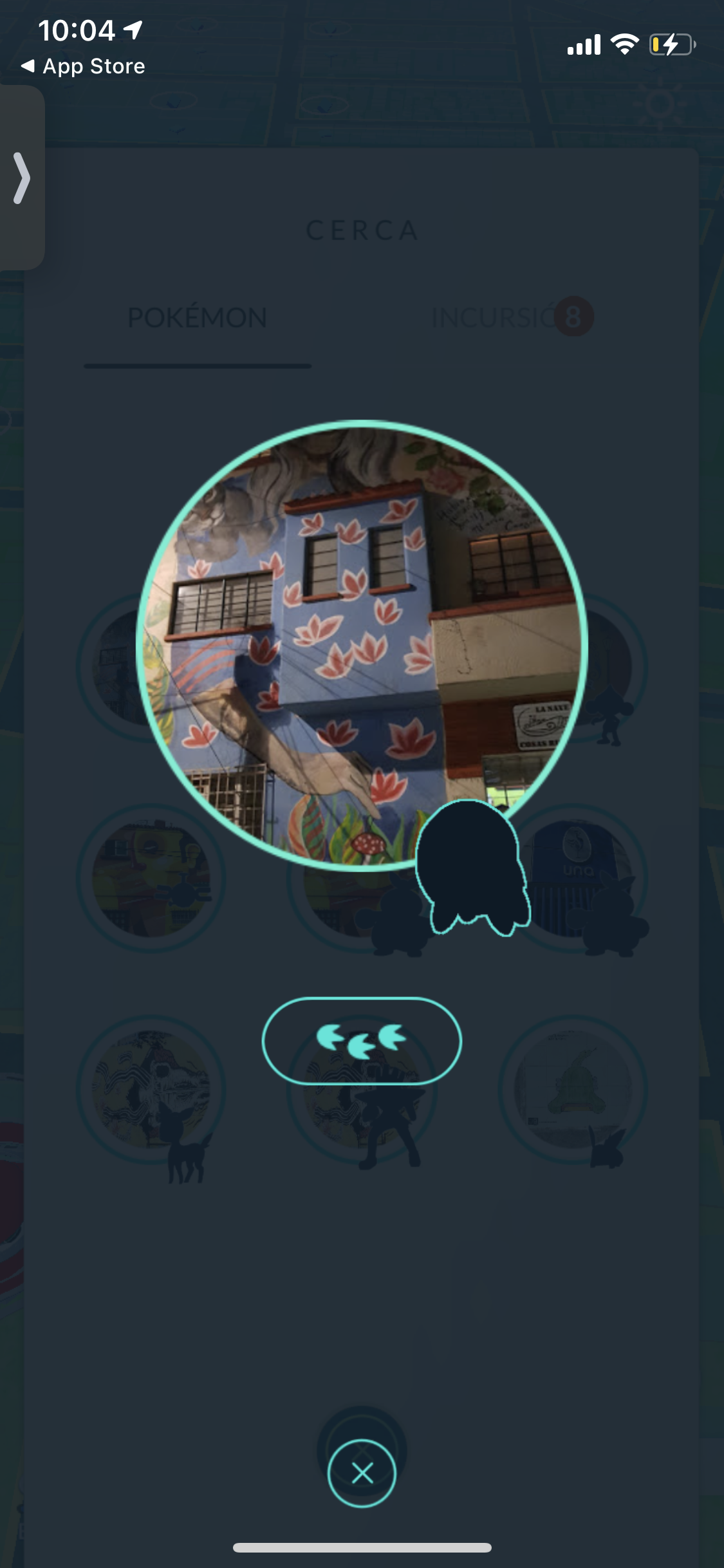
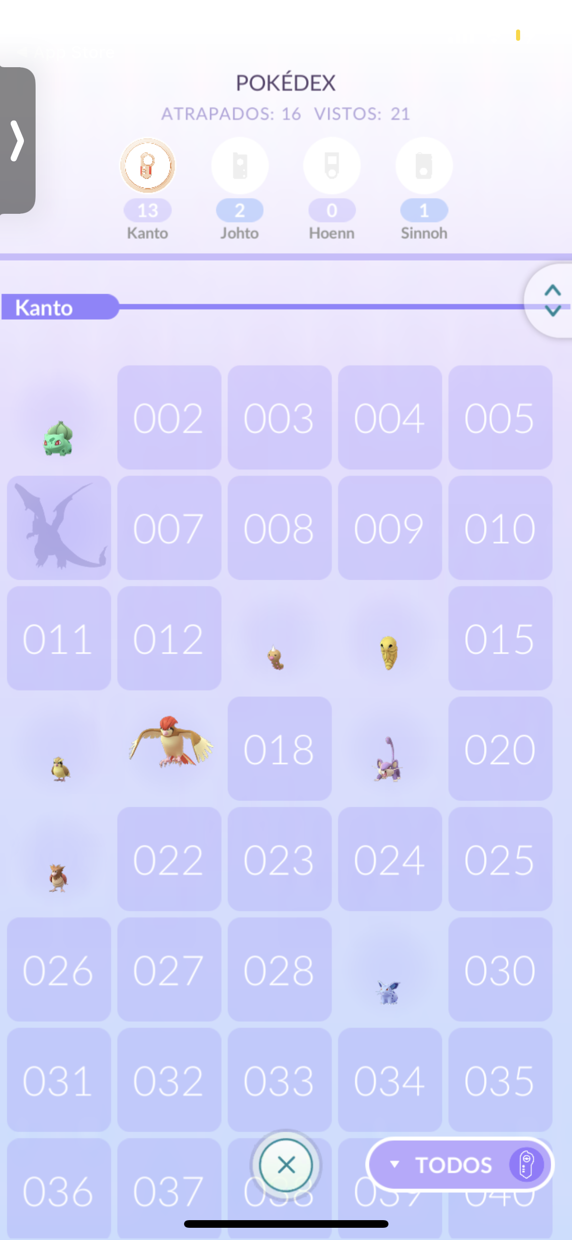
I do have one issue with the design of the game: the lack of consistency on extraneous pages. On most pages, the aesthetic is cohesive with its reliance on variations of blue and green. However, it is unclear why some pages go into a dark mode aesthetic or why purple is randomly introduced in the Pokedex. I suppose the dark mode is good to emphasize things that have not been discovered, but the design doesn’t change based on the state of the location. Also, purple is used to designate landmarks that are refreshing, so it doesn’t match the context of the Pokedex. Color must be thoughtfully used in order to provide a smooth transition between pages.

