Elements of Cheese or Font
- Core: Names of cheeses and fonts to identify
- Core: Space for player to write guess for each name
- Core: Timer
- Core: way to indicate whether you think each name is a font or a cheese
- Supportive: “C or F” instruction above answer column
- Supportive: “Cheese or font?” above names column
- Supportive: colors to differentiate names of cheeses/fonts from answer space
- Extraneous: Feedback on each guess as you go
- Extraneous: Running score out of 50 at the top of the page
- Extraneous: Failures phrased in a funny way
Thumbnails
Secret Hitler Board Analysis
I think the Secret Hitler boards are beautiful.
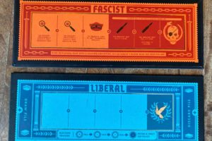
First, the boards use visual hierarchy well. The names of the boards (Fascist and Liberal) are large and centered at the top of each board, making it clear what each board is for. The consistent color scheme (red and orange for Fascist, blue for Liberal) further emphasizes the distinction between the boards.
In the rectangles on the Fascist board, the icons take up more space than the text does. This prevents the board from appearing cluttered. It also allows more experienced players to ignore the text, while still providing explanations for new players (if they need to, they can read the small font).
Finally, the title font and description font are in the same family, but the title font is more ornate than the description font. This allows the title font to draw the eye, the description font to be readable, and the whole board to appear cohesive.