- Identify elements of cheese or font
- Next Quiz Button – Core
- Cheese Types Choice – Core
- Font Types Choice – Core
- Word – Core
- Sketch out the core elements
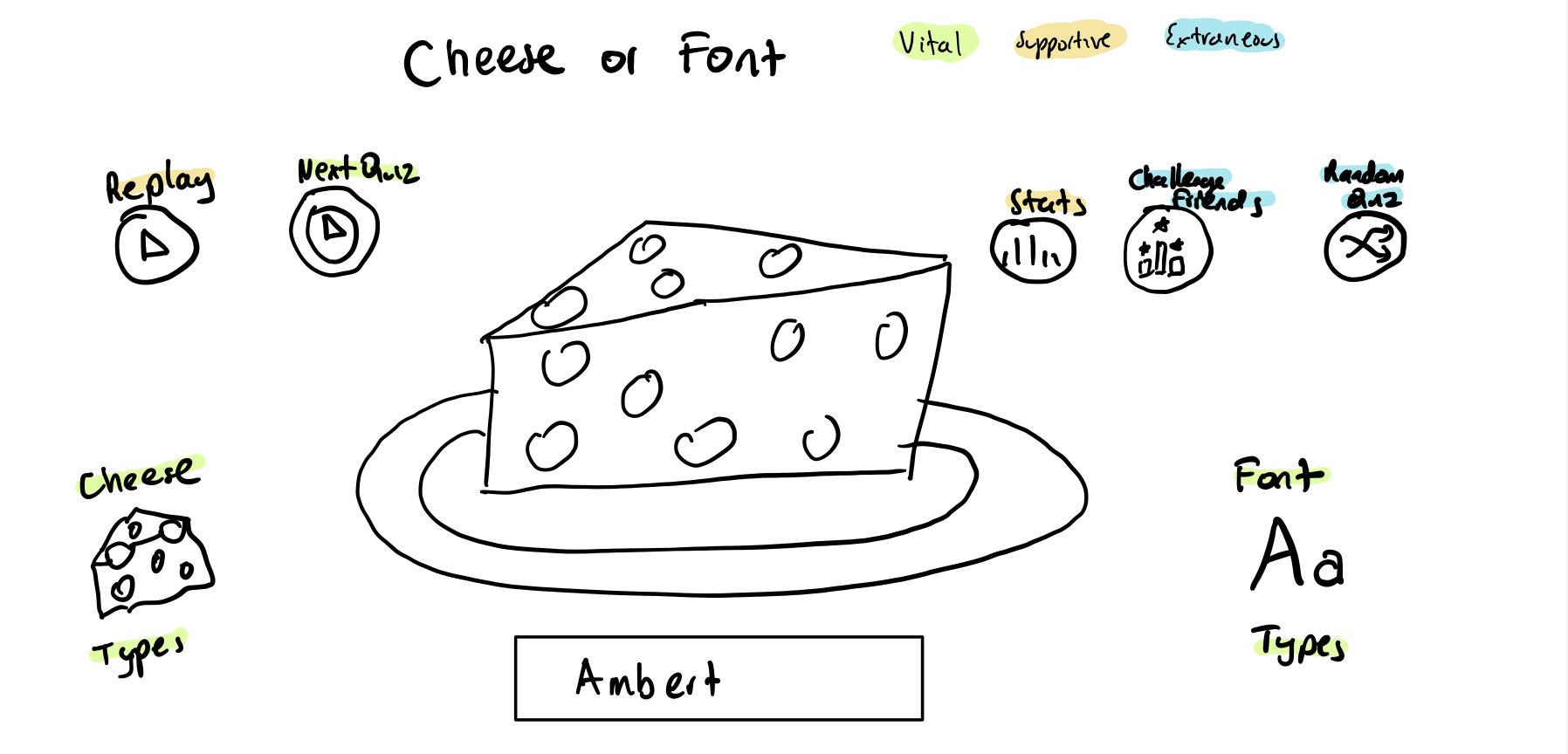
-
Make one element in a NEW thumbnail sketch HUGE.
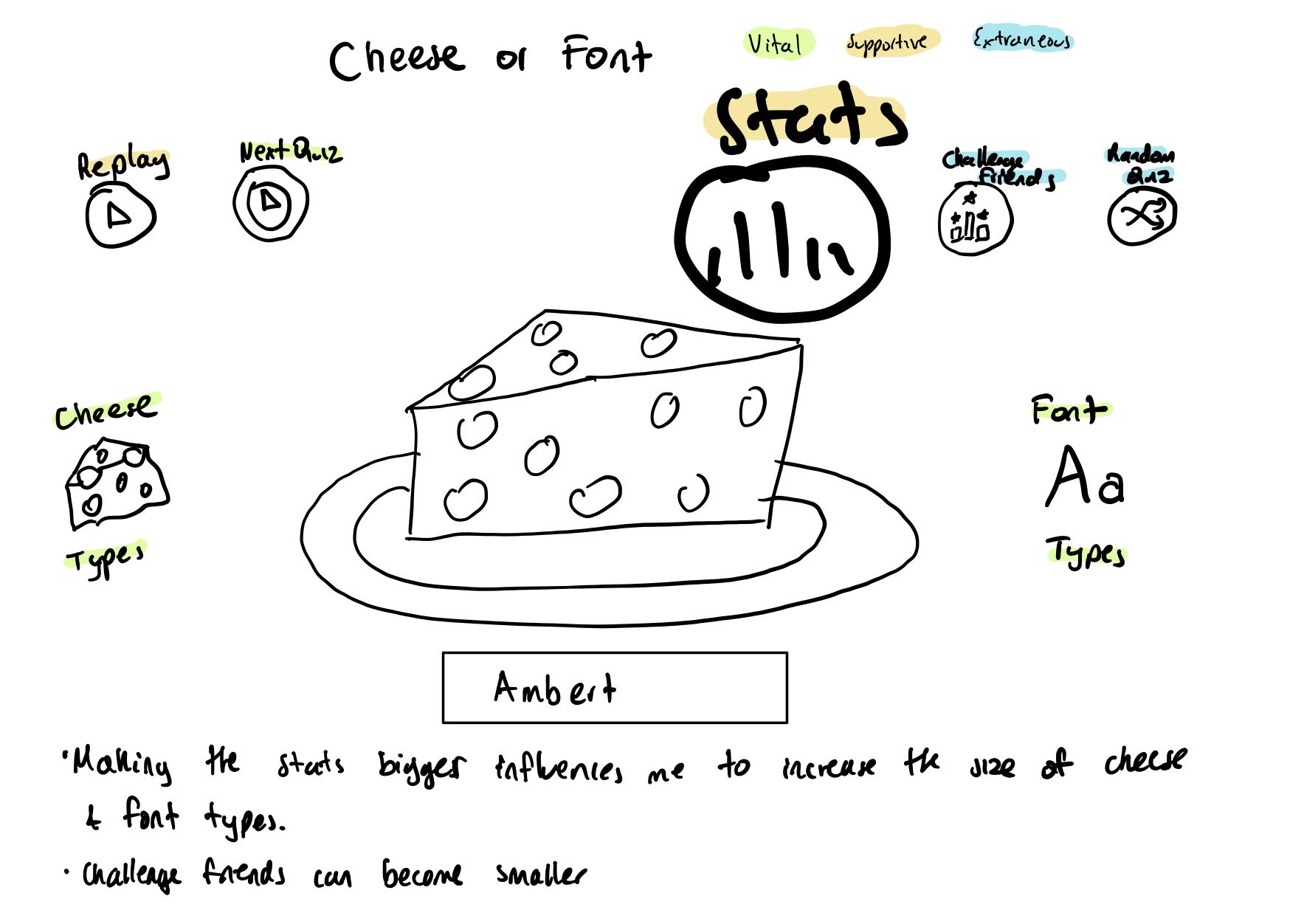
-
Try taking ONE color and using it in your thumbnail sketch along with black.
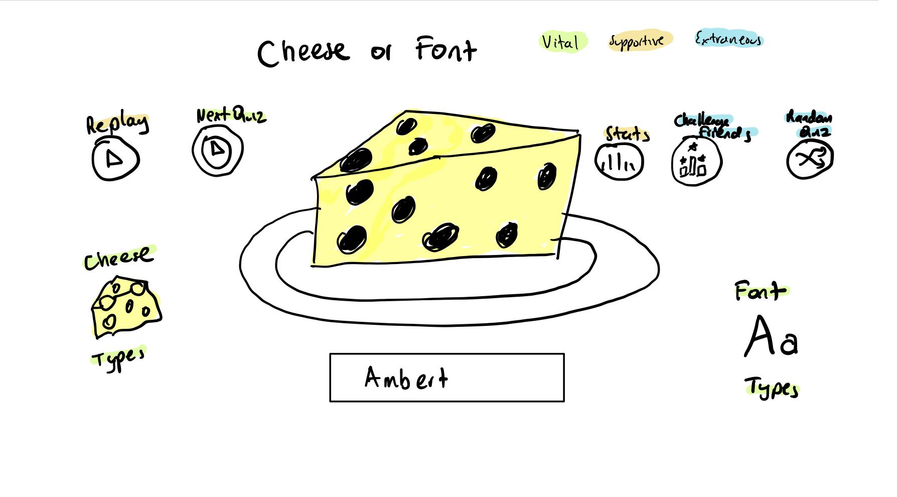
-
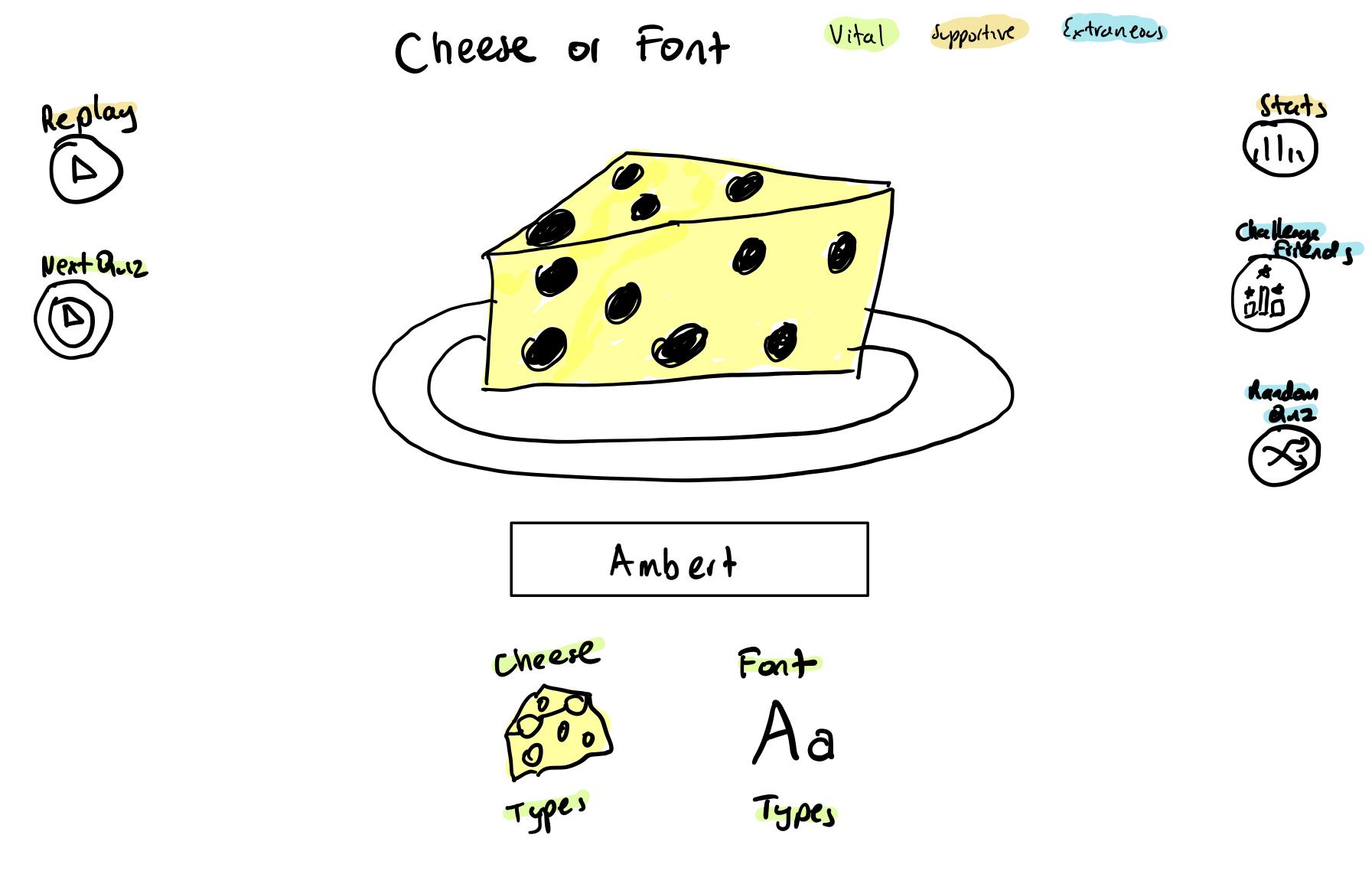
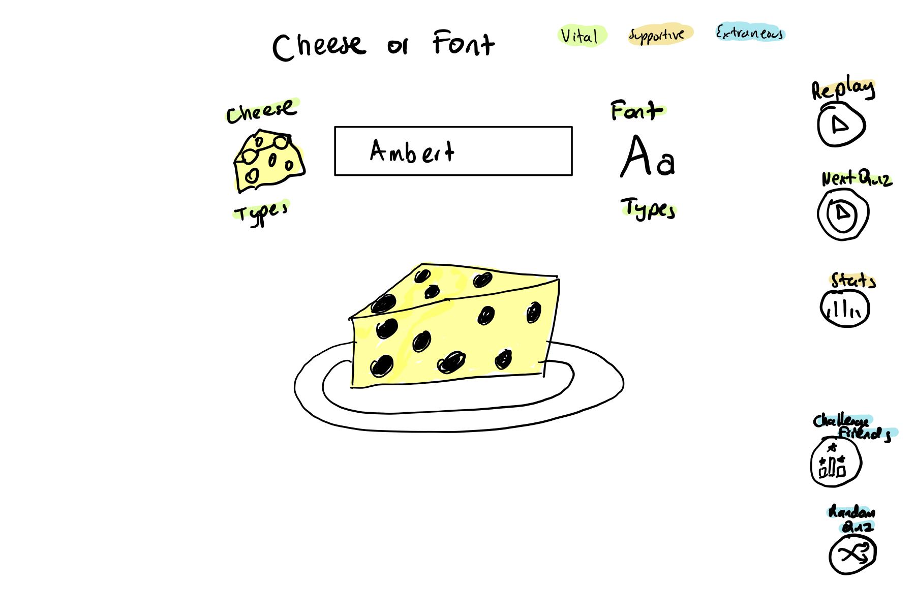
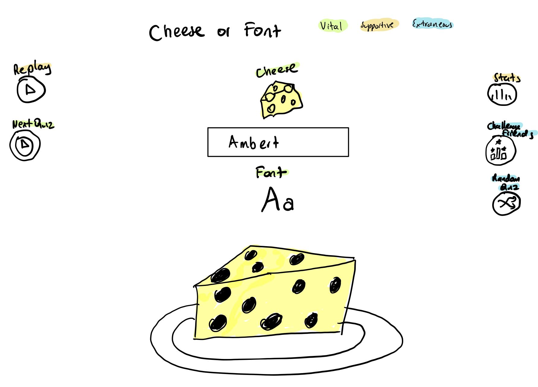
Make 3–4 thumbnail drawings that use type in different ways
-
Explore proximity in your design (short descriptions answering the questions is ok).
- The Replay and Next Quiz Buttons should be grouped.
- The Stats, Challenge Friends and Random Quiz Buttons should be grouped.
- The Cheese Types, Font Types, cheese/font visual and Word Text should be grouped.
Visual Design Principles in Fortnite
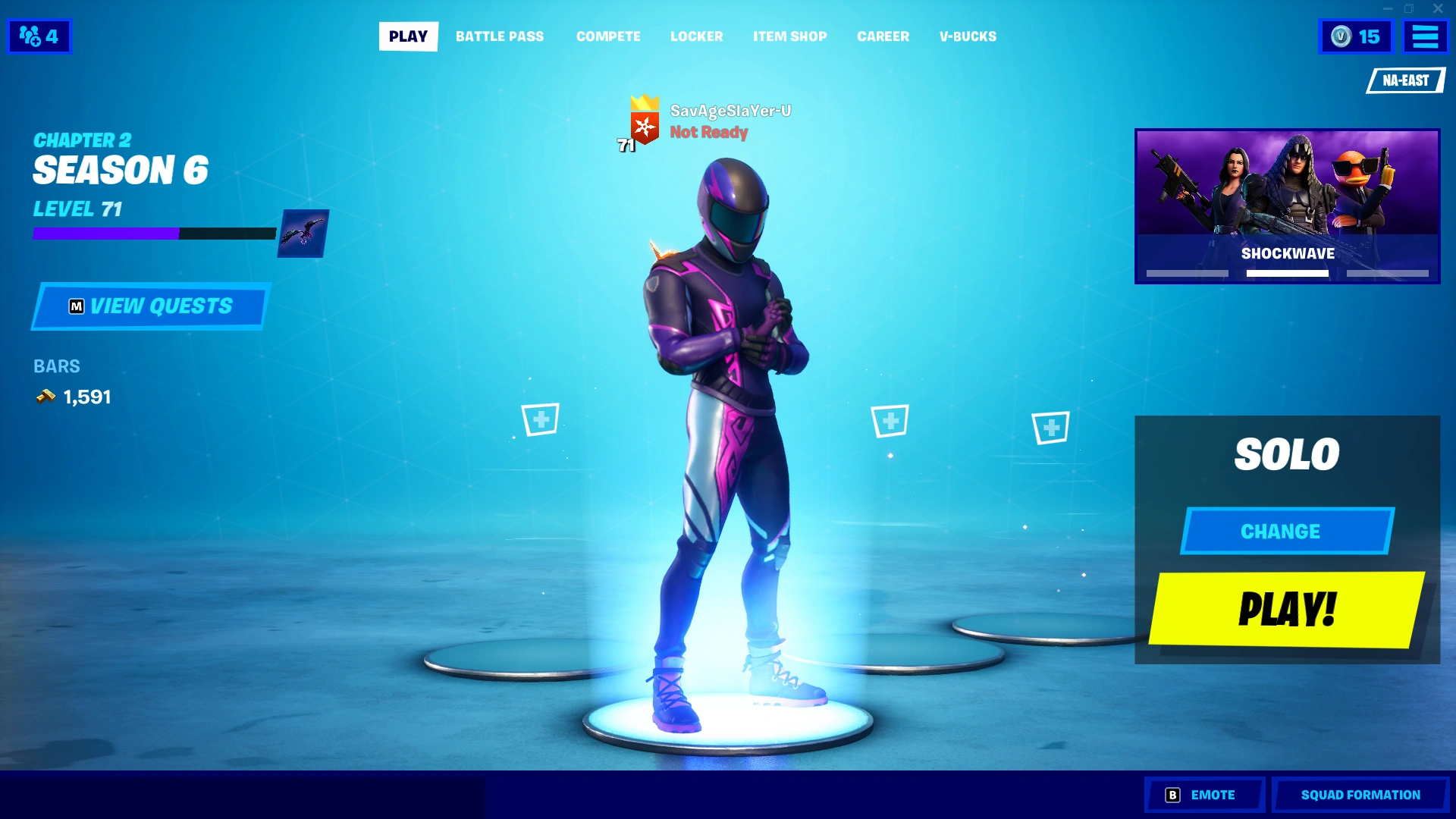
Fortnite is a good example of good visual design:
- Size: The font makes it clear what the main components of attention are (Main player, the “PLAY” button, etc.)
- Color & Contrast: The colors make it intuitive where the human eyes should look at first or more importantly – i.e. note the only yellow is the most contrasting color from the color theme here.
- Typography: There are capitalization, along with family fonts, at play here. This makes it intuitive for the user to think of the different components of the game.
- Alignment & Proximity: The way in which all of the elements in this screenshot are aligned make it clearer what the user should prioritize – main player is at the center of the screen, left side grouping show tasks/statistics for the given Season, right side indicates logistics for upcoming game match, etc.

