

One of the games I love most that I think has excellent visual design is the menus of Super Smash Brothers Ultimate!
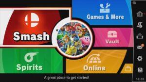
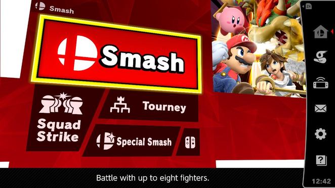
The size and color of each portion of the menu is visually distinct, and the size corresponds to their relative importance to the average player — Smash is the primary game mode that most people are going to be going to, so it defaults to that position and it occupies the largest area on the screen with a deep red color that catches the eye. The text of within each subsection of the menu also corresponds to the size of the subsection, and upon highlight, gains an extra stroke around the text for further emphasis. Each menu subsection also comes with its own little icon to display what that portion of the menu is all about. I also really love that when you click on any menu item here, that it moves inwards, and if you press b to back out, it visually moves outwards, giving visual feedback for the nested menu system. The same visual hierarchy discussed earlier also applies to these nested menus, with more important or commonly used menu options occupying the most space, although now the background color has changed to match the colors from the main menu, so the user never really loses track of where they are hierarchy-wise.
Overall the design of these menus makes for a very elegant, intuitive, and beautiful to look at experience!

