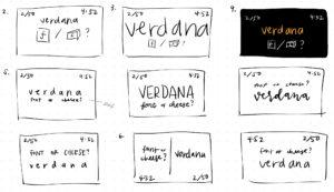
Cheese or Font
1. Elements
Core
- words to classify
- way to select cheese or font (keyboard in this version: C or F)
- timer
- score
- “play quiz” button (becomes backgrounded after entering the game, but initially required to start)
Supportive
- question of cheese or font?
- right/wrong classification of previous answers (gives hints sometimes)
Extraneous
- next/prev
- seeing multiple words at one time
- pause
- next quiz, random quiz, replay
2. Core elements sketch
3. Size
4. Color
5. Type
6. Proximity
The word should be grouped with the question of font or cheese since the question directly relates to the word. The play button, time/countdown, and score should be grouped together, as they are important information/controls, but are different because they do not directly influence the gameplay in the moment the player is making a decision and thus should be separated from gameplay. Including other factors, the next/prev and pause buttons should similarly be together but separated.
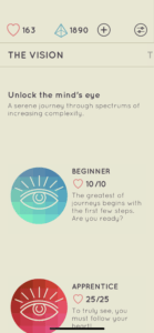
I Love Hue
One game I think is beautiful is I Love Hue; it uses size to indicate which tile is currently on the screen with the numbers below the tiles, and color/contrast/boldness to indicate what tiles have already been completed. Despite it being a game emphasizing colors, outside of the tiles that are full of color, it uses color very mindfully with a neutral background color, dark gray text color, and only red/blue as accents to emphasize certain aspects. The controls are grouped in proximity at the top and some at the bottom, keeping the main focus on the tiles, which are key for gameplay; this forms a kind of grid layout/alignment that leaves space for the most important aspect. It also uses typography pairings in its description of different levels.
 .
.