


Map 1
Map 2
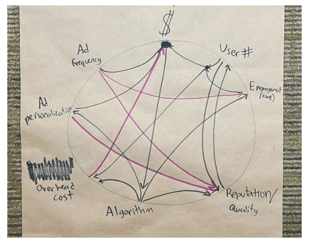
Both concept maps presented visualize the process of “Enshittification,” a term coined to describe the degradation of online services over time. They share common elements such as “Frequency,” “User #,” “Reputation/Cost,” “Quality,” and “Algorithm,” suggesting a core understanding of the factors influencing this decline.
There are distinct differences in their structure and emphasis. The first map is more linear, with a clear progression from “Frequency” to “Quality.” This suggests a more straightforward causal relationship, where increased usage leads to a decline in quality. The second map is more interconnected, with multiple relationships between the elements. This implies a more complex interplay of factors, where the decline in quality is influenced by a combination of factors rather than a single linear progression.

