

Core Elements:
- Game Interface:
- The platform where you see names and choose whether they’re cheese or font.
- Rule:
- Identify as many names as cheese or font correctly as possible.
- Procedure:
- Enter a ‘C’ or ‘F’ to guess and reveal whether each name is a cheese or a font.
Supportive Elements:
- Logical User Journey:
- Automatically moves from one word to the next, guiding the player on how to start and proceed in the game.
- Results (Correct/Incorrect):
- The correct answer is revealed after each guess.
Extraneous Elements:
- Telling the correct answers in a fun way: when the player guesses wrong (sometimes distracting though…).
Here are my 7 sketches and an explanation below:
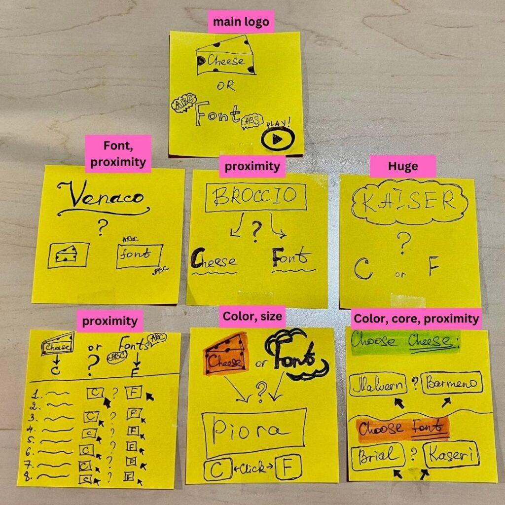
1. Main Logo:
- I redesigned it, adding some touches that illustrate Cheese and Font. As a non-English speaker, I was initially confused about cheese and font and couldn’t directly understand the meaning of the words. So, adding some illustrations describing the meaning of the two words would help me quickly understand the game.
2. Proximity:
- I used proximity in three aspects:
- One huge word and cheese or font in graphics as a choice.
- Many words and buttons with C and F choices.
- Two words to choose between; one for Cheese and one for Font.
3. Used Different Sizes (from huge to small).
4. Used Colors (to highlight Cheese and Font in different colors).
My favorite game — 2048
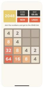
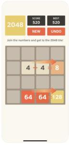
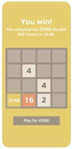
(Photos are from App Store)
The core design of the game “2048” revolves around its grid layout, number matching mechanism, and swipe controls. The grid serves as the foundational structure for organizing and maneuvering numbers, with the primary objective being the matching of identical numbers to reach the coveted 2048 tile. Supporting the gameplay are elements such as color coding, which aids players in visually distinguishing between numbers, a score counter that provides feedback on progress, and the option to undo moves for a more forgiving user experience. Extraneous design elements include the aesthetic background, animations, transitions, and sound effects, which, while enhancing the overall appeal, are not integral to the essential mechanics of number matching. These elements collectively contribute to the game’s intuitive and engaging design.
- Core: So easy to play! It is designed in a way that you will intuitively grasp the rules. The matching numbers are key. The grid layout is fundamental to the game (proximity). It provides the structure for arranging and moving numbers.
- Supportive: Different colors help players match the corresponding numbers quickly. The swipe controls, allowing players to move numbers in different directions, are crucial for gameplay.
- Extraneous: Colors are in pastel warm tones, making it aesthetically pleasing!
By Meerim Nurlanbekova

