


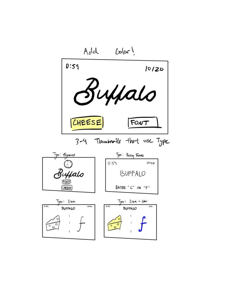
Explore proximity in your design: I placed extraneous elements such as the timer and scoreboard in the corner while enlarging the word in the center. I also tried using both keyboard inputs and images for cheese/font options and played around with vertical alignments.
Monument Valley is a game that I believe is simply beautiful in terms of graphic design for the following reasons:
- The game’s levels are carefully crafted with a balance of shapes, colors, and structures. Each stage is symmetrical, creating a sense of harmony that guides the player through the puzzle-solving process. This symmetry also helps to emphasize the game’s central theme of architectural manipulation.
- Monument Valley employs a limited color palette that effectively sets the tone for each level. Soft pastel shades, contrasted with bold, saturated colors, evoke a dreamlike atmosphere. This color choice also simplifies the visuals, making it easier for players to focus on the core gameplay mechanics.
- Monument Valley features unique geometric shapes and structures that challenge the player’s perception of space. The game uses Escher-esque designs and impossible architecture to create optical illusions and puzzles. This choice of shapes and forms enhances the gameplay experience by challenging the player’s understanding of the game world.
- In Monument Valley, visual hierarchy and emphasis guide the player’s attention to essential elements. Key interactive objects are highlighted or designed to stand out from the background, ensuring that players can quickly identify the path forward. This approach makes the gameplay more intuitive and accessible.


