

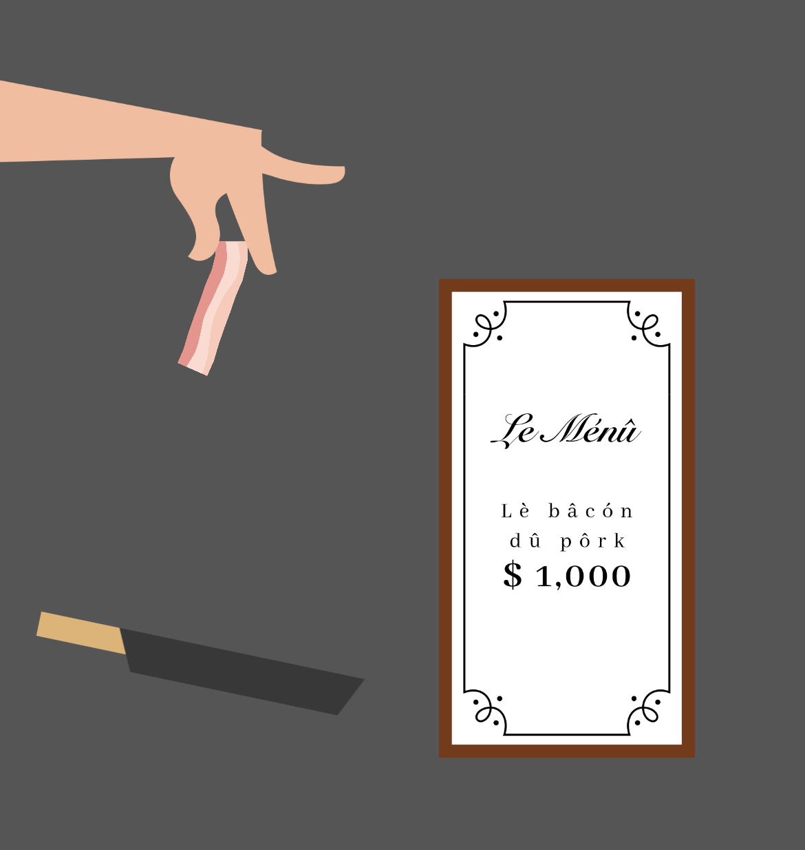
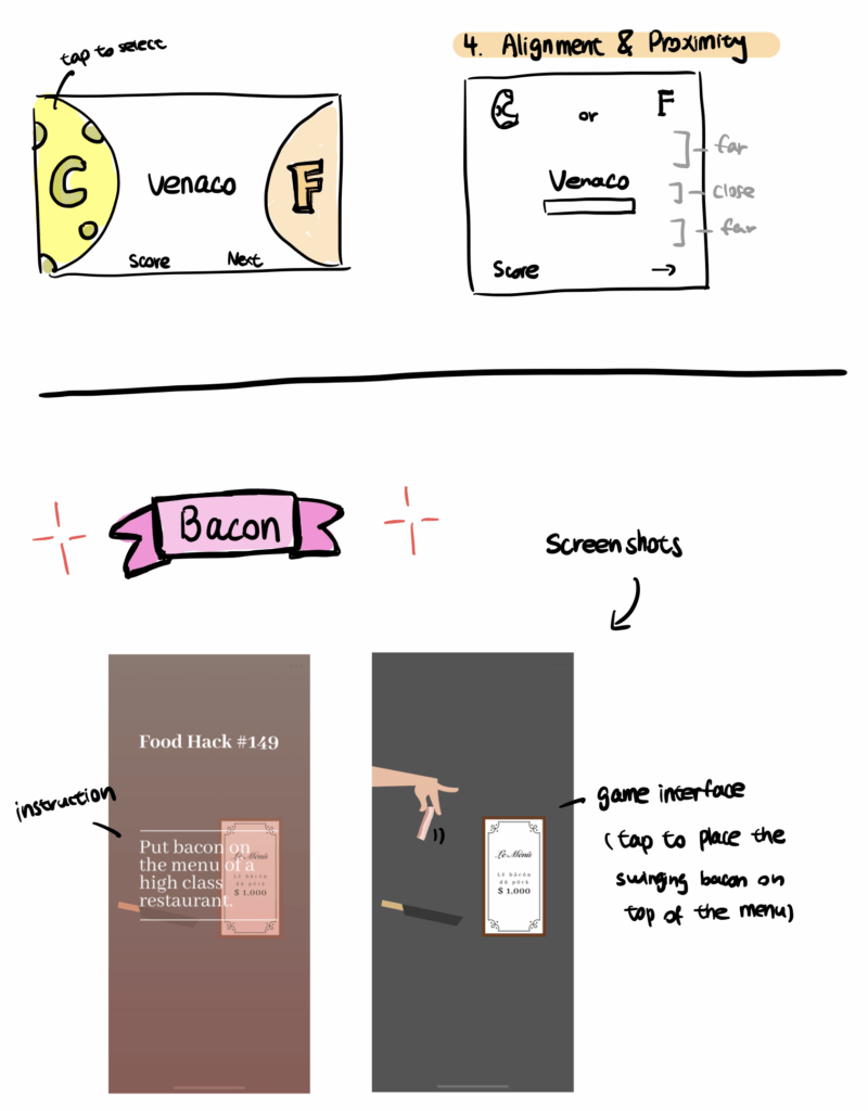
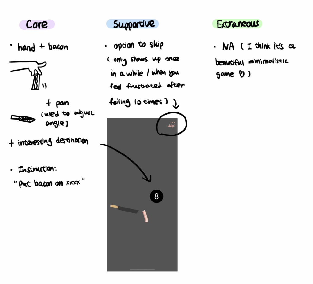
I really like the visual design of Bacon ⬆️ because of its minimalistic style and high color contrast. The core elements are simple: there is a swinging bacon held by a hand, a pan that is used to adjust angles, and an interesting object that serves as the destination. Players need to place the bacon on top of the destination. For example, in the screenshots above, the two destinations are “menu of a high class restaurant” and “8-ball”. The supportive elements include an option to skip (see the screenshot above). However, this option only appears after players failed to place the bacon on top of the destination ten times. I think this is a very clever design because players, most likely, will not be reminded that there is a “skip” button when they are enjoying the challenge but only see the button when they fail many times and feel frustrated. I don’t think there are any extraneous elements in this game.
The visual hierarchy of this game is superb. On the instruction page (see the first screenshot), there is a lot of space between the title and the body text. There are two horizontal lines near the body text and this close proximity helps players to understand that the lines and the body texts are one section and the title line is another section. The title text is also bolded, which further distinguishes the two sections. For color contrast, on the gameplay page, the color pink is used as an accent color that pops out from the background, and the color pink also matches the color of bacon, which is the overall theme. While there is not much variance in typography, the current font in the game gives a clean and elegant feeling, which matches the overall vibe of the game.

