

Hey guys,
I started my analysis by picking out the major features of the game, as can be seen here:
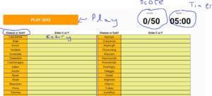 ( Image is a bit blurry)
You could break down these elements as follows:
Supportive: Score out of fifty. Five minute timer. C or F instructions.
Core: Start button. Cheese categories. Boxes of stuff.
The following are some designs I came up with implementing some of the exercises in the article. I think the game could be greatly improved with a kind of flash card option.
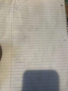
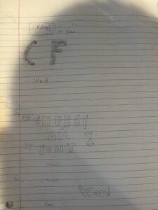
I tried to explore proximity in my designs by placing the options for cheese / font close to eachother, and in large rectangle formats.
One game whose artstyle I love is called Return of Obra Dinn. The entire game is a modern recreation of the lcd era of the (the Atari? I think?).
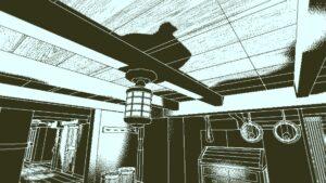
The game is a master class in using color combination to contrast different details
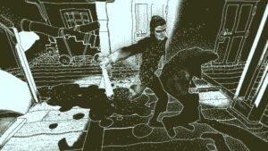
The violence and action in each scene is a problem for the game designer, as depth is hard to convey in this situation with the lower-scale graphics. But Lucas Pope manages it through his renderers pixel choice, etc.
Thanks for reading!

