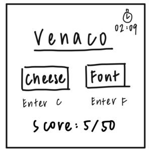
Core elements
- Name of cheese/font to guess
- Choices of cheese/font + mechanism of selection (enter C/F)
- Time remaining
- Current score
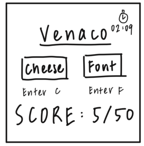
Supportive elements:
- Comments confirming the correct choices (cheese/font)
- Button to switch from numerical score to percentage
- Button to switch timer to practice mode
Extraneous elements:
- Unnecessary comments like “Sorry if some of these wrong answers are mean. Also, sorry, but you’re wrong, it’s a font.”
- Prev/next buttons
- Pause button
- The empty input field (in between the prev and next buttons)
All core elements:
One HUGE element (score):
One color (yellow):
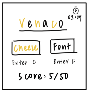
3 different typography:
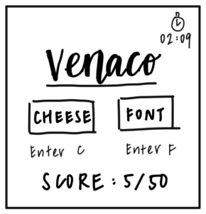
Proximity: I grouped the two choices cheese/font together and placed the enter keys right below the choice words. I did this because I tied the action item of entering specific keys to the choices together because essentially they are one thing – entering c/f equates to choosing cheese/font. I also placed the current word right above the choices so the players can associate the choices directly with the current word. Right below all of that, I placed the score. Since the objective of this game is to win as much as possible, score is an important thing to keep track of and player would most likely want to know their current score.
I placed the timer a little bit farther away from the main elements in the center since the objective of the game is to finish as much as possible so honestly the timer doesn’t really matter since you are just going as fast as possible while aiming for accuracy. But it’s still a core element since it is still important for the players to know their remaining time just in case they really are running out of time.
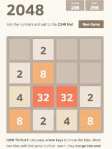
A visually aesthetic game: 2048. I really like the aesthetic design of 2048 since it uses colors of the same tone – warm colors ranging from white, beige, orange, red, to yellow (2048). It gives a very harmonic sense when players play the game since all the colors are from the same tone, and it is really visually-easy to play since you just want to pair up the tiles that have the same color which this game makes obvious of. It is pretty minimalistic in a sense that it only displays the core elements that users care about during the game – the actual board itself, the current score, and the high score (most users want to beat their own high score). However, there is an anomaly – when users start to get past 2048 (this game does not end which means the tiles can go to 4096 or up) which I have never personally been to haha, the color of the tile starts turning into other colors like purple which can seem like a bit contrasting since it is a cold tone. But I still like this design because the game is called “2048”, so going past 2048 can be seen as like advancing through the biggest boss which puts you in this extra-strong phase. Therefore, everyone seems very harmonic and minimalistic with only a little bit of contrast when users get past 2048 to signal that they have exceeded the normal upper limits of the game.