

Analysis of the Elements
Core
- Left column that tells you the word you’re looking at, titled “Cheese or font?”
- Box where you input your answer
- “PLAY QUIZ” button. Without this, there is no way to start the game and begin entering your answers
Supportive
- Score display (X/50)
- Timer
- Instructions: “Can you name the cheeses and fonts?”
- Title “Cheese or font?”
Extraneous
- “PREV” and “NEXT” buttons are extraneous since you can also just click on the box you want to guess in next
- Pause button
- “Give Up” button
- The comments in the boxes are extraneous since they immediately show up after you input your guess (not before, i.e., they’re not hints)
6 Layout Ideas
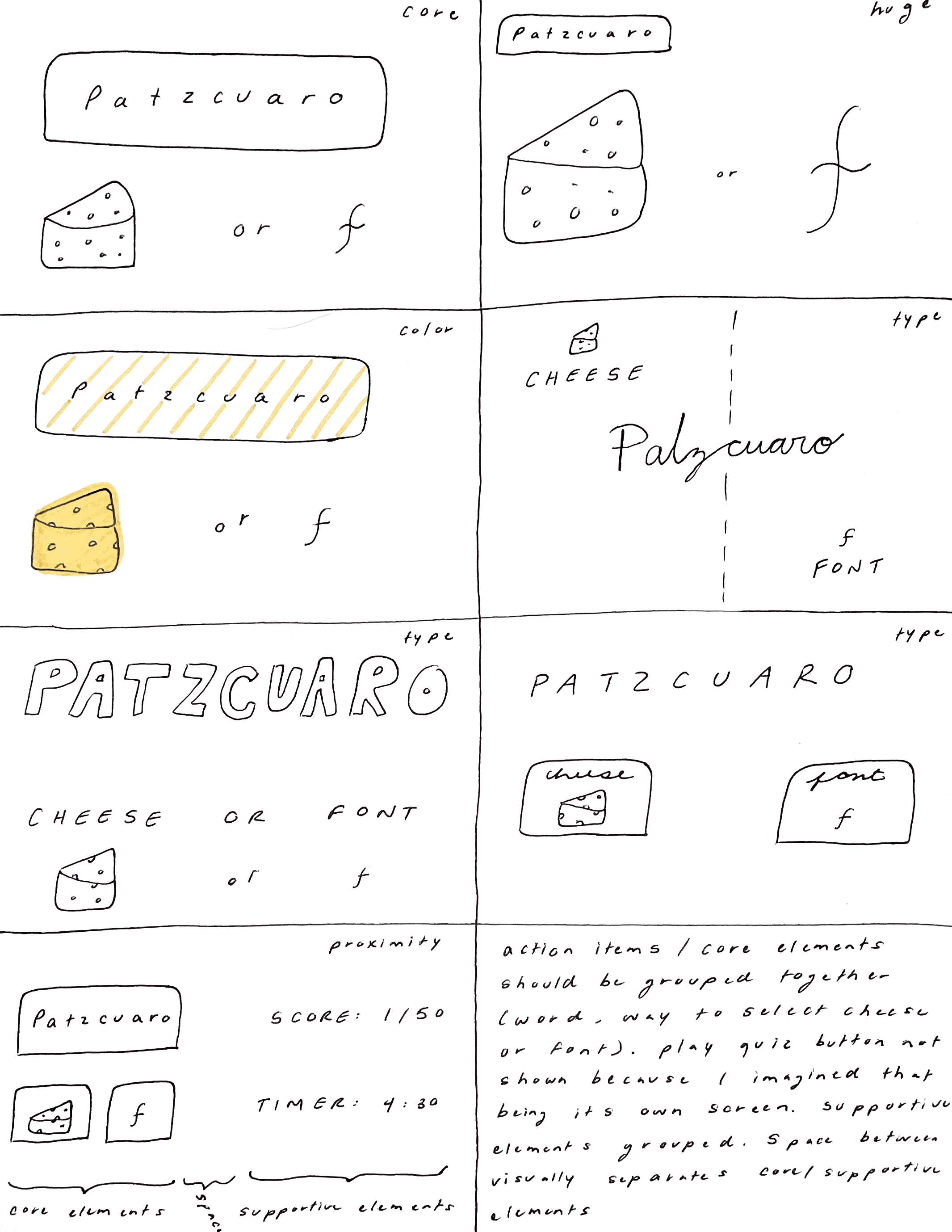
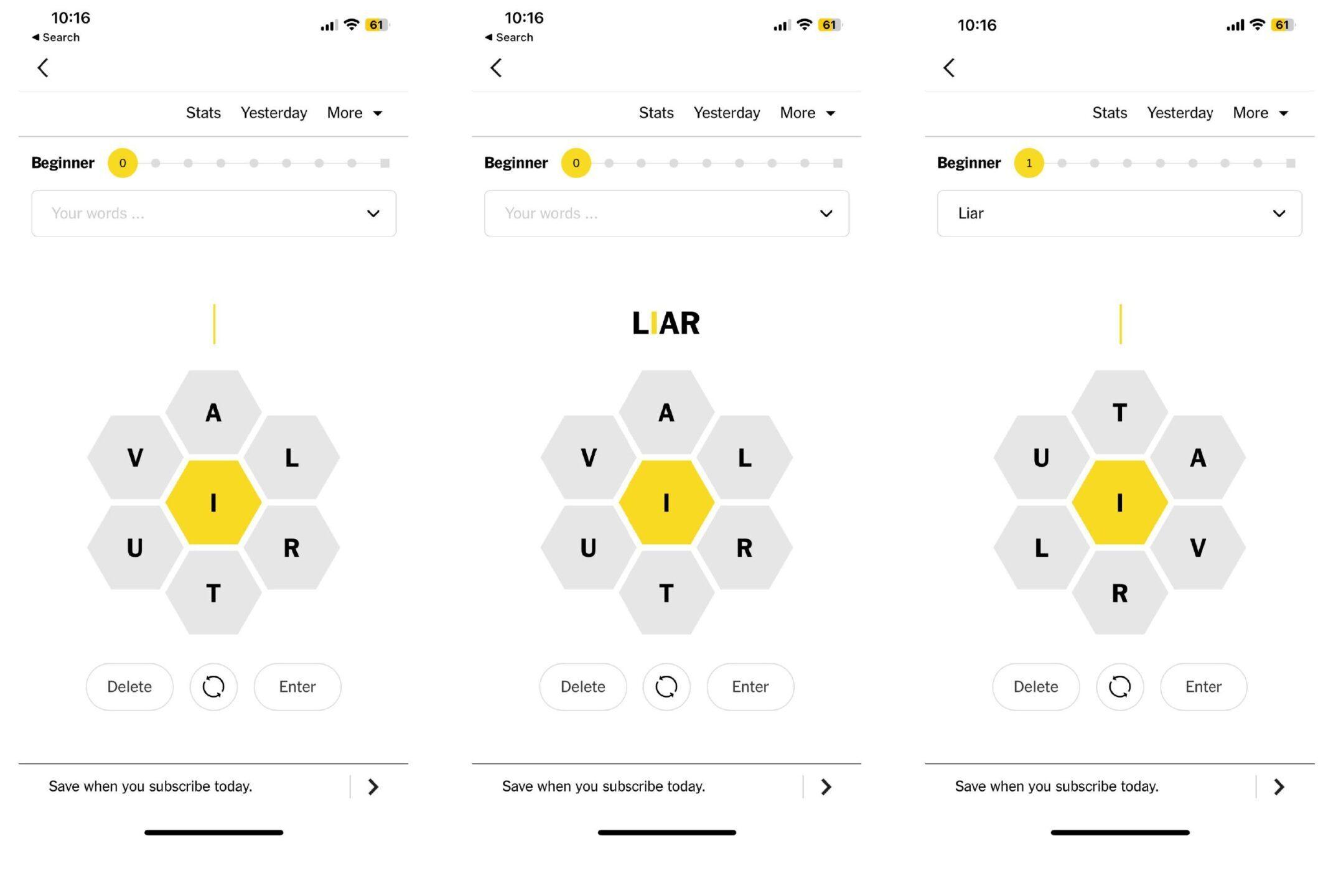
Beautiful Game
When doing the Cheese or Font exercise, I thought about the New York Times Spelling Bee game because of the yellow accent color. This game is very beautiful. The minimalist font makes the game look clean and sleek. The accent color is used strategically to highlight important elements of the game: what letter you must use in your words, and how many words you’ve created. The core elements are close in proximity: the wheel in the middle, the enter and delete button. The supportive elements are also close in proximity to each other: stats, your word list, how many words you’ve gotten (top bar) but deliberately separated from the core elements. The hexagon shapes of the letters push the bee theme, as it makes the center wheel look like a honeycomb. The design also plays with size here — the honeycomb wheel is huge, especially compared to the other elements, making it the focus of the screen. All of these graphic design elements work together to create a beautiful design.

